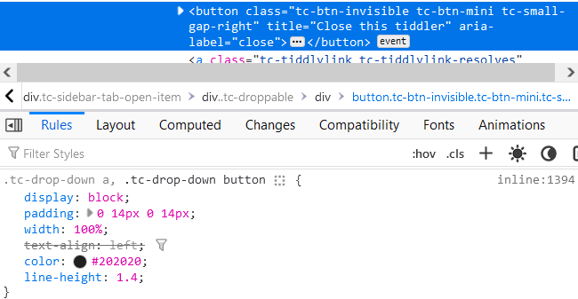
Why the tiddler links and close button in menubar dropdown of Sidebar/Open is not aligned correctly in a single line.

Why the tiddler links and close button in menubar dropdown of Sidebar/Open is not aligned correctly in a single line.

It’s a CSS issue: by default, dropdown links and buttons get block formatting.

Changing width: 100% and replacing display: block with display: inline-block should fix it—though you may not want to overwrite the default styling for all dropdowns. I’d recommend targeting nav.tc-menubar .tc-drop-down a, nav.tc-menubar .tc-drop-down button or another more specific class of your choice.
I have a few solutions where this occurs sometimes and not in others. I would love to find a simple way to apply a style or class in a dropdown where this occurs, but its beyond my CSS skills.
If it’s a general issue with buttons and links not appearing inline within dropdowns, it might be easier to target sibling elements.  Maybe something like this?
.tc-drop-down a + button,
.tc-drop-down button + a,
.tc-drop-down button:first-child {
  display: inline-block;
  width: fit-content;
}
That might be broader than you need, depending on your use-case. (FWIW, @arunnbabu81, the following also solves your inline issue—but I haven’t tested to see what else it affects, if anything.)
.tc-drop-down button:first-child {
  display: inline-block;
  width: fit-content;
}