This is not really about TiddlyWiki — though I’d love to implement the idea in TiddlyWiki, and I bet somebody here will at least validate the conceptual itch as worthwhile…
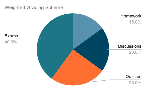
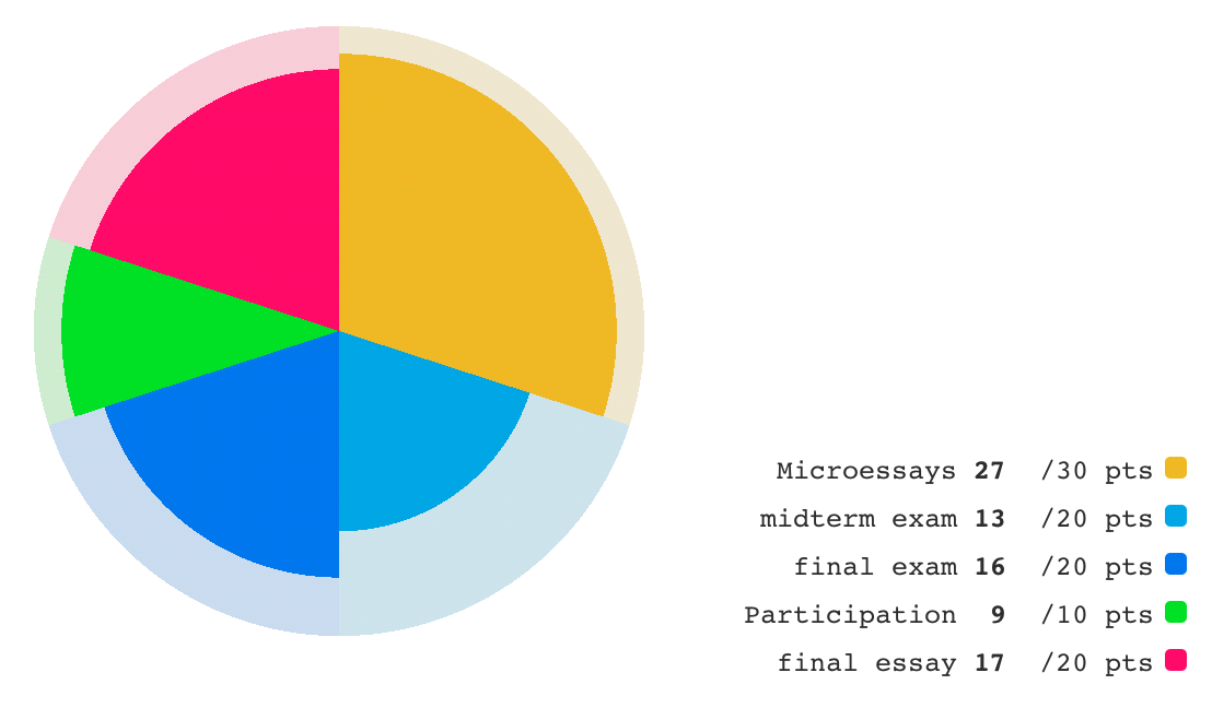
Start with a pie chart for elements of a grade, which uses differences of radial-angle “sweep” to make percentages salient:
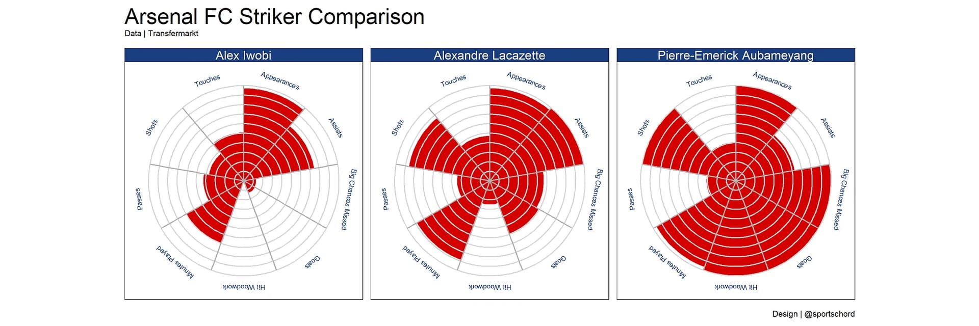
Now, represent the student’s proportional achievement of each slice in a nightingale / coxcomb fashion, as in these radial diagrams, which use extent of radial “reach” to convey information:
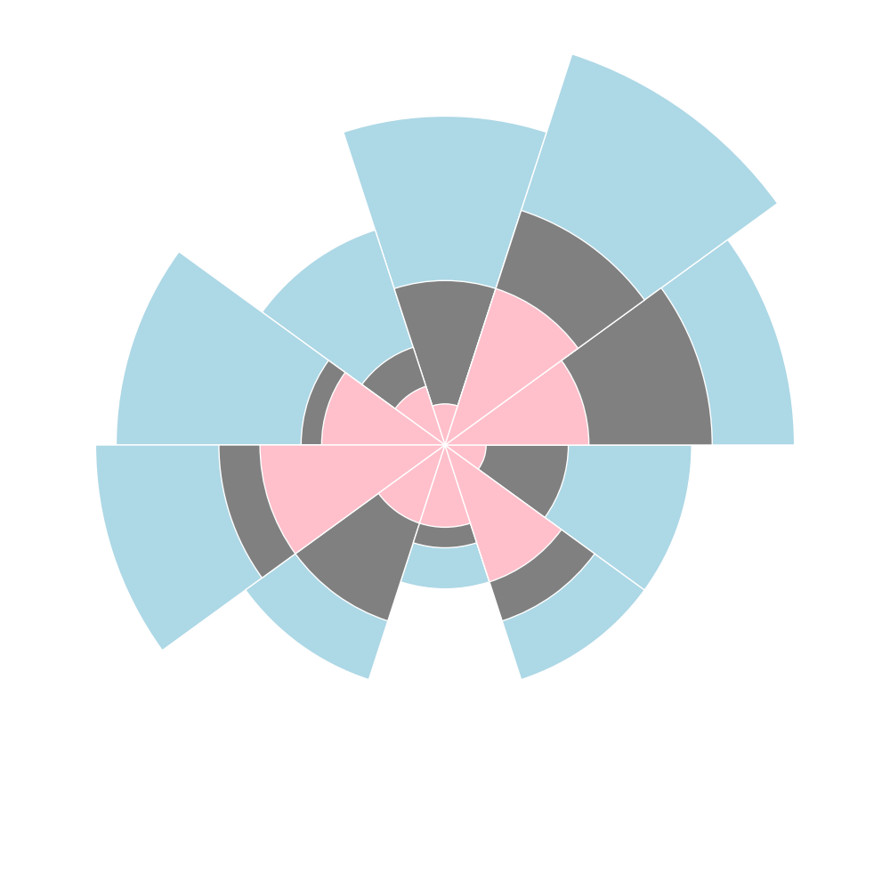
Every pie chart apparently insists on doing ZERO interesting stuff with the interior concentric (radial-“reach”) dimension within each slice.
Of course, I can “cheat” by using a coxcomb or nightingale template where there are, say, TWENTY equal (5%-each) slices, so an assignment that’s worth 20% can be distributed across 4 slices-worth of pie. Then, an 80% score on that assignment would be shown as contrast color on the inner 80% of the area of each of those 4 slices, and so on with each other assignment according to its share in multiples of 5%…
But this approach won’t play nice with how labeling and color-coding are pre-arranged in charting tools, and “out-of-box” versions of these charts insist on making each slice look separate.
I’ve combed through a few chart libraries (including the eChart set that we’ve got a plugin for), and I’m not finding what seems like an obvious and useful format that simply combines these features…
Of course, there might be some magical terminology that I’ve been missing in my searches…
I’m tempted more than I should be to build my own. But that’s not what my time should be going to.
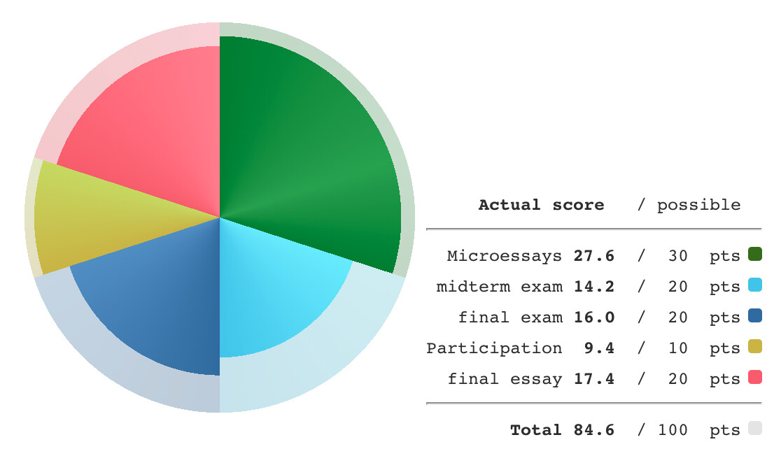
UPDATE, for curious folks. The chart demo is now improved in FOUR ways:
draws on field-values for percentage earned (with live field-edit on demo) — this is proof-of-concept for more complex ways of drawing data from calculations.
draws on field-values for how much each slice is worth (with live field-edit on demo) — this is proof-of-concept for being able to adjust the background “grading pie” for another overall semester rubric.
Interesting @Springer I have little to contribute, however when researching wind resources for my property I came accross the “Wind Rose” which seems to use at least a many degrees of freedom as your chart.
@TW_Tones As far as I can tell, wind rose diagrams also insist on having each slice of the pie occupy the same conical angle… Add a link if you find one that doesn’t?
That is absolutely fantastic! Thank you so much for sharing.
It might be a nice alternative to make the outer ring entirely transparent.
Also, the color article you mention in the text looks like an excellent resource.
It’s true, but Tony is right as well that there is another variable represented, compass direction. There’s clearly a way, with the right data, to chart three variables:
compass direction
section angle
radius
Of course these would all be data of certain types. Compass directions would best be used for something cyclic (hues, month of year, days of week, etc.) Section angles would be for something that represents fractions of a whole, since together we would expect them to add to 360º. Radii are a little more flexible, able to represent fairly arbitrary scaled data in a given range, although probably only if the ratio of largest to smallest value is not much more than three or four, I imagine, although I suppose it could also use a log scale in some cases. And it might represent a range, if your sections didn’t extend all the way to the center.
I don’t have a data set that would use all three, but I can see some potential real value in the combination.
You might have been able to save Springer some work if you’d been able to chime in earlier.
But then we wouldn’t have her beautiful results to steal learn from!
You’re right. I probably do. But I’m not going to spend too much time trying to come up with it at the moment, as I have enough to do without trying to add a dimension to @Springer’s excellent work!
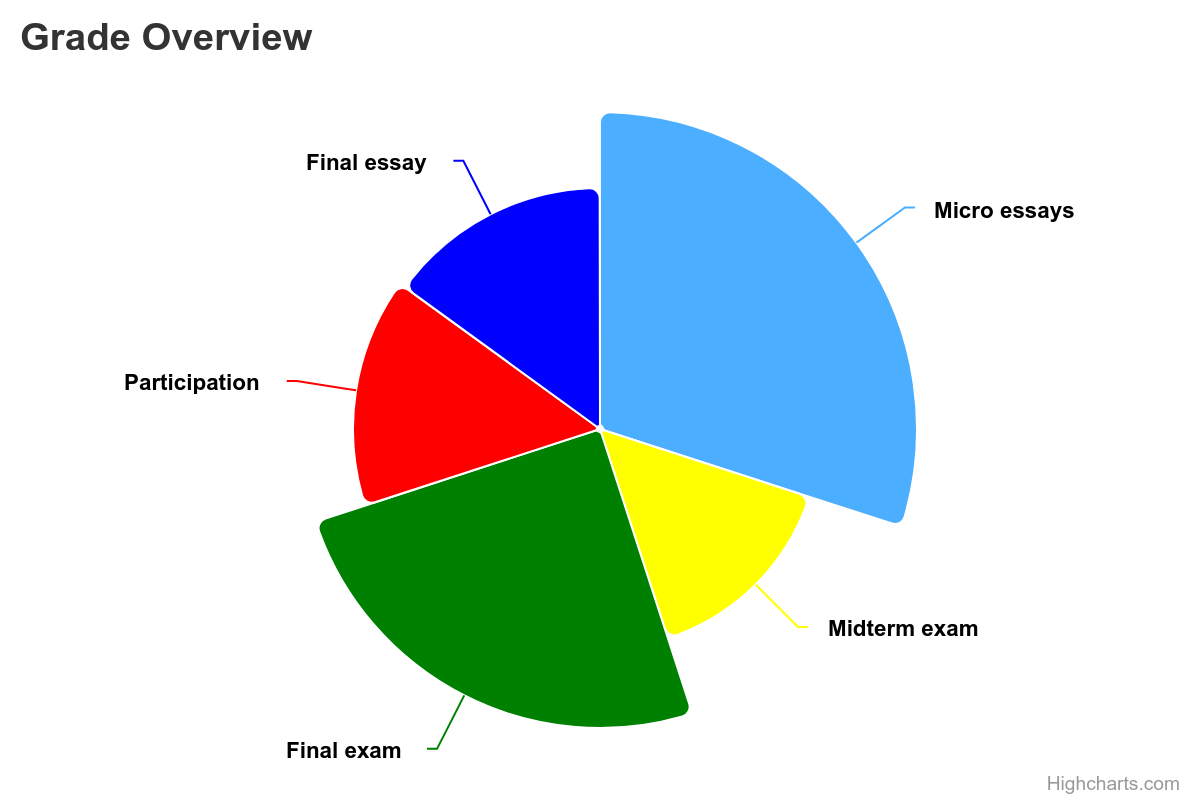
This is the closest I’ve seen! The one thing it doesn’t have is a clear visual cue corresponding to the gap is between actual and potential points…
Do you mean adding a thin outer ring of transparency within the overlay layer, so that we see a thin solid circle of color along the outer edge… ? That would be a nice touch, since the contrast along the outer edge of the circle is currently less than ideal. Still, it would have to be very thin, so as not to seem like an additional kind of information to parse.
Here is one from my own bureau of meteorology which uses the more of a telescope wind rose and uses the conical angle to divide the length into a further division, that we see as a color in other wind roses, it does not necessarily add more information.
I am confident in my travels I came across one with an additional parameter represented in the angular like a pie chart (or am I dreaming?).
Just to play devil’s advocate, is there any danger of overloading the visual senses here?
It seems to me that the existing situation might be described as linear or 1 dimensional, the angle or the radius of a wedge is used but not both together.
You critcise one instance where a single variable is actually used to control both angle and radius and say it should be banned, I don’t know but I assume that you allude to the fact that now area rather than a linear quantity like angle or radius is changing, the shrinkage in your example is then proportional to the square of the measured quantity(1), dependent on whether someone is more sensitive to area or not it could be read the wrong way.
“square” because you tell us that in the example shown the same variable controls angle and radius but of course this would usually be two different variables.
I am a tad suspicious that the most flexible example conceivable using only the styles shown in your post might be heavy on the brain because we are seeing a mix of area and linear information and whilst we can analytically decode that area comparison represents the multiple of two variables we may subconsciously infer incorrect cues when decoding one wedge and another that might differ in overall radius, angle and also be subdivided as you show. Does the viewers subconsious decoding of visual quantities favour area over length? When comparing dissimilar squares do we see the length and width of a square before we see the area of a square, how do our brains work in this kind of situation and is it constant in the population?
My suspicion is that there might be a good reason for these limitations.
If there difficulties decoding many variables within one graph is it not time to consider using two graphs side by side?
I wonder if usability might be taking a backseat here?
That could also be a useful approach, but no, I meant something more like what @john.edw_gmail.com presented (which was posted while I was typing my response), with only the implied outer circle to show the potential extent of the radius. That carries the same information in only a slightly less easy-to-interpret manner, but is less busy visually.
I’m not sure whether I like it better or not for myself, although I see that you would like “a clear visual cue corresponding to the gap [in] between actual and potential points”
Of course there is. My suggested extension into three variables might not be at all feasible. But I think the two-variable version above is enhanced by this presentation.
I think so. IIRC, Edward Tufte presented evidence to this effect in his course. It’s probably in at least one of his books, and I’ll try to look later for references.
I know that looking at the Nightingale chart with that structure, I certainly expect that the dark blue has far more weight than the purple, and would be very surprised if this were merely a factor of three or four as unsquared linear interpretation would imply.
Of course, but I don’t think we’re close to that point here. The graph holds meaningful information in angles and radii. But it also captures useful information in their combination, in the area. We can see at a glance that this student’s best specific performance is in the essays and participation, and also that the largest portion of missed performance is in the midterm.
This risk is one that any diagram-maker should take seriously. In this case, the simple pie chart is already familiar to the target-audience of my example (they have seen this basic pie-chart since the beginning of the semester, without the “your actual score superimposed” element). I think in the absence of that background familiarity, the complication of a second dimension of information might be cognitively challenging.
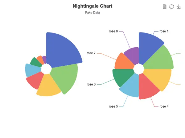
If you look at the actual example I’m criticizing (following the link), what’s clear is that what they’re doing is much worse than working with area rather than linear ratios. Compared to the 40 value (for “rose 1”), the 10 value (for “rose 8”) is given 1/4 the radial reach AND 1/4 the conical angle. So the smallest category has far less than 1/4 the area of the largest — less than 1/16 as much area, in fact.
I agree that relative area might be a more accurate solution for many purposes. I confess that the math for representing actual achieved scores as relative areas (rather than as linear differences of “radial reach” from the center) is both less of a “no-brainer” to set up, and harder to troubleshoot. After considering an area-based solution, I decided on doing my proof-of-concept model in this simpler linear way.
Then I also reasoned that for something like grades, working with linear difference in the reach of the inner section may make sense; the closer you get to 100%, the more a point here and there feels like a big deal. On any given assignment, the first 50% is much easier to achieve than the second 50%; the difference between 72% and 76% is academically and psychologically less meaningful than the difference between 89% and 93%, and so on… At the outer extreme, an area-based solution would make the difference between 97% and 100% on an assignment seem quite visually compressed (perhaps to the point of being imperceptible at small scale), while that difference remains a bit more perceptible in the linear approach.
For a polar diagram where there isn’t something like a meaningful target or threshold perimeter, the area-based approach would make more sense. If you’re tracking rainfall across six states (of different sizes), you might apportion the pie angles according to the relative areas of each state, and then represent the rainfall such that two meters-worth of rainfall (over, say a 60° arc) has twice the area compared to a meter-worth (over that same 60° arc).
What makes a diagram effective can be quite specific to its purpose and audience!
We also know there are common human misinterpretations such as problems with larger numbers, problems understanding in area and volume / squares and cubes.
It can be easy to misrepresent data by playing with common human weaknesses and falacies. If you want to be honest it is importiant to allow people to read exact values off a diagram.
even just helping the reader by ephasising difference over the absolute values can be misleading unless you explain this to the reader.
Indeed, I never present any information only in a diagram. The information is available as plain old qualitative feedback within plain old sentences, and in numeric tables as appropriate. A diagram serves to put the semester’s ingredients into perspective, with raw numbers as a backup.*
Indeed, the ultimate form of this diagram would have a neatly-placed caption pointing to each section of the diagram (rather than relying on the color-coding within the legend, no matter how accessible the palette). Each section of the pie also ought to function as an image-mapped link to the relevant details… This is why informative GUI design is a full-time job.
*Honestly, this diagram project is for my own sake as much as for students. If a student in a large class asks for perspective on why their semester grade came out as it did — or what end-of-semester assignment re-take opportunities might make the biggest difference, etc. — this kind of chart can orient me to a reply far more quickly than any table full of digits! (So, I suppose the general guideline is: to the extent that someone will have occasion to consult many output-instances of a chart template, that template can afford to be more complex than it should be for an audience whose concern is limited to a snapshot or two of information.)
Yes that’s precisely the point I was making, I was not making a point against area being used in general rather that two variables when combined in this way lead to an area difference proportional to one variable multiplied by the other - in your particular example since it was the same variable used for both angle and radius then the square.