What do you use for media query to detect mobile? Is <<sidebarbreakpoint>> an good option?

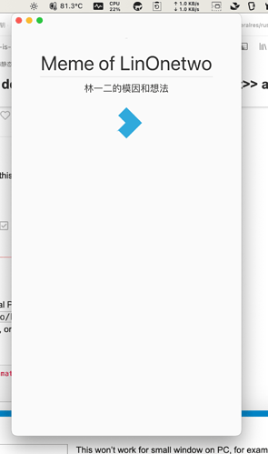
I use <<sidebarbreakpoint>> in my themes to detact mobile size screen (including small sized desktop window, like TidGi-Desktop’s menubar small window)

For example:

\import [[$:/themes/tiddlywiki/vanilla/base]]
\rules except horizrule dash

@media (min-width: <<sidebarbreakpoint>>) {
	.tc-sidebar-scrollable {
	  padding: 40px 10px 0px 15px;
	}
}

@media (max-width: <<sidebarbreakpoint>>) {
    .tc-sidebar-header {
	  margin-top: 20px;
    /** fix mobile left side still have width after close */
    padding-left: 0;
    padding-right: 0;
	}
  .tc-sidebar-header > .tc-reveal {
    padding-left: 10px;
    padding-right: 10px;
  }
  /** solve collision with tc-sidebar-scrollable in mobile */
  .tc-topbar {
    z-index: 1002;
  }
}

What do you think? Its name “sidebarxxx” indicate that it is not originally designed for this scenario, and you need \import [[$:/themes/tiddlywiki/vanilla/base]] to use it, and \rules except horizrule dash to prevent - in css variable broken.
Have you looked at the info tiddlers? $:/info they include;

Personaly I use something like this

\rules except dash list horizrule 

@media (width < {{$:/themes/tiddlywiki/vanilla/metrics/sidebarbreakpoint}}) {
..
}
1 Like

So you are using sidebarbreakpoint as well, maybe this is what everyone used for “mobile breakpoint”.

Install the “browser-sniff” plugin from the TiddlyWiki Official Plugin Library. Then, at startup, this will create $:/info/browser/* tiddlers, including $:/info/browser/is/mobile, which has a text value of “yes” when running on Android, ios (ipad, iphone, or ipod), or Windows Phone.

Then, in your CSS, use:

<$list filter="[[$:/info/browser/is/mobile]get[text]match[yes]]">
  ...
</$list>

-e

1 Like

This won’t work for small window on PC, for example menubar window of TidGi-Desktop, unless I set $:/info/browser/is/mobile for it.