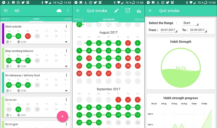
Some new user of TidGi Mobile is attracted by tw-calendar plugin, and ask for visualization like time block app
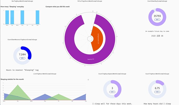
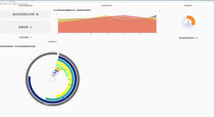
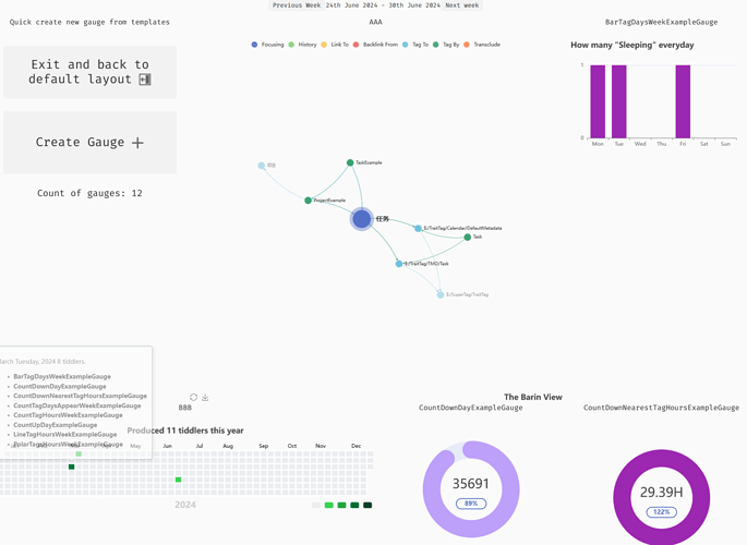
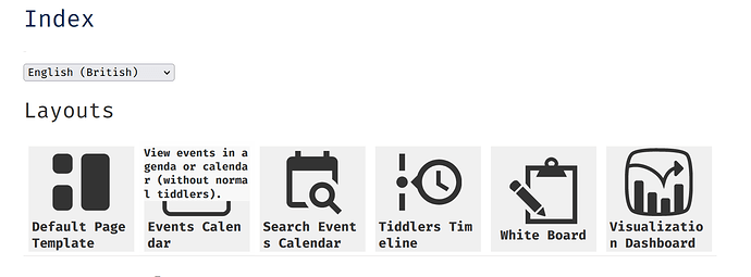
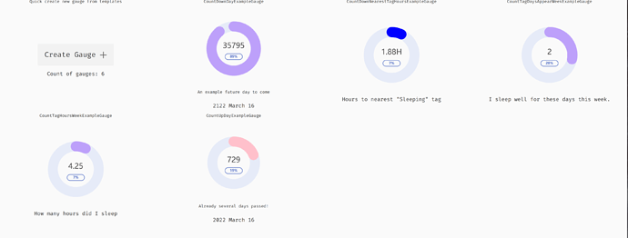
So I’m creating a new vis dashboard layout, that can display multiple gauges fullscreen. It is still on dev, but you can try it by click “Visualization Dashboard” button on the simple layout launcher on:
https://tiddly-gittly.github.io/tiddlywiki-calendar
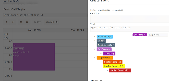
And to give data to some gauge, you need to drag some Sleeping event (event with Sleeping tag) on the calendar on Index
Then you will see some counter gauges on the dashboard layout
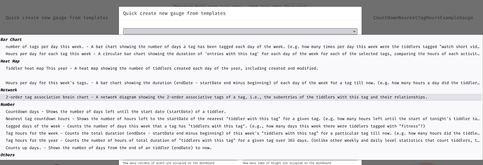
To simplify the filter expression that collect data for these gauges, I write multiple new fitler operators, you can try them on https://tiddly-gittly.github.io/tiddlywiki-calendar/#Visualization
There are 2 things I’m uncertain
- the dashboard seems too simple, I need more design for it
- what other visualization do we need? I personally don’t use much visualization before, because there wasn’t much structed data on my wiki for it
Github: GitHub - tiddly-gittly/tiddlywiki-calendar: Widget and Page Layout displaying tiddlers on calendar and agenda, based on created, modified, startDate and endDate fields.
Dev with: Unnamed Plugin — Unfilled Description
 .
.