Using Icon for Plugins

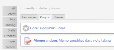
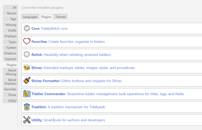
In updating the kookma plugins, I started using the plugin icon ( a TiddlyWiki feature less used). The cost is few kilobytes (less than 1~2 kB).
For example see

What is the best practice to include the plugin icon?
Q1- the type of icon to work on all browsers? I use svg.
Q2- the size of the icon? Is the standard size 22pt?

The pt is less common and I prefer px. I hope in the new update of TiddlyWiki, core icons use px instead of pt.
3 Likes

Me too. However, setting width and height is unnecessary and may interfere with its scalability. The image can be scaled better by the browser (and your CSS).

button svg {
  width:1.5em; /* or similar */
}

See point 2 here: 10 golden rules for responsive SVGs | Creative Bloq (but also review point 6).

Note: I’m not an SME when it comes to svg, but every “informed” piece I’ve read suggests the same thing: remove width/height.

See point 2 here: 10 golden rules for responsive SVGs | Creative Bloq (but also review point 6).

Much appreciated!

For core images, I assume if we remove the height and width, we can then use css everywhere we use them!

SVGs are good. You should just ignore the default size. Most likely it will be overwritten by CSS or transclusion parameters.

You can probably use: https://svgomg.net/ to make them smaller. SVGs usually also contain more meta-data, that can be removed if used with TW.

The core macros use the bare minimum that it needed to work with TW. So you can use them as a reference, to make your own icons smaller.


A side note: We desperately need a filter option in the plugin tab.

If you mean TWX that may be possible, but with TW5 that will probably never happen for compatibility reasons.

TW Icons v1.10 — A large collection of icons for TiddlyWiki is probably the best resource for icons. I understand it’s not everyones favourite hobby but I rather enjoy trying to identify the best icons to represent what the plugin does.

I’d recommend sticking to black/gray/white for public plugin icons out of respect for the users; it is distracting with a sudden color blot in the plugins list - and it will keep on distracting every time your eyes scan the list. It is possible to modify the color of svg icons (…even if I personally suck at doing things in svg).

2 Likes

Agreed. But it can be one helluva time-sink.

Hi Mario,
Thank you for your comments. Yes, I go with svg! I used the same 22pt, but as you said it is overwritten by transclusion/css.

If you’d like to save a lot of space, you could try using Unicode emoji characters instead of SVG images. Unicode characters can be rendered by using HTML “entity” syntax (&#x.....;).

For example:
:house_with_garden: “home” = 🏡
:stopwatch: “clock” = ⏱
:art: “palette” = 🎨
:pushpin: “push pin” = 📌
etc.

Also, Unicode characters automatically scale to match the current font size, so they can be easily resized in TiddlyWiki via CSS using @@font-size:...; &#x...;@@. For example: @@font-size:5em; ⏱@@ produces a huge clock icon.

There are lots of reference sites to lookup Unicode and emoji character codes. Here’s a few links to get you started:

enjoy,
-e

1 Like

Thank you Eric.
Amazing! I expected to have a tiddler of type of image. An هcon tiddler in form of <span style="font-size:30px">&#x1F4DD;</span> resulted in:

image.png

I am a big fan of TW icons! It is a great resource.