Create an entry, either in the form of adding $:/tags/Stylesheet tags, or wrapped in a block of style tags. Copy the code below over. Then write a widget with the following code as well.
/* Stylesheet for date input box under specific style */
.specific-container input[type="date"] {
  color: transparent; /* Hide text */
  position: relative;
  padding-right: 5px;
  padding-left: 5px;
}

/* Show placeholder text */
.specific-container input[type="date"]::before {
  content: attr(placeholder);
  color: #999; /* Placeholder text colour */
  position: absolute;
  left: 0px;
  top: 0%;
  transform: translateY(-50%);
  pointer-events: auto;
  display: block;
}

/* Clear browser default style (cross-platform compatibility) */
.specific-container input[type="date"]::-webkit-datetime-edit,
.specific-container input[type="date"]::-webkit-inner-spin-button,
.specific-container input[type="date"]::-webkit-clear-button {
  display: none;
}

.specific-container input[type="date"]::-webkit-calendar-picker-indicator {
  opacity: 1; /* Retain calendar icon */
  position: relative;
  z-index: 1;
}
<div class="specific-container" >
<$edit-text tiddler="AppSettings" field="myconfig" type="date" /><p/>
</div>
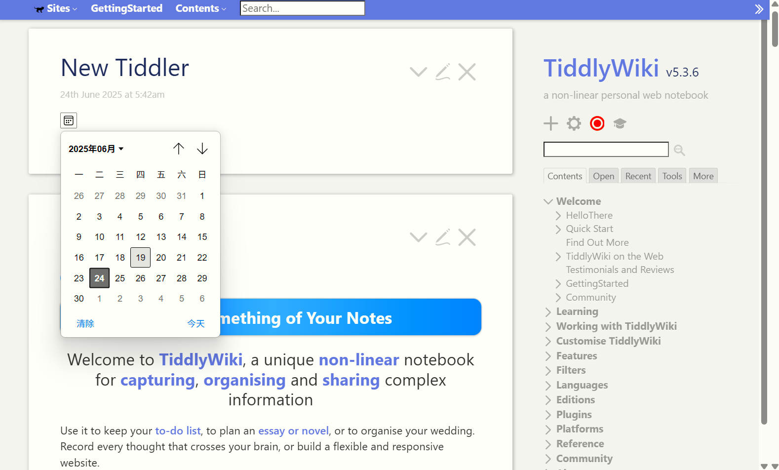
Now you get a button like editor. But it’s not a real button and may need styling tweaks. I’m not a CSS expert, this is the answer given by AI, but it’s really good. You can change the css class name to whatever you like.