Unusual layout: is it possible?

Most versions of full screen around are a full screen within the browser.

Of course if you open a tiddler in new window WidgetMessage: tm-open-window it has no side bar etc… only what you permit in the template you use, which could be your;

  • or at least your playground to experiment before you incorporate the template deeper into tiddlywiki.
  • Just to prove the feasibility of this in the example below I edited the tiddler SampleWindowTemplate to contain {{$:/core/ui/PageTemplate}}, for safety set code-body = yes on SampleWindowTemplate
    • Rather than {{$:/core/ui/PageTemplate}} you would specify your own template as you develop it. This is the whole layout.
    • You can choose if it effects the source wiki

I provide more on the “open in window” below but want to point out;

  • I now think I know a way to trigger on open specific tiddlers, an open in new window.
  • Window management features are now possible.

In this example that works on tiddlywiki, a variation on the demo provided I use the info tiddlers to find the screen width and height= to identify what full screen would be,

  • However you can always maximise any window.
<$button>Open Window
<$action-sendmessage 
  $message="tm-open-window" 
  $param="$:/temp/openme" 
  template="SampleWindowTemplate" 
  windowTitle="My Window Title"
  width={{$:/info/browser/screen/width}}
  height={{$:/info/browser/screen/height}}
  something="This is my new window. There are many like it, but this one is mine." />
</$button>

particularly;

  width={{$:/info/browser/screen/width}}
  height={{$:/info/browser/screen/height}}

The advantage with such new windows is the full wiki is still present back in its browser tab, and this window can remote control the wiki (if you want).

Because I see value in this approach I am again working on RFC Window manager in 5.3.2 coming soon - #18 by TW_Tones

2 Likes

Playing with my demo I discover I could have easily have two (or more) “full screen” windows at once, one in the browser, one separate, but both belonging to the same wiki. With a custom page template in the separate window we could have a different story, history and more.

  • I have a two screen desktop
  • It needs a little work to get the links and other details working independently.
1 Like

Thank you. I’ve been following your work in this area. Multiple windows is not what I want here, but it’s an interesting alternative. I always love the variety of approaches this community can find.

1 Like

What about, rather than thinking in terms of “certain tiddlers”, you have a button that hides everything you want to hide, and then reveals them again when you click it a second time?

  1. Close sidebar
  2. Open tiddler as a modal / lightbox
  3. Maybe hide some viewtemplate or edittemplate items you don’t need to use

That would be a one button with a bunch of actions in it that all happen at once.

1 Like

I could, but I feel as though it would be cleaner to run this when the appropriate tiddlers are opened. These tiddlers should show in a distraction-free environment and should grab as much of the available space as feasible. I would rather they didn’t open in the story river alongside other tiddlers and next to the sidebar. But I want the sidebar and multi-tiddler environment when dealing with the other 60% of the content, and probably also for edit mode on these tiddlers. It’s an odd requirement, I know.

I will likely play with various of these suggestions this weekend, but as mentioned, this is still in the dreaming stage. Moreover, it will never be a very important project to me, just a fun little wiki. But it’s an itch I would like to scratch.

BTW, I don’t mean to be mysterious about this. The project would be an extension of some of the first JavaScript code I ever wrote, back in 1998. I have copies of it floating around. One is at http://andoverct.info/bingo.html. (If you’re offended by a minor cuss-word related to excrement from male bovines, I apologize.)

That page hosts (American-style) bingo cards, with each square (except the free square) holding a corporate-speak term, things like “Think outside the box”, “Synergy”, or my personal favorite “Leverage” (as a verb). That page has 1000 random cards, and lets you choose between them or just choose a random one. I have distributed printed cards to select participants in corporate meetings, and enjoyed the confused hilarity when someone actually shouts out “BINGO” in a staid, serious meeting. :wink:

I’ve wheeled them out on and off over the years. But I’m thinking that in days when most meetings seem to be virtual, it would be good to come back to this, and expand it. TiddlyWiki is my golden hammer; I would choose to reimplement it in TW.

Obviously, I could make the squares interactive, click on them to turn them green or something. That sounds simple enough. But I would also like to do Devil’s Dictionary-style definitions for the terms1, and perhaps flash-cards as well.

The point of the question, though, is that if you have the bingo card open, it should probably be the only thing open. Or so I would prefer it. But whatever definition/flash-card interface I come up with probably should not act that way.


1 I haven't really started thinking about actual definitions. Anyone is welcome to join in the fun. Here's a start:
Action Item (n)
A hot potato passed around until one poor unfortunate sucker is stuck with it. The goal of that sucker is to make everyone forget what was committed to, and if ever reminded of it, to point out that the work is dependent on someone else's Action Item. With proper handling, said sucker need never to actually perform any Action whatsoever.
Best practice (n)
How the other guy should be acting.
Leverage (vt)
Use
Sundown (vt)
To bring the usage of a system down to 20% of its previous value, and then promise for each of the next seven years to be finished by Q2 next year. Management views this as already an 80% win. Software Development views this as job security.

You could use system tag $:/tags/BelowStory to play with the layout. You could create a tiddler tagged with this tag. It would be something like:

<$list filter="[<your_filter>] +[first[]]">
<div class="class_to_work_as_overlay">
<$list filter="[<your_filter>] " template="$:/core/ui/StoryTiddlerTemplate" />
</div>
</$list>

Hmm. I’m not quite following what that would do. It looks like time for more research! Thank you very much.

I don’t think you need anything more fancy than a positioned div with navigation between these tiddlers embedded in the div. KISS.

But don’t forget a close button! :scream:

I’d also give this a spin Introduction to the Tour Plugin

I think you (and Emily) are probably right, and I will try it.

Yes, sir!

I’ve been through it a few times. I’ll look again this weekend. I can’t tell if it would be directly helpful to my problem, but there’s certainly plenty to learn from it.

Thank you very much. Interesting food for thought. Am I right that this was intended as a response in Unusual layout: is it possible? (And @mario, is there a mechanism to move messages from one thread to another? I don’t see it in the controls I’ve recently gained access to.)

This was one of the two approaches I had thought would be required. I believe some of the other suggestions in the thread might make this unnecessary. Still I might play with it, simply as a learning exercise.

I had not considered this, and I can’t right now see how it connects, but I will definitely read up on it.

I can’t see how that would help, when I do expect to display a tiddler at such times. Perhaps emptyMessage could become sophisticated enough to display my chosen tiddler, but I don’t really see how.

This was the other of the ideas I had considered, combined with your first option. To me that one would guide me in how to approach this one.

This one is going to take exploration. I will have to read up on that. It sounds like it might be relevant, but I don’t quite see it yet.

I’ve heard about this but never looked into it. Its very interesting, but I can’t quite see the relevance. I’ll reread it tomorrow, though.

Just create the tiddler $:/config/EmptyStoryMessage and put whatever you want in it including all your content, or transclude other tiddlers, even according to some logic etc… If you close all tiddlers it will appear.

  • In side this tiddler you could also build an alternative story view and make use to tiddlywikis native story mechanisium.
  • So as to not be boringly long I will have to leave it to you imagination as to how you could use this space in a tricky way. Just imagin any existing view or element conditionaly displayed within it including a single tiddler or an alternative story.
  • Similar could be said to transcluding a target tiddler in a tiddler with the $:/tags/AboveStory - your view will remain at the top.
  • I have also made a way to pin a tiddler at the top, which could be your custom view.

I haven’t found the time to play with the suggestions here, but I did get together a wiki that I can use to do so. I may find some time later tomorrow, but there’s a good chance I won’t have any time until Tuesday evening. If anyone finds this interesting and wants to try out a technique, this wiki is a shell of what I want to do:

http://scott.sauyet.com/Tiddlywiki/Demo/BullshitBingo.html

There’s only a few of the definitions I want to create, and a few hard-coded bingo cards. (Well, they’re generated, but the list of terms they are generated from is stolen from my old site. Eventually, they’ll be created by a [very-]pseudo-random number generator.)

My goal will be that when a Bingo Card is opened it will fill all the available space. If a different one is then opened, it will fill all the space and the first one is closed. If the open Bingo Card is closed, the UI should revert to a standard story river and sidebar. I’ll deal with more appropriate CSS for the card if I get this far.

I know that the Parts of Speech here are not a great fit for this wiki, but I had them around for another project, and it seemed fun to include them. I probably won’t keep them.

Feel free to play with it. I will also be testing out several of the suggestions that have been made… but perhaps not for a few days.

I think this is a win win. Good synergy and thinking outside the box. While nothing seems to be set in stone you have been proactive in opening the market window and raising the bar to produce something which is best in… Hold on… BINGO!!!

1 Like

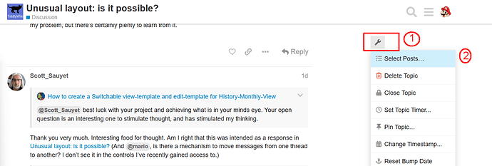
There should be a “wrench” symbol above the quick select sidebar

I usually start with “select + reply” because it also selects all connected replies, which is nice for long threads.

Important Then I do check if all the replies are really part of the “communication stream”. Sometimes users select any reply and then “diverge” from a “stream” – I manually deselect those.

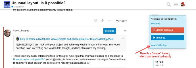
Then I use the “move to” button and create a new thread.
It makes sense to invest some time to create a “friendly” new thread title, especially if you “move” a “starting post” from a different user than yourself.

Last but not least. There is a “cancel” button, which is easy to miss :wink:

hope that helps
-m

@Scott_Sauyet best luck with your project and achieving what is in your minds eye. Your open question is an interesting one to stimulate thought, and has stimulated my thinking.

My hunch is to modify the story display to that tiddlers that meet a particular condition is displayed on its own and the others in the story hidden

Here is a brain dump if you are at loss for ideas.

Here are a few novel approaches to consider;

  • Alternative views exist out there from Murri, MCL, Trello and aforementioned slide shows all of which the mechanism may be informative.

  • Consider Creating SubStories with alternates for view and edit templates

  • Consider closing all tiddlers and having your own emptyMessage when the story is empty, Empty Story, all tiddlers closed, TiddlyWiki background see $:/config/EmptyStoryMessage but of course the content can be quite sophisticated.

  • Consider building your own Story View vs classis/Pop and zoomin

  • Use the zoom story view and open a tiddler containing a Example Table of Contents: Tabbed Internal as an alternate navigation. One tiddler open at a time with a frame around it you control - see discussions on outlier

  • Consider novel uses of the Dynaview Plugin

Thank you very much for the detailed instructions. I had gone as far as selecting the posts, but somehow had missed the option there to move to an existing topic, thinking it only created a new one. It’s right there in front of me and I should have noticed. Sometimes I can be really blind!

Thank you for the help!

I like to wrap things up and conclude when I can. Here I really can’t, as while I’ve had some success trying several of the techniques here (plain CSS, telumire’s full-screen), I’ve decided to put this aside for the moment.

I’ll try to get that wiki in good shape, but I asked this before I saw the page in progress. I’m less concerned about this layout than I was at first. I may be back to this when I finish other parts of this silly little project.

But I wanted to thank everyone who participated. I’ve learned a lot, even if I’m not using it yet. Thank you, all!

1 Like

Its is important to take away the answer to your question that “unusual layouts are possible” and there are many ways to achieve it. Perhaps start a new thread when you are ready asking how to introduce a specific unusual layout feature, and link back to the methods here, that you try :nerd_face: best of luck

1 Like