[tw5] System and shadow need some love

Hi everyone

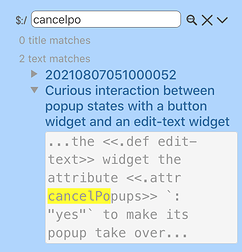
I am playing with the field-search plugin by PMario, and seeing how search results for a simple search come up in tabs one can pick from.

This made me wonder, why couldn’t there be something similar: do a search from the default searchbar, and have standard, system and shadow come up as tabs?

This seems like it would be much more intuitive for users: search, then filter results. As it stands, $:/AdvancedSearch does the opposite: it makes you pick a type of search (standard, system, shadow, filter) first, and only then can you do the search. The search string you want to enter may or may not stay in your short term memory while you are figuring out which type of search you want to do. It seems like it would be a better user experience to ‘dump’ the search term first, then figure out which tab you want.

On the same subject, Why is there no comparable “recent” tab for system tiddlers? It seems like developers would benefit greatly having something like that open as they work on macros, styling, buttons, etc.

I would love to hear your input:

Do you agree with me? Why or why not? If so, should this be core pull request or a plugin?

What are the reasons $:/AdvancedSearch is set up backwards? Technical limitations? Workflow-related?
What are the ways you work around these limitations?
I hate the loss of the edit post button on this forum.

I forgot a point: the actual steps are four, before you can enter your search term in $:/Advanced search:

  1. Move from what you are doing in the story river, to the sidebar.

  2. Resist the urge to do a regular search, and instead click $:/AdvancedSearch button.

  3. Switch your attention back to the story river to view $:/AdvancedSearch.

  4. Pick a tab

  5. Then and only then can you enter your search string.

Instead, what I am proposing is

  1. Move from what you are doing in the story river, to the sidebar.

  2. Enter search string in regular search bar as step two, rather than step five

  3. Pick a tab and see results

  4. Refine search string if needed

Like you, @David : i rely heavily on $:/AdvancedSearch -but that is often a 2nd step, after i first ‘dump the search term’ into the default searchbar, i will then click the magnifier icon beside to look into the other tabs provided by #:/AdvancedSearch. I guess this the search workflow on which the UI design is predicated; works well enough for an “advanced beginner” like myself (i.e. one who is usually looking for content, but does fairly often need to retrieve the code behind it), but for a bonafide developer like yourself, i can see how this 3-step workflow might be suboptimal.

/walt

I agree that the other forms of search could be made a bit more convenient, though I’ve gone back and forth on the best way to solve it. For a few years I did what has been suggested, break the other options down into tabs. As a minimalist though, nowadays I instead built a “smarter” search bar that looks at the first character and changes search type accordingly. I just opened the code for AdvancedSearch and copy pasted it all into one search area. Now if my search bar starts with the:

  • “[” character it acts like I’m in the filter area
  • “$” character it acts like I’m in the system area
  • “!” character it acts like I’m in the shadow area
  • else, treats as a regular search
    This kind of gets me to the same place, but is a little more keyboard friendly. It also kind of hides the advanced functionality for those that might be overwhelmed by it - until such time that they realize how valuable it can be. I know I’m not the first to think of it - just mentioning it for others who haven’t thought that way.

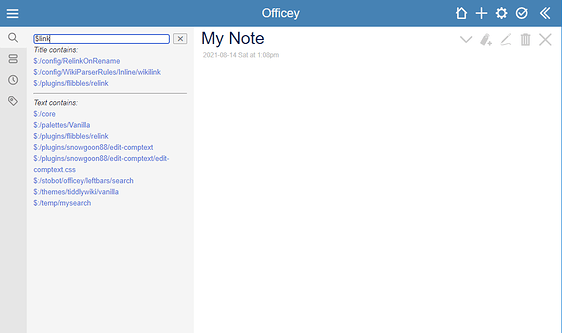
On another topic related to the search functionality (and I bring up since I mentioned greatly changing normal functionality), I like a persistent results area (rather than the standard semi-transient default one). I’m currently working on a theme/edition aimed at corporate Office workers like myself (currently calling Officey) and am taking opportunities to make it look/feel more like an Office365 web application to hopefully drive adoption at my company. A quick example screenshot is below. I envision there being 4 key ways of navigating content that happily have the acronym SORT - so I can call it the SORT area. The components are dedicated tabs for each:

  • S - Search: Where I house the “smart” search bar.
  • O - Open: I just transclude the normal open sidebar tab
  • R - Recent: I just transclude the normal recent tab (though like the idea below of separating / including system tiddlers!)
  • T - Tags: Kind of a mashup of the tags area, and some kind of global table of contents - still a work-in-process.

Lots of CSS still to figure out (really not my strong suit), but I like the way it’s coming together. I aim to pair this with some introductory videos etc. linking it to how to use it along-side other Office applications like Outlook, Excel, etc.

Anyways, sorry if that branches off too hard from your post David, but just adding thoughts.

This made me wonder, why couldn’t there be something similar: do a search from the default searchbar, and have standard, system and shadow come up as tabs?

I think this should be possible. … The whole search behaviour has grown organically. I think nobody requested it in a reasonable interesting way. … I personally did create the advanced-search-plus (ASP) plugin, which perfectly fits my needs. … So I don’t have the desire to create new stuff as long as the existing behaviour is “just good enough” :wink:

This seems like it would be much more intuitive for users: search, then filter results. As it stands, $:/AdvancedSearch does the opposite: it makes you pick a type of search (standard, system, shadow, filter) first, and only then can you do the search. The search string you want to enter may or may not stay in your short term memory while you are figuring out which type of search you want to do. It seems like it would be a better user experience to ‘dump’ the search term first, then figure out which tab you want.

That was 1 reason, why I did create ASP plugin.

On the same subject, Why is there no comparable “recent” tab for system tiddlers? It seems like developers would benefit greatly having something like that open as they work on macros, styling, buttons, etc.

IMO Nobody requested it. But it seems to make sense.

I would love to hear your input:

Do you agree with me?

yes

Why or why not? If so, should this be core pull request or a plugin?

hmmm, That’s a difficult question. … You are a very advanced user already. So your desire IMO is very different to novice users.

What are the reasons $:/AdvancedSearch is set up backwards?

It has been implemented that way and it did make sense. I think nobody questioned it since now.

Technical limitations? Workflow-related?

No … It was developed that way and it worked. … just good enough :wink:

What are the ways you work around these limitations?

As I wrote: advanced search plus plugin. … There is a video on the plugin page. In combination with the “link-to-tabs” plugin it solves all my dev needs.

have fun!
mario

I agree that the other forms of search could be made a bit more convenient, though I’ve gone back and forth on the best way to solve it. For a few years I did what has been suggested, break the other options down into tabs. As a minimalist though, nowadays I instead built a “smarter” search bar that looks at the first character and changes search type accordingly. I just opened the code for AdvancedSearch and copy pasted it all into one search area. Now if my search bar starts with the:

  • “[” character it acts like I’m in the filter area
  • “$” character it acts like I’m in the system area
  • “!” character it acts like I’m in the shadow area
  • else, treats as a regular search

That’s a nice idea. I like it!

  • S - Search: Where I house the “smart” search bar.
  • O - Open: I just transclude the normal open sidebar tab
  • R - Recent: I just transclude the normal recent tab (though like the idea below of separating / including system tiddlers!)
  • T - Tags: Kind of a mashup of the tags area, and some kind of global table of contents - still a work-in-process.

Lots of CSS still to figure out (really not my strong suit), but I like the way it’s coming together. I aim to pair this with some introductory videos etc. linking it to how to use it along-side other Office applications like Outlook, Excel, etc.

Anyways, sorry if that branches off too hard from your post David, but just adding thoughts.

That’s pretty. I’m looking forward to that theme. If you need help, just let me know.

-mario

@David,

I definitely find it better to access system and shadow tiddlers from the sidebar search, but I’m not sure all users should see these options by default.

I’ve replaced the sidebar search on my wikis with a customised version that has a “normal”/ “shadows and system” toggle. That helps a lot for development. It can be slow in the latter mode, unless the text field is populated before toggling to it. :wink: It doesn’t give me access to the “Filter” tab’s functionality, but by far my most frequent non-standard searches are just looking in system or shadow tiddlers. It hasn’t been too inconvenient so far to lump system and shadow tiddlers. I still have access to the advanced search if needed.

(I’ve customised the results, too, and this does not make things faster! :stuck_out_tongue: The text snippets use a slight modification of $:/plugins/danielo515/ContextPlugin/widgets/context.js from GitHub - danielo515/TW5-contextPlugin: A plugin to allow preview with word highlight within searches but n .)
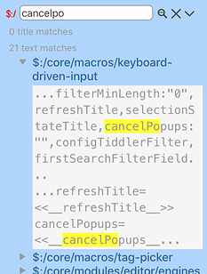
It’s not a perfect setup, but it did turn out to alleviate the pain I was having with opening the advanced search all the time. It’s contained in a plugin that I would not like to say is ready for general consumption, but it will probably show up on my notes wiki at TiddlyHost the next time I update it (that wiki has an older version without the toggle right now).

Best,
Chris

David, I’m confused why you see 5 steps to get to advanced search.

Control-Shift-A opens the Advanced Search tiddler and puts your cursor in the search field… The tab is whatever you last chose, so often there’s only the one quick step.

Your other points are important (and I too use advanced search about as often as the standard search), but this “5-steps” description misses the keyboard shortcut…

-Springer

I am late to this thread but I have designed a method called advanced search indicators. Below

There is already a feature to support tabs see $:/tags/SearchResults
additional tabs appear in the standard search drop down if you tag some search tabs, although I am not keen on this method.

eg make a tiddler tagged $:/tags/SearchResults and the field caption = System and include the below, now search in the sidebar

\define searchResultList()

//Search System Tiddlers//

//{{$:/language/Search/Matches/Title}}//
<$list filter="[is[system]search:title{$(searchTiddler)$}sort[title]limit[250]]" template="$:/PSaT/ExtendedSearch/ListItemCaptionTemplate"/>

//{{$:/language/Search/Matches/All}}//

<$list filter="[is[system]search{$(searchTiddler)$}sort[title]limit[250]]" template="$:/PSaT/ExtendedSearch/ListItemCaptionTemplate"/>

\end
<>

Advanced search indicators - design concept

  • What it does is monitor the content if the standard search entry and does much of what you want, ie starts with $ searches for system tiddlers, or allows you to open a tiddler if it exists and a lot, lot more. Basically additional icons appear that if clicked will do something based on the content of the search temp field. eg list all items with the current search string as a prefix…
    I will publish this one day, and sooner if someone can sponsor me.

Tones

Post script,

In line with the OT, I also though we could have a system-caption field that is searched Along with standard tiddlers, so system tiddlers would have the option of “publishing themselves” in the standard search. eg the tag manager, if you search for it in empty you will not find it, as it exist in a system tiddler $:/TagManager if we gave this a system-caption = “Tag Manager” then this system tiddler would be found although it is a system tiddler.

This is a somewhat simple core change, or hack.

Regards
Tones