Default behavior of tabs macro is to transclude caption if one exists, fallback to title – any way to transclude icon as tab instead, controlling for size (64px), without rewriting the macro itself?
The caption field is wikified when it is rendered as a tab “label”. Thus, you can put transclusions into the caption fields for each tab tiddler. Something like this:
<$transclude $tiddler="SomeIconTiddler" size="64px"/>
-e
Hi Eric,
I tried your suggestion (or {{$:/core/images/plus-button|64px}} which does quite the same), but it looks like the default tab button template limits resizing.
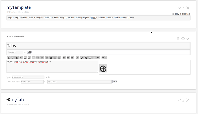
@well-noted you can use the buttonTemplate tabs macro parameter with something like this code in the template tiddler:
<span style="font-size:50px;"><$tiddler tiddler={{{[<currentTab>get[icon]]}}}><$transclude/></$tiddler></span>
(in this code I use the icon field from each tab as an image)
Fred
Thanks both of you for your suggestions! 
Both had the same problem for me, namely that they were rendering at full size.
I ended up pursuing @tw-FRed’s course, since my inkling is to leave the caption field open for other uses. Here’s what I came up with for the template:
<$tiddler tiddler=<<currentTab>>>
<$list filter="[<currentTab>has[icon]]" emptyMessage="""<span style="font-size: 16px; padding: 20px;"><<currentTab>></span>""">
<$image source={{!!icon}} width="64"/>
</$list>
</$tiddler>
and I am calling for them:
<$tiddler tiddler=<<currentTab>>>
<div class="icon-tab-buttons">
<<tabs "[tag{!!title}field:projectstatus[ongoing]]" template:"$:/templates/tab-stream-template" buttonTemplate:"$:/templates/icon-stream-template">>
</div>
</$tiddler>

<style>
.icon-tab-buttons .tc-tab-buttons button {
    background: none;
    border: none;
    padding: 0;
    margin: 0 15px;
    transition: transform 0.2s ease-in-out;
}

.icon-tab-buttons .tc-tab-buttons button:hover {
    transform: translateY(-3px);
}

.icon-tab-buttons .tc-tab-buttons button.tc-tab-selected {
    background: none;
    border: none;
}


.icon-tab-buttons .tc-tab-buttons button:not(.tc-tab-selected) img {
    opacity: 0.6;
    transition: opacity 0.2s ease-in-out;
}

.icon-tab-buttons .tc-tab-buttons button:not(.tc-tab-selected):hover img {
    opacity: 1;
}
</style>
