Towards a more seamless seamless

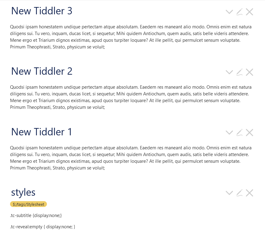
I’m using the seamless theme. In addition I’ve added CSS to remove subtitles and tagging. But there is still a chunk of space left:

Some of the space is because of the height of the title and icons, which I might be able to cinch down with lineheight=1.0em. But even when I do that, there are one or two div tags with class=“tc-reveal” in between. There doesn’t seem to be any class I could use to set their display to none without changing all the divs everywhere to display=none, which I assume is a bad thing.

Does anyone have some magic CSS or settings to zap the additional space?

Basically, I want all the tiddlers to flow like a regular document in the actual story river.

Thanks!

That’s a little odd and surprising. The divs are showing zero height in my devtools, and the title has zero height margins, too – so I can’t figure out what’s causing that space.

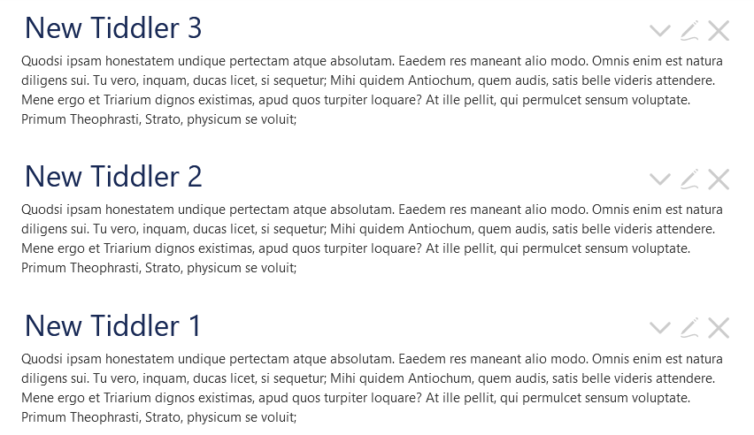
Here’s my attempt (only styles added are in bottom tiddler)

.tc-reveal:empty has no meaningful effect – I was just checking.

This is closer (but I’m not a fan of this kind of change – unrestrained relative “bumping” has a way of breeding offspring at an alarming rate)

.tc-tiddler-frame .tc-tiddler-body {
 position:relative;
 top:-1em;
}

.tc-subtitle { display:none; }

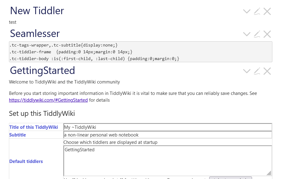
The space is caused by the first and last element inside .tc-tiddler-body, usually a p element or a pre element. Try this :

.tc-tags-wrapper,.tc-subtitle{display:none;}
.tc-tiddler-frame  {padding:0 14px;margin:0 14px;}
.tc-tiddler-body>:is(:first-child, :last-child) {padding:0;margin:0;}

2 Likes

Wow! That looks very promising. That :is syntax is new to me. Has it been around for awhile?

Thanks!

Edit: Here’s an oddity. The CSS moves bullets, and only bullets, out to the left:

What if you took out padding and just made the last line:

.tc-tiddler-body>:is(:first-child, :last-child) {margin:0;}
2 Likes

Just an FYI. It has been around but was confusing for a while as it’s name changed twice in it’s history.

What is it? Basically a shorthand for simplifying otherwise over-verbose CSS.

Here is a reasonable outline of it: :is | CSS-Tricks - CSS-Tricks

Side note. Best, TT

2 Likes

This is because the list is the first child of .tc-tiddler-body so the padding and margin of the list are removed. I did not think of that, try this instead :

.tc-tags-wrapper,.tc-subtitle{display:none;}
.tc-tiddler-frame  {padding:0 14px;margin:0 14px;}
.tc-tiddler-body>:is(:first-child, :last-child) {padding:0 auto;margin:0 auto;}

That way you get ride of the vertical spacing that can be introduced by padding or margin, but not the horizontal spacing. You can also follow the advice of @TechLifeWeb and only remove the margin.

The :is pseudo selector is supported on every current major web browser (not counting IE, as it’s deprecated): "is" | Can I use... Support tables for HTML5, CSS3, etc

The :is() (formerly :matches(), formerly :any()) pseudo-class checks whether the element at its position in the outer selector matches any of the selectors in its selector list. It’s useful syntactic sugar that allows you to avoid writing out all the combinations manually as separate selectors. The effect is similar to nesting in Sass and most other CSS preprocessors.

You can also use :where() for a similar effect, the difference being the specificity of the selector : :where does not increase the specificity while :is take the highest specificity.

If you plan to override theses CSS rules, then you may want to use the :where pseudo selector instead of :is.

Thanks! That seems to have fixed things.

My go-to source for CSS info is usually w3schools. They don’t list :is ! Or at least I couldn’t find it. It seems like it has been around for awhile, but didn’t get widely used until last year (2021) ?

MDN Web Docs is much better IMO :slight_smile:

You can hover the browser versions in the can i use.. link to see when support was added.