[ TopBar ] - how does your ideal top bar look like?

Hey all,

at MultiColumn Layout — a non-linear personal web notebook I’m experimenting with a github-styled topbar.

I’m using it every day in one of my wikies and I have some ideas how to make it better

Since I made it, I asked myself how the ideal top bar would look like for other users

Are there things you like in my top bar?
Would you like to see things changed?
Would your ideal top bar look totally different?

It would be great if you’d give me some feedback :slight_smile:

Thank you and kind regards,
Simon

2 Likes

A problem that has turned out to be more difficult than it sounds like is that the wiki content should appear below the topbar, not behind it where it is covered. I believe the current official solution is a very “thin” topbar for this reason, or it would hide the tiddler titles when titles are navigated to.

I think you can find previous discussion on this from a few years back, see also github. I believe Felix Kupper/Hayashi had some solution for this but it was not accepted, if I recall.

Other than that, here are some desired features/aspects:

  • Option to make it hide, e.g have it slide out when touching the top edge (thus pushing everything else down).
  • In my own topbars, I use a “show-on-hover” thing so that some of the title links seen are hoverable to immediately show a dropdown list.
  • Captions should work
  • Any topbar should have a proper z-index value so to not interfere with other stuff, e.g the sidebar toggle button, sticky tiddler titles, etc.

Try this:
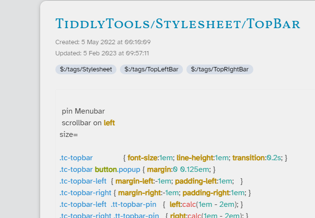
https://tiddlytools.com/#TiddlyTools%2FStylesheet%2FTopBar

Features:

  • Topbar shows items tagged with “tc-topbar-left” and “tc-topbar-right”
  • Pin/slide buttons to toggle show/hide of topbar.
    • Use ctrl-click on pin/slide button to show Topbar settings panel in a popup
  • When hidden, topbar retracts until mouseover at top edge of window causes bar to slide out.
    • If a topbar button opens a popup (with class “popup”), topbar remains visible until popup is closed.
  • When topbar is pinned, it remains visible all the time
    • StoryRiver and Sidebar are moved down so they won’t overlap with topbar
    • StoryRiver and Sidebar are independently scrollable
    • Checkbox option to place StoryRiver scrollbar on left side of window (instead of having both scrollbars on the right)
  • Topbar content is scaleable via decimal “size” factor (minimum=1)
  • Also works with TiddlyWiki “MenuBar” Official plugin

To install, just drag-and-drop the above tiddler (title is draggable!) to import into your TiddlyWiki. This single tiddler contains all needed CSS (tagged with $:/tags/Stylesheet) as well as pin/slide buttons and popup settings panel. Also give it a try by dragging into https://TiddlyWiki.com to see it work with MenuBar plugin

enjoy,
-e

4 Likes

Eric this is very good and fully featured.

I noticed how you include the scrollbar on left option. This is very helpful separating the story and sidebar scroll bars and makes mouse navigation on a desktop much easier.

Would it be possible to create an independent solution that does only this?

I think this would be popular and help in some cases of accessibility.

Thanks in Advance.

The “scrollbar on left” CSS rules only seem to work when scrolling is applied to the .tc-story-river class, rather than the default scrollbar handling that is automatically applied when the body element overflows the viewport.

Here’s the most important bits of CSS:

@media (min-width: {{$:/themes/tiddlywiki/vanilla/metrics/sidebarbreakpoint}} ) {
.tc-page-container { height:100vh; overflow:hidden; }
.tc-story-river    { height:100vh; overflow:auto; overflow:overlay; }
.tc-story-river    { direction:rtl; } .tc-story-river > * { direction:ltr; }
}

Notes:

  • This CSS is only applied when the window width is a minimum of the “sidebarbreakpoint” setting (see $:ControlPanel > Appearance > Theme Tweaks), which places the StoryRiver and Sidebar “side-by-side”. Otherwise, the Sidebar is “stacked” above the StoryRiver and the scrollbar handling uses the TWCore default styles.

  • The tc-page-container height is set to match the window height and scrollbars are suppressed. This prevents the normal “whole page” scrollbars from appearing.

  • The tc-story-river height is also set to match the window height with overflow handling to show scrollbars as needed. This lets the StoryRiver scroll independently of the .tc-page-container. Note that overflow:overlay is only supported on some browsers, and causes the scrollbar to not take up any width, which prevents the StoryRiver content from shifting to the right when a scrollbar is needed. Otherwise, if overflow:overlay is not supported, the CSS falls back to using overflow:auto and the StoryRiver will shift to the right when a scrollbar is needed.

  • To show the StoryRiver scrollbar on the left, the tc-story-river is set to direction:rtl and it’s child elements are then set to direction:ltr to restore the normal direction for the StoryRiver contents.

3 Likes

The scrollbar-width property is only recognized by Firefox, and only supports values of auto, thin, or none.
See https://caniuse.com/?search=scrollbar-width

For other browsers (Chrome, Edge, Safari, Opera), you can use the ::webkit-scrollbar-* pseudo-classes.
See https://caniuse.com/?search=webkit-scrollbar

For thin scrollbars on all these browsers, you can install TiddlyTools/Stylesheet/Scrollbars.

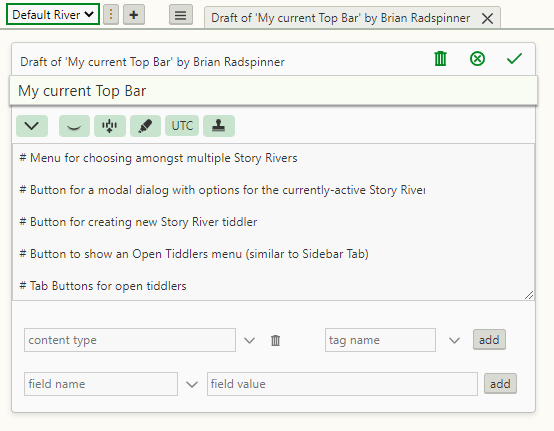
Here’s what I’m currently working with, in case it sparks anything for you:

CurrentTopBar

Hey @EricShulman,

I played around with your Top Bar Stylesheet this morning and I have a question.

I’m using the MenuBar plugin and I noticed that without your spreadsheet, when I click the title of a tiddler, that tiddlers moves such that the title is just below the MenuBar with the top of the tiddler frame hidden behind the MenuBar. However, when I’m using your stylesheet, there is a gap between the bottom of the MenuBar and the top of the tiddler frame when clicking the title of a tiddler.

I was wondering what CSS setting affects this behavior. The browser inspect tools weren’t very helpful (or I was not awake enough to see it).

Thanks!

In a standard TiddlyWiki, the StoryRiver DOES have a default 1em gap between the MenuBar and the topmost tiddler in the StoryRiver. However, because the MenuBar display overlaps with the StoryRiver, when a tiddler is scrolled into view by clicking on a title, the top of the tiddler appears to be positioned so that the title is “just below the MenuBar”.

In contrast, my TiddlyTools/Stylesheet/TopBar is specifically intended to avoid the overlap between the MenuBar and the StoryRiver by giving the StoryRiver it’s own scrollbar, instead of scrolling the entire page content. As a result, the top 1em padding on the StoryRiver is maintained, even when a tiddler is scrolled into view by clicking on a title.

Although I don’t recommend it, you CAN disable this behavior. In TiddlyTools/Stylesheet/TopBar, find this line:

<$list filter="[<name>match[Menubar]]">.tc-story-river { padding-top:1em; }</$list>

and comment it out by surrounding it with CSS comment markers - /* and */. This will completely eliminate the StoryRiver top padding.

-e

Thank you, sir. I think I may use your stylesheet for that reason. Another couple of questions.

The checkboxes don’t show up in my wiki like they do yours. Am I missing something?
image

Also, when I control click the pin in the upper left corner, I get an error:

By default, the TWCore cascade mechanism applies a $:/config/ViewTemplateBodyFilters/stylesheet so that tiddlers tagged with $:/tags/Stylesheet are rendered using plain text. However, the TiddlyTools/Stylesheet/TopBar contains wikitext for rendering its controls. As a result, the default shadow cascade definition interferes with the display of those controls.

The fastest way to fix this is to copy $:/config/ViewTemplateBodyFilters/body-template from https://TiddlyTools.com. This custom cascade item adds special “override” handling for tiddlers that have a “body-template” field, so that those tiddlers can specify an alternative to the TWCore default ViewTemplateBodyFilter cascade.

TiddlyTools/Stylesheet/TopBar has a body-template field set to $:/core/ui/ViewTemplate/body/default, so that when the above custom cascade installed, TiddlyTools/Stylesheet/TopBar will render as normal wikitext, allowing you to properly see the controls.

That is unexpected. I have not seen that error in any of my testing. Can you post a link to your TiddlyWiki, so I can try debugging it myself?

I copied over the body template as suggested and, indeed, that fixes the checkbox issues.

As far as the other error is concerned, my wiki is not online due to copyright concerns (I have a lot of potentially copyrighted material in it). I would love to have it out there to share, but I need to address those concerns somehow. I might be able to send you a copy privately on the condition you don’t share it.

I have being thinking that since the top bar is static, content scrolls under it, perhaps MCL could have an additional layout. This idea would leverage all the IP of the MCL solution but provide a substantially different layout.

  • Imagine you have three columns active
  • In the TopBar or just below it, have three (or more) “tabs”, one for each story, that remain at the top. Clicking on a tab brings only that column/story into view.
    • Perhaps the sidebar optionally comes into view in this single column at a time layout.
  • This would allow focusing on a single column at a time whilst retaining the MCL multi-column logic a simple layout change away, while also curating the set of columns in use.