Have you thought about having a seperate field like a caption?
Hi @BurningTreeC
One further thought: Is it necessary to switch between draggable mode and normal mode? Of course, it is not practical to have dragging on the body of a tiddler, when you are working with it.
It would be interesting to see a version where only title and borders allow to drag the tiddlers.
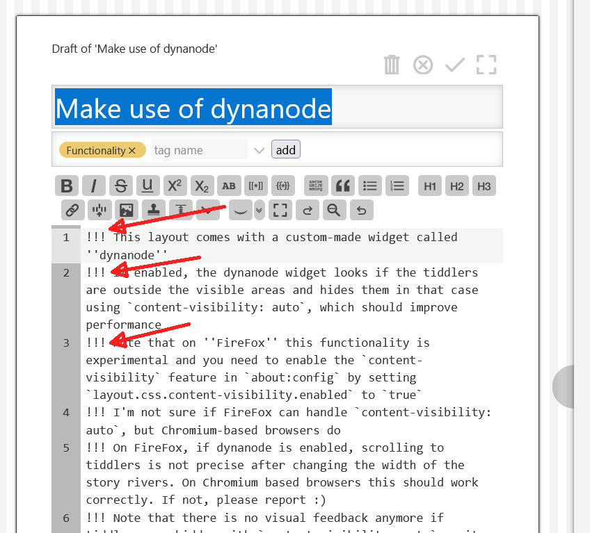
I just found out, that all your wikitext paragraphs are H3’s using !!!. Is that intentional?
From a HTML point of view, that’s not only semantically wrong, it also is a complete nightmare for accessibility tools.
Why did you do that?

Hi @BurningTreeC ,
i worked a little on the sketch for the column-manager I would like to have.
columnmanager.json (1.4 KB)
Unfortunately in my wiki, the flex-plugin is causing some issues.
Mainly tiddlers clicked in the sidebar do not open but trigger an element does not exist error. I guess this is due to heavy modding. Layouts —
The error I get is TypeError: widget.list is undefined
This is now on CPL BTC/TiddlyFlex, you can easily update when @BurningTreeC release on Github.
I add some translation and description, hope you don’t mind. (Ultil feat: t macro and docs by linonetwo · Pull Request #7821 · Jermolene/TiddlyWiki5 · GitHub)
This GH issue may be interesting for you  Adopt Feather/Lucide icons · Issue #7652 · Jermolene/TiddlyWiki5 · GitHub
@BurningTreeC, for hackability or just for changing palettes, it would be great if the icon could use the
tc-image-button classes and styles of the other icons for example to be used as captions in tabs…
for $:/plugins/BTC/TiddlyFlex/icons/layout
<svg width="1rem" class=" tc-image-button" viewBox="0 0 24 24" stroke-width="2" stroke-linecap="round" stroke-linejoin="round"><rect width="7" height="9" x="3" y="3" rx="1"/><rect width="7" height="5" x="14" y="3" rx="1"/><rect width="7" height="9" x="14" y="12" rx="1"/><rect width="7" height="5" x="3" y="16" rx="1"/></svg>
Hi @pmario, I have no clue why I’m using H3 and I don’t have any clue what I should be using instead 
It is very interesting, thank you for pointing it out!
Hi @JanJo
I believe that switching from draggable mode to normal mode is necessary.
But maybe I can make it configurable … I’ll see
Hi all,
at the moment the dynanode widget doesn’t work as intended but I’m close to getting where I want it to be.
Tonight I’ll add an update…
Thank you,
Simon
Two line-breaks in between the paragraphs so TW will create HTML P-tags.
Hi @BurningTreeC I use icons instead of captions for the sidebartabs…with more than 6 tabs this is useful to avoid the linebreak.
I would really love to use a single column of tiddlyflex for a special sidebar (with classroomtools that would like to arrange there) but I did not succeed so far in isolating a single-column macro starting from $:/plugins/BTC/TiddlyFlex/ui/Layout , could you make such a thing possible in your plugin.
Hello all,
I have now released v0.0.151
It changes only how dynanode works
It now works applying the style contain: content to elements outside of the view
Elements with that style then are not refreshed during a refresh cycle except there are changes detected that would possibly cause such a “hidden” element to change, like if we’re editing a tiddler and another hidden tiddler transcludes that tiddler.
Performance improvements with dynanode enabled are big if there are many tiddlers open in the story rivers. The best way to feel it is opening many tiddlers for editing and dragging the sidebar resizer
I’m happy how dynanode works now and will focus on other details from now on
- There’s still a configuration tiddler missing for the ControlPanel
- Move-left and move-right buttons are missing
- The ensemble saver needs to be configured for more options to save
- Probably more (do you have any idea?)
Thank you,
Simon
For some apps that is, I think, going to be very useful!
I did one quick test already and it is working good (50 visible, 200 not visible) with noticeable improvements.
I will test more because it is relevant to a very large project I am planning.
A dopo.
J
Thank you for this groundlaying work… which is so important, that it could use its own dokumentation and thread I guess.
To add my voice here as a multi-column layout enthusiast (in the general sense, currently on Muuri due to an issue with MCL):
I would say a resounding yes to being able to switch, because I often copy & paste text into other pages/software. You can only copy comfortably in normal mode, and it’s the mode I spend most of my time in.
TiddlyFlex is very impressive - unfortunately it has the same issue for me in that it doesn’t support the text preview plugin (the appear plugin is a prerequisite shipped on the same page).
I realised I was too reliant on preview and thus changed to Muuri, which is not quite as slick as either MCL or TiddlyFlex.
It would be brilliant if you could explore support for this at some point, BTC. It gets quite addictive if you lower the preview delay to 150 – 300ms!
That text preview plugin is published on top of TW V 5.1.15 (the plugin 0.5.6 / 2016-01-22 that is 10 years ago) and the genius TobiBeer has not being as active as he? once was.
- I am fairly sure others have provided similar solutions since.
Along with @EricShulman, @pmario (and notable others) especialy TobiBeer, they where all my “essential companions” when I transitioned from tiddlywiki classic V2.x to V5.x
- Where is Tobi now?