I am starting a developer documentation item in my tiddlywiki to provide some clues for future developers and support staff.
I am looking for suggestions of what to include. So far I’ve got (titles only at this stage)
bobj
Oh Cool!
Will this be from n00b to master etc?
From what I’ve seen and tried the initial step seems pretty steep.
Basic beginner development project examples and workflows would be great!
I wish you every success in your effort. I know from experience that it will not be an easy task. I keep notes in a wiki about configuration changes, tricks, tips and tweaks and it’s already quite complicated. This is only because TiddlyWiki is so versatile and can be adapted and adjusted to almost any need.
May I presume that you are going to concentrate on the HTML version? The Node.js version adds a lot of complexity, but also a great number of strengths.
Great.
It would be useful to have the Info sorted in stages Adapted to a learning Curve.
Hi @Bob_Jansen
Here’s a few things I’d like to find in a technical documentation for a TW application:
//invoices// are tiddlers tagged <<tag "Invoice">>.

They are displayed through a [[viewtemplate|$:/my/app/templates/invoices-block]]
thanks to the [[View Template Body Cascade|https://tiddlywiki.com/#View%20Template%20Body%20Cascade]]
using [[this filter|$:/my/app/templates/invoices-block-filter]].

Another template is used in the [[Invoices]] list: [[$:/my/app/templates/invoices-inline]].
Fred
While I’ve done something akin to this for wikis I’m looking to one day hand off to others, they’ve never gone much further than quick explanations for how to use the data entry tiddlers I’ve built for the wiki. This is a great idea, and I’m excited to see how it comes out.
I would suggest some description of how to format content. While users may be able to glean a lot from what the editor buttons insert into the edit area, it’s worth making these things explicit, even if it’s just a link to the main documentation, for things like Tables in WikiText.
If you use any custom field editors, then at least a brief description of how they work would be helpful.
And, as @tw-FRed suggested, anything like this would be improved by including links to tiddlywiki.com.
Hello @tw-FRed
I think that @Charlie_Veniot’s Kiosk Gadget could be useful when linking to concepts.
Demo here
HI Everyone,
thank you all for your comments and ideas. My thoughts are getting clearer as follows:
the documentation is focused on how my TW app works. It is not meant to be a general discussion into TW itself. To that end, I have hovered up useful resources that I have used over time and will include links to them as I go along, as well as a general statement about TW support, etc, as follows
I am proposing a general template as follows:
Concept Title
Concept description with appropriate links to specific GROK TW, TW wikis and others as appropriate
Footer listing the more general support resources
As a result of reading your comments, my thoughts are to not follow the titles list that I described previously but instead focus on specific functionalities implemented in my TW app. The titles would not mean much to a non-TW support person at this stage. I propose to point them to GROK TX to get the general look and feel of TW.
I have not started detailed documentation yet but my planning is underway.
@Scott_Sauyet , following along your lines, I have already provided some documentation for the two main functions, add a new gun and add an image. You can see an example from this link
thanks again for your thoughts and suggestions.
bobj
Bob, I empathise with what you want to do.
If I understand correctly you want supporting documentation for users who are not likely to adopt tiddlywiki as a solution but do want to use a tiddlywiki, then enhanced with specfic references within a specific Wiki?
If this is in fact your approach I may be able to contribute a set of headings and some documentation to this end. Please let me know.
That feels very similar to what I did in one of the wikis I mentioned, and I may steal your format for one I expect to start next month.
Very nice!
@TW_Tones , almost right. The documentation only applies to someone supporting or extending my particular TW App. I guess someone might get some ideas out of my documentation but I would not say it would be very applicable to another TW app apart from my way of doing things .
Very interested in what you have done though.
bobj
@Scott_Sauyet , happy to oblige
bobj
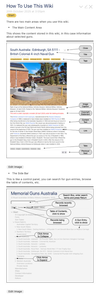
Until I can think of anything better, this is as much usability documentation I expect to store in the wiki. Because the major use case is handheld devices, I may split the images display into two tiddlers with a parent tiddler linking to both.
Note: the Edit buttons are shown because the wiki is not running from a server, just from local filestore. This is the expected way that editors of the content will use the wiki and hence editing buttons are visible.
This is also the mechanism for version control. A version of the wiki is saved after each edit and so the editor can roll-back the wiki to any saved version (I only store the last version of any day).
bobj
Bob,
I was thinking of information for visitors to use, such as navigating the wiki, using tools that may be importiant like printing, looking up the contents and searching. First starting with generic information just for visitors then can see a need to then include wiki specific guidence, as you seem to have done nicely above.
There will be generic info all visitors may need and a few cases where the Generic and the specific Visitor Guidence overlap where access to a community resource that is easy to customise, then the wiki specific information.
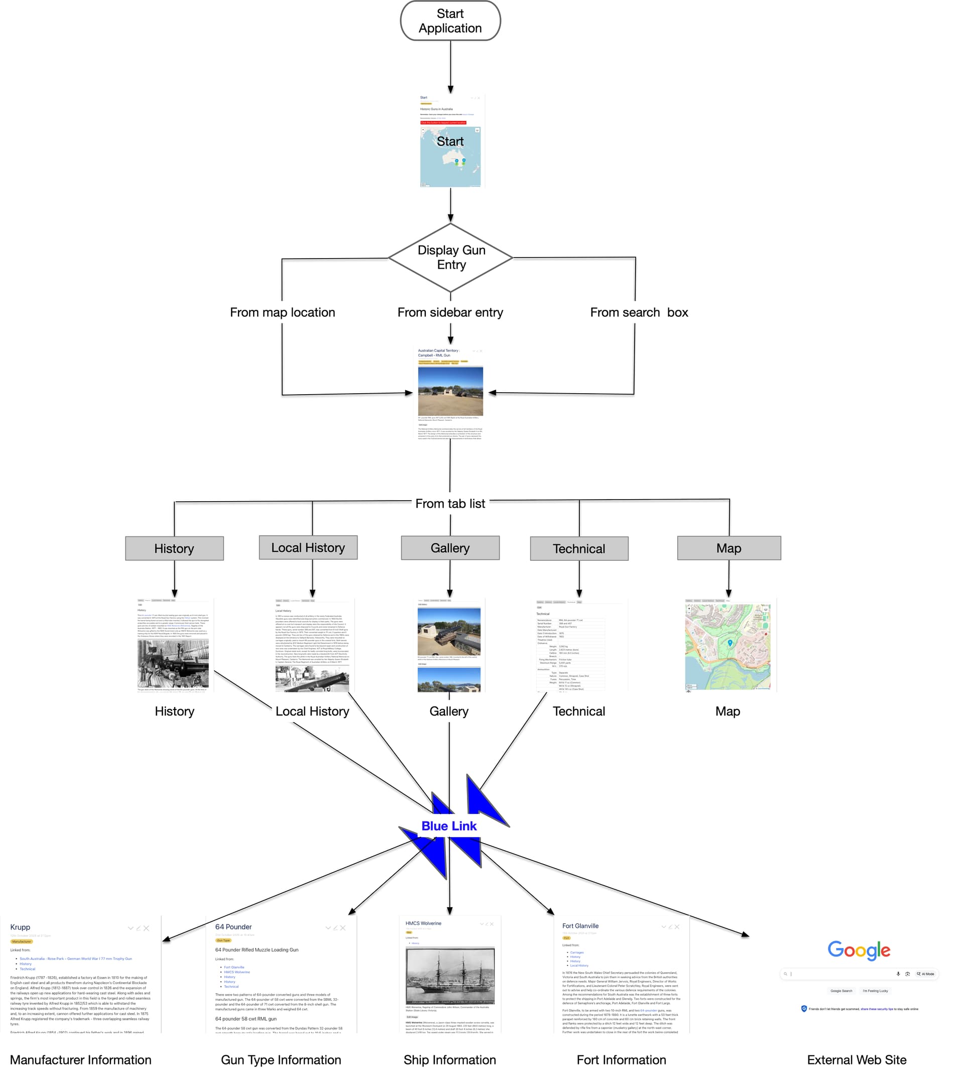
I have been pondering about a visual prompt for the flow of a non technical user through my TW app. Have come up with this as a first attempt. Looking for feedback, do you think something like this is useful? If not, what can you recommend?
I can’t figure out how to depict the various possible loops through the content through the closing of tiddlers, without making the diagram very complex. Its a problem with the flexibility of TW I suppose.
bobj
I am not a very visual person, but I very much appreciate this.
For me the bottom half works a bit better than the top half. This is very much a “Flow Chart”, as it depicts how one might flow through your application, but the top bit hearkens too closely to software flow charts. The “Display gun entry” decision box feels wrong, because as a user I don’t think I enter the application and try to make a decision about which way I will choose to display an entry. I would suggest formatting this the same way you do “from tab list”, which instead of suggesting a conscious choice between alternatives simply shows the different paths you might take.
Other than that, I really like the diagram. And I wouldn’t worry about this:
If you have the perspective that this shows the paths you might take to get to certain information, and not that this shows the possible states of your wiki, I think everything is simplified.
I do like this diagram very much. IMO it gives a clear overview of your app. It starts abstract overview about navigation and it becomes more and more detailed with real images. So users know what to expect and where.
According to loops. IMO that’s not necessary. Users will find out by them self.
Good job.
I have taken on board the feedback from @Scott_Sauyet and @pmario and have amended the diagram.
I really appreciated @pmario 's comment about using real content in the images and have amended the first half as @Scott_Sauyet suggested. I have also replaced the blue link icon with real text from one of the guns.
Have a look and tell me what you think? This page now combines the flow chart with the explanation images I posted in an earlier post and is all I envisage is needed for useability information.
http://cultconv.neocities.org/ArtilleryRegister/MGADemo.html#How%20To%20Use%20This%20Wiki
I appreciate that for the main use case, that is for handheld devices, these images are too large to be easily readable without zooming in but I assume that anyone who uses such devices (ie. mobile phones) is aware of zooming in for content too small to read.
I have also taken on board the comments about looping within the content and will not attempt to include that.
Thank you all for your feedback, it is appreciated.
bobj
I think it looks fantastic. I really can see stealing
If there are any nits to pick, they’re extremely tiny:
Side Bar node should be moved to the right, to improve symmetry and consistent spacing.I imagine the first two should be quite easy. The third one may well entail more effort than it’s worth.
Really nice work!
I think it’s great bob, the flow chart is now including search and sidebar but not only is it informative I think it promotes the site and content helping the visitor get a measure of the content.
I would have thought blue link should read “blue link(s)”