A tutorial might be required to describe this. I need a tech writer to articulate my ideas and implementations. But I’ll give it a go. Where is my chatGPT window? 
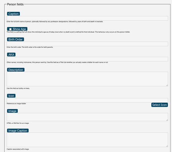
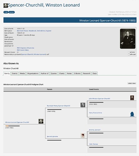
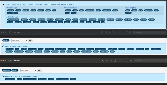
Your screenshot shows a complementary set of data entry fields that appear in Edit Mode of a tiddler. Users (and I) found it difficult to use the “out of the box” edit fields. First, users have to know what fields to select and then are limited to single-line text data entry. The objective of these complementary data entry fields is to show the user what fields are available based on how the tiddler is tagged and where possible, make data entry selectable rather than data entry.
You mentioned JavaScript. From what I recall, there is no JavaScript to generate this behaviour.
Here is a list of things I defined to do this:
- Write one or more EditTemplate tiddlers. I currently use one. However, it has become long and cumbersome. So, review and refactor as you go.
- Write a custom StyleSheet tiddler specifically to manage what fields appear for each tag. What will be confusing in Memory Keeper, is that I do not have a dedicated tiddler for this, I buried the style for this in one huge MK StyleSheet tiddler. However, I’ll try to break that down for you.
In Memory Keeper this cumbersome “EditTemplate” tiddler is titled “$:/plugins/cls/mk/field-selector”. It should be renamed. It was originally named and written to generate pop-up “selection” fields. More on this later. In the end, this tiddler manages various types of fields.
As mentioned in MK this tiddler is named: $:/plugins/cls/mk/field-selector and tagged: $:/tags/EditTemplate
The first logic in field-selector allows the user hide / show TWs edit fields. This is optional.
<span style="float:right; font-size:12px;"><$reveal text="hide" default={{$:/state/fieldeditor}} type=match><$button set="$:/state/fieldeditor" setTo="show" tooltip="show TW edit fields">{{$:/core/images/unfold-button}}</$button></$reveal><$reveal text="hide" default={{$:/state/fieldeditor}} type=nomatch><$button set="$:/state/fieldeditor" setTo="hide" tooltip="hide TW edit fields">{{$:/core/images/unfold-button}}</$button></$reveal></span>
It creates a button to appear on the far right to show/hide the TW fields.
Then I created a container to hold all the field definitions. This is done to hide all or any number of items. For example, if no tags exist or tags exist that are not associated with my fields, we want to hide these edit fields. That wrapper is:
<fieldset class="fieldset" id="fieldsetid">


</fieldset>
Everything inside this will define what we want to appear based on tags.
In MK the first thing listed are the legends. These are group boxes. In your screenshot I see the group box “Person Fields”. This is done with:
<legend class="fieldlegend" id="personledgeid">Person fields</legend>
The class and ID will get configured in the StyleSheet. Create a legend for each type of tagged tiddler you want to configure.
Next comes the laundry list of fields. Put them in the order you want them to appear on the screen.
Here is a simple single-line edit field to enter a URL:
<!--URL-->
<div style="width: 100%" class="fieldtext" id="urlid"><br/><label class="cuslabel">URL</label>
<$edit-text class="tw-edit-texteditor mkTextEdit" tiddler=<<currentTiddler>> tag="input" field="url" />
<span class="helptext">Enter URL for document.</span></div>
The class and IDs used here get defined in the StyleSheet.
Here is multi-line text box:
<!--Description field-->
<div style="width:100%" class="fieldtext" id="descriptionid"><br/>
<label class="cuslabel">Description</label>
<$edit-text class="tw-edit-texteditor mkTextEdit" rows="4" minHeight="2em" tiddler=<<currentTiddler>> tag="textarea" field="description" />
<div class="helptext">Use this field as tooltip on trees.</div>
</div>
How about a dropdown list box:
<!--Source state -->
<div style="width:100%" class="fieldtext" id="sourcestateid"><br/>
<label class="cuslabel">State:</label><br/>
<$select tooltip='Choose source state:' field='sourcestate' default='new'>
<option>new</option>
<option>under review</option>
<option>reviewed</option>
</$select><br/><div class="helptext"><$reveal state="!!sourcestate" type="match" text="new">The source has been added to the collection, and you have yet to commence the review process.</$reveal><$reveal state="!!sourcestate" type="match" text="">The source has been added to the collection, and you have yet to commence the review process.</$reveal><$reveal state="!!sourcestate" type="match" text="under review">The source is currently undergoing review.</$reveal><$reveal state="!!sourcestate" type="match" text="reviewed">The review of the source is finished.</$reveal></div></div>
The complex data field, which I have not seen anyone use, is the multi-selection pop-up. The dropdown example above shows a static list. The multi-selection pop-up that I wrote is used to populate “title” fields, those fields that contain 1 or more references to associated tiddlers (that already exist). No one wants to type these in, you want them to be selectable. So, I wrote a macro “field-selector” to manage these. I elected to use a non-modal pop-up, because I wanted to be able to navigate away from the pop-up to generate a tiddler if it does not exist. Then go back to the pop-up to select the new tiddler. I will not put the code here for that macro. (You’ll find it MK). However, here is an example on how I used it. This provides a pop-up to select one or more spouses:
<!--Spouse Selector-->
<$set name="ov" tiddler={{!!draft.title}} field="spouse">
<$macrocall $name="selector" id="spouseid" tagger="person" field="spouse" label="Spouses" originalvalue=<<ov>> dialogid=<<dialogid>>/></$set>
Now to the StyleSheet. Here are my default settings:
.fieldtext {display: none;}
.helptext {font-size: 9px; }
.mkTextEdit {width: 100%; }
.fieldselector { display: none; }
.fieldlegend { display: none; }
.fieldset { display: none; }
Then I’d associate tags to the fields. For example, to have the description field (along with two other fields) appear on the person tiddler (in Edit Mode) I’d add this to the StyleSheet:
[data-tags~="person"] #fieldsetid,
[data-tags~="person"] #personlegendid,
[data-tags~="person"] #descriptionid,
[data-tags~="person"] #captionid,
[data-tags~="person"] #akaid
{
  display: block !important;
}
This also forces the field set wrapper to appear and the approapriate legend (group box) to appear when the tiddler is tagged with person.
There are classes here that I use that you need to change to meet your needs. For example, cuslabel for me is:
.cuslabel {
  background: <$text text=<<themecolor>>/>;
  color: white;
  padding: .2em .5em;
  margin: 2px;
  border-radius: 4px;
  border: 1px solid #666;
  box-shadow: inset 0 0 0.1em #fff, 0.2em 0.2em 0.2em rgba( 0, 0, 0, 0.3 );
}
Users can customize the colours in my solution, hence the background color.
After all that. Wouldn’t be better if there was a plugin to do all of this for us? Something we configure and it just does this magic.
I hope this helps.
Craig


