Story river scrolls when a popup is displayed

Clicking on a small album artwork image in a tiddler in my tiddlywiki music player displays a larger version of the artwork in a popup the size of the tiddler, which I implemented with CSS (not sure if this can be implemented with the ActionPopupWidget, as I don’t fully understand the documentation). This works well. What I am seeing though is that whenever the tiddler’s height is larger than the height of the browser window or is followed by other tiddlers such that the total height exceeds the height of the browser window, it is scrolled by its top margin, I presume by tiddlywiki’s scroll mechanism, such that its top aligns with the top of the browser. On hiding it jumps back to its original position. When the tiddler (or the total height of the tiddlers) is smaller than the height of the browser window this does not happen, as desired.

In Quine on iPad this scrolling somewhat annoyingly interferes with selection in the sidebar, which, as a good law-abiding citizen, does not move: the tiddler selected in the sidebar is the one two tiddlers below the tiddler touched (in my setup). If no scrolling occurs, selection in the sidebar is unproblematic.

Is there a way to prevent this scrolling from happening, i.e. to not scroll at all when the larger image is popped up, also not when the tiddler is not the top one in the story river? That would be wonderful.

Included is test code with which the behavior can be reproduced.

the “testPopup” tiddler

<a href="##testPopup"><img width="128" src="a local album cover image.jpg"/></a>
<div id="#testPopup">
  <a href="#" class="testPopup"><img width=600 src="the same local album cover image.jpg"/></a>
</div>

content to make it larger (or smaller)...

the CSS tiddler, testPopup.css

[id="#testPopup"] {
width: 100%;
height: 100%;
position: absolute;
top: 0;
left: 0;
z-index: 1;
display: none;
background: rgba(240, 240, 240, 0.4);
}
[id="#testPopup"]:target {
display: block;
}
.testPopup {
width: 602px;
height: 602px;
position: absolute;
left: 0;
right: 0;
margin: 64px auto;
border: 1px solid #CCC;
cursor: default;
}
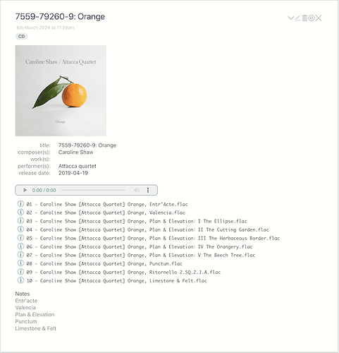
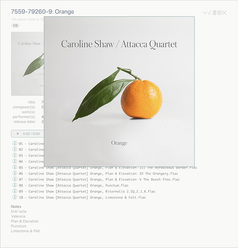
After having finished my player I had a second look at the problem. I did not fully realize that the links in the testPopup tiddler were actually anchor links (https://tiddlywiki.com/#Anchor%20Links%20using%20HTML), which explains the scrolling problem described. The scrolling as described was correct for the implementation given but it was not what was desired. (I did not bother to figure out why it interfered with selection in the sidebar.) The desired behavior was: on click on the small version of the album art scroll to its tiddler and show the popup, and on click on the full-size version of the album art hide the popup. A correct implementation is shown below (which uses logic from How can I change styles with macro buttons? - #4 by TW_Tones – thank you). (This implementation shows only the essential logic, details important in the player but irrelevant in this small test version are left out.)

The test tiddler with the album art

<$button class="tc-btn-invisible">
  <!-- Navigate to the current tiddler -->
  <$action-navigate/>
  <!-- Show the popup -->
  <$action-setfield $field="cdcover-display" $value="block" />
  <!-- For the purpose of this test cdcover.jpeg resides in the root directory of the player -->
  <img width=256 src="cdcover.jpeg"/>
</$button>
  
<!-- The background div containing the button with the large album art -->
<div id="#cdcoverid-$(currentTiddler)$" style.display={{!!cdcover-display}}>
  <$button class="tc-btn-invisible cdcover-popup">
    <!-- Hide the popup -->
    <$action-setfield $field="cdcover-display" $value="none" />
    <img width=600 src="cdcover.jpeg"/>
  </$button>
</div>

Additional content here

The corresponding CSS

/* The background div containing the button with the large album art  */
[id^="#cdcover"] {
width: 100%;
height: 100%;
position: absolute;
top: 0;
left: 0;
z-index: 1;
display: none;
background: rgba(240, 240, 240, 0.4);
}

.cdcover-popup {
width: 602px;
position: absolute;
left: 0;
right: 0;
margin: 64px auto;
border: 1px solid teal;
cursor: default;
}

May or may not be helpful to others.

By way of illustration:

I’m very happy with the result.
This forum has been a great help.

1 Like