Static Tabs - Experimental

Static Tabs.

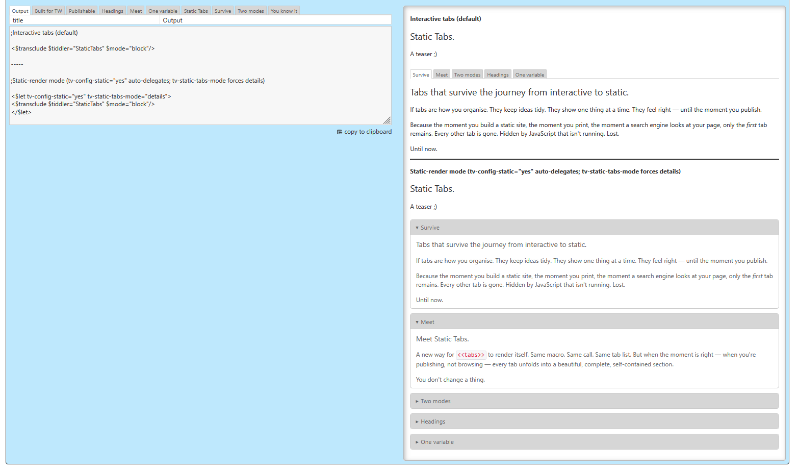
A teaser :wink:

Tabs that survive the journey from interactive to static.

If tabs are how you organise. They keep ideas tidy. They show one thing at a time. They feel right — until the moment you publish.

Because the moment you build a static site, the moment you print, the moment a search engine looks at your page, only the first tab remains. Every other tab is gone. Hidden by JavaScript that isn’t running. Lost.

Until now.

Meet Static Tabs.

A new way for <<tabs>> to render itself. Same macro. Same call. Same tab list. But when the moment is right — when you’re publishing, not browsing — every tab unfolds into a beautiful, complete, self-contained section.

You don’t change a thing.

Want more ...

Two modes. Both gorgeous.

Sections. Each tab becomes a card. A heading on top, the content below. Every reader sees every tab, in order, in full.

Details. Each tab becomes a <details> element. Native HTML. Native interactivity. Click to collapse, click to expand. No JavaScript required — ever.

You pick. The macro adapts.

Headings that just nest.

When a tab gets its own heading, what happens to the headings inside it? They demote. Automatically. An h2 becomes an h3. An h3 becomes an h4. Your document outline stays clean, all the way down.

Even when tabs nest inside tabs, headings keep their place.

One variable. That’s it.

tv-config-static="yes" — already set during static-render. Do nothing, and your interactive tabs print themselves into beautiful static HTML. Add a single <$let> block, and you turn any page into a printable document.

That’s the whole API.

Built for the way TiddlyWiki actually works.

It uses the colour palette. So it themes. It uses tv-adjust-heading-level. So it nests. It uses <details>. So it prints, accordions, and works without JS.

It is not a plugin. It is not a workaround. It may be a part of $:/core.

You already know how to use it.

If you know <<tabs>>, you know Static Tabs. There is nothing new to learn — only something old to discover printing the way you always hoped it would.

It’s here. It’s in core (maybe ;). It’s yours.

Tabs, finally publishable.

I could not resist. Lorem ipsum is so boring :wink:

Demo: Experimental Preview

Means: the code, the functionality and the styles the be changed without warning.
What do you think?

Mario

Great work!

Not only may, but should be!


To confirm, would this also work with HTML exports of a single tab?
So not rendering an entire static site but clicking ‘export’ and ‘Static HTML’?

You mean a single tiddler - yes.
I did just test it. Export a single tiddler as “Static HTML” does set the tv-config-static variable, which is responsible for the template change.

There are 2 modes. Details and section. Details creates pure HTML details elements and “section” creates “tab headers”. The CSS currently is the same for both, but that can be changed easily.

Mario, great work, although I primarily use TiddlyWiki interactively now days and are unlikely to generate static sites, I have long felt that the export static tiddlers or site is a useful but somewhat limited tool, doing this to “activate tabs” is a good enhancement.

Despite the current limitations which you have made “roads into” I have felt that the template system and the possibilities for such exports do demonstrate well some of the possibilities. As you may know we can use the Innerwiki plugin to generate whole tiddlywikis so anything between a static tiddler and a full wiki is possible. Arguably all we need is custom templates.

My own work in this area was to alter the static template so all “internal links” on static pages loaded the tiddler in the interactive wiki. Something I thought should be the default behaviour.

Never the less I do believe as a community we could develop these features to generate even more sophisticated websites, even interactive ones with live Javascript. To assist in this endeavour we could make use of tools and config to;

  • Export multiple generated output files through a zip
    • this could even include images and other files.
  • Allow the domain to be set on each output file enabling relative file references
    • <head>... <base href="https://example.com/subfolder/"> ... </head>
  • The ability to provide suitable navigation over the top of multiple file exports,
    • A kind of menu bar equivalent, or even “translate” the meu bar to a static menu included with every exported tiddler.
  • Build a set of common tiddler → website templates adapted to common types of page found on the internet.
  • A revision system so with updates we need only export changed pages, then unzip on the site.
    • TiddlyWiki can then remain a repository of methods and metadata to generate a classic website.

I have often felt it unnecessary when exporting tiddlers for them to carry the display CSS that looks like tiddlers, when they could become something more.

  • perhaps there are other TiddlyWiki elements that could be effectively exported as you have done with tabs?

Some food for thought.

What do you think about?

I did already extend the TOC macro, which is already part of v5.4.0. I also detects the tv-config-static variable to produce static tocs. It’s not used for the v5.4.0 static page yet. But it should be used soon.

See: Simple TOC level parameter by pmario · Pull Request #9612 · TiddlyWiki/TiddlyWiki5 · GitHub merged
and: [DOCS] Add deep links to the static banner by pmario · Pull Request #9339 · TiddlyWiki/TiddlyWiki5 · GitHub pending

Great, the thing about a TOC as well as other links in static pages is it is valid to have them point to either static pages or the tiddlers in the interactive wiki or both. It would be nice to parameterise this. and example may be a ctrl-click to open static page, or the interactive wiki with one set as the default.

@pmario you are/have anticipated something I have been reflecting on, converting from a tabbed interface to one with dropdown lists, a bit like your Want more example in your post. In my case, each tab would have such a dropdown (using the name of the tab as the title).

I feel that the tabbed interface is OK for wide displays but would not work too easily on phones. The tabs would slide off the screen or be rendered with a new line when the width of the display was reached (which would look aweful). A vertical list of dropdowns might work better!

I’m working on changing my wiki now as a test to see what my userbase prefers.

bobj

Ideally we would have a responsive solution that determines when to generate columns verses rows so it works without rewrite.

You are right. Some may know, that I am not a fan of “hidden” information, except for “Spaced repetition learning cards”.

I always think if information must be hidden, why is it part of this context - or - why is it there at all. …

I know there are many users that like tabs and especially vertical tabs :confused: – Our current export to static does not handle tabs at all. Primarily I wanted to fix that.

But playing around with the examples I found out, that the tabs macro could also be “mis-used” to create accordions or even marquee like UIs in a simple way.

So if a screen gets too small, switch from tabbed view to accordions. For static export we need default expanded, so everything is shown

For dynamic use that’s actually not the case. Accordions can work in different ways. Only show one topic at a time, like tabs. Or expand / collapse individually.

The main difference is, how to configure it and how to activate. …

Just brainstorming.

@pmario your comments have got me thinking more deeply about the tabs issue, at least in my case.

I originally chose tabs because we were seeing the wiki on a desktop/tablet and so screen real estate wasn’t an issue. But now we are looking on a mobile phone (iPhone SE) I have my doubts about the UI.

The problem in my mind is that in my case, the information displayed after clicking a tab can be very long with lots of images. I have no control over the length of an entry nor the number of images. Certainly I provide a resize mechanism to allow images to be displayed at a smaller scale.

In any case, my thoughts today are that even a reveal dropdown to render the target sub-tiddler, will make things too large for a mobile phone app. The amount of scrolling would put me off even with a ‘top of page’ button and the story river I suspect is most confusing with many open tiddlers. Users are used to the ‘Back’ button.

I am not convinced though that merely rendering the sub tiddler in a separate window solves any of these problems, except for the close button to close the window. This at least displays the previous tiddler in its previous state, scrolling wise. The UI would need a ‘Window’ menu for user control.

I am thinking now that a complete redesign of the information may be needed, splitting the large volume of text into sub texts linked to from the main tiddler. Adopting this may require persuasive arguments to the authors of the text so they dont feel their IP is being trivialised. They are used to writing tomes (the original content for this wiki is a large Microsoft Word file collated over 20 years or so). To get them to think in ‘snippets’ will require some doing and might even turn them off.

I am going back to a book I mentioned many moons ago, Mapping Hypertext by Robert Horn (it is available in digital form on the Internet Archive, Mapping hypertext : the analysis, organization, and display of knowledge for the next generation of on-line text and graphics : Horn, Robert E : Free Download, Borrow, and Streaming : Internet Archive). This may provide some insight into a way forward.

bobj

I would not force your authors to change their behaviour. It will most likely cause problems.

I also see no real problem, if mobile users need to scroll a lot. They are used to it. If the text contains images, imo that’s a good thing. IMO if images “interrupt” the reading from time to time is a good thing. For me it would make it more interesting.

If I’m not in the mood of reading I only can watch the images. And if there is something interesting, where I do want to know more I can start reading again.

As I wrote. The tabs macro could probably be sensitive to screen width and switch to a presentation, that is similar to WikiPedia mobile view. Where you have some initial text and the details are accessible with accordions.

IMO for mobiles you do not need a “To Top” button. A fast swipe up or down will do the trick. The back to top button imo may be more valuable for desktops users that have no swipe.