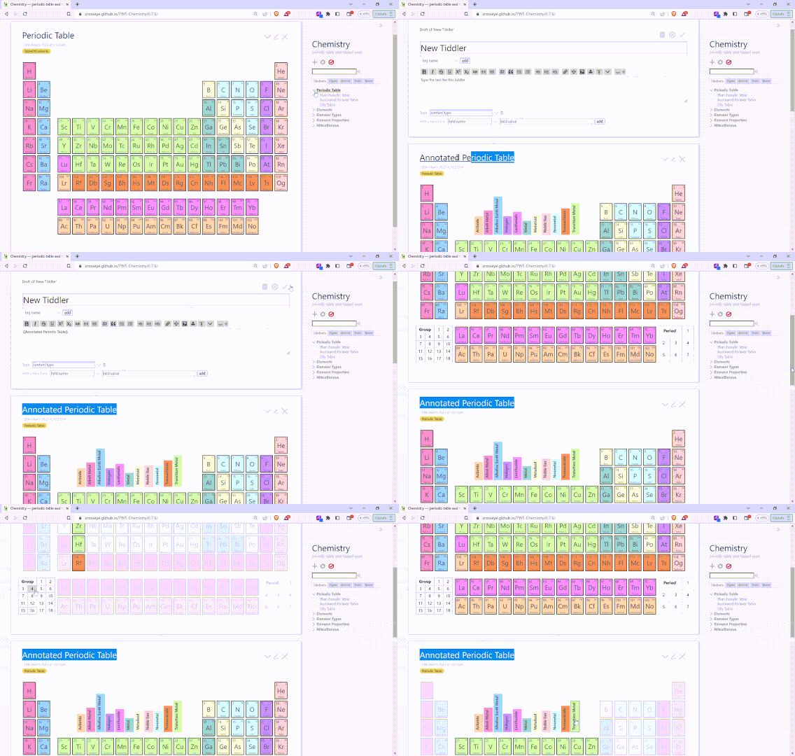
I’m working on my Periodic Table Demo (as I usually start questions these days ![]() .) The latest feature I added was a view of the table with hoverable section letting you display periods (essentially rows, but with some complexities at the bottom four rows), groups, (columns but skipping the bottom two rows), and element types (more complex shapes, visually segregated by colors.) You can see this behavior in the latest version.
.) The latest feature I added was a view of the table with hoverable section letting you display periods (essentially rows, but with some complexities at the bottom four rows), groups, (columns but skipping the bottom two rows), and element types (more complex shapes, visually segregated by colors.) You can see this behavior in the latest version.
I’m moving onto other things for the moment, but am also trying to learn a little more about how TW and CSS interact, so that when I try to extend this behavior, I’ll be able to understand it.
I have three questions. There is much more detail below, but the quick versions are:
- Are rendered
<style>tags are somehow scoped to only apply to the tiddler they’re in? If so, how is that done? - How big of a performance hit is dynamically generated CSS?
- Are there any examples of continually modifying a dynamic CSS tiddler by toggling many field values? Has it worked well?
Question 1
Are rendered <style> tags are somehow scoped to only apply to the tiddler they’re in? If so, how is that done?
I really want to know why the following actually works. My annotated table creates somewhat complex CSS rules that connect the hover of one node with the change in opacity in certain tiles. (Note this behavior is not yet available in Firefox!) There is nothing about the current tiddler in those rules, so I was expecting that if the tiddler were to show up twice (for instance if it were to be transcluded in another tiddler, and both were in the Story River), the hovering one of the controls in one of them would affect both. That’s not what I wanted to happen, so I’m pleasantly surprised by this little demo:

But I want to know why.
The element tiles look like this:
<div class="tile">
  <div class="element transition-metal period-4 group-11">
    <div class="number">29</div>
    <div class="mass">64</div>
    <div class="symbol">Cu</div>
    <div class="name">Copper</div>
  </div>
</div>
And one of the control blocks (bottom-left on the table) looks like this:
<div class="group-annotation">
  <a class="header"><b>Group</b></a>
  <a href="javascript:void(0)" class="focus focus-group-1">1</a>
  <a href="javascript:void(0)" class="focus focus-group-2">2</a>
  <!-- ... -->
  <a href="javascript:void(0)" class="focus focus-group-18">18</a>
</div>

<style>
/* lots of other bits elided */

table.periodic:has(.focus-group-1:hover) .element:not(.group-1) {opacity: .25}
table.periodic:has(.focus-group-2:hover) .element:not(.group-2) {opacity: .25}

/* ... */
table.periodic:has(.focus-group-18:hover) .element:not(.group-18) {opacity: .25}
</style>
Note there is nothing in there specific to the tiddler where this is happening. It feels like magic. I though I was going to have to either find a way to address this using qualify or simply ignore it. Instead it simply works the way I would like. What is this sorcery?
Question 2
How big of a performance hit is dynamically generated CSS?
The above is generated by
<$list filter=[range[1],[18]] variable="idx">
table.periodic:has(.focus-group-<<idx>>:hover) .element:not(.group-<<idx>>) {opacity: .25}
</$list>
There’s a similar list to generate the individual controls; and all this is duplicated three times for the three sets of controls. With seven periods, eighteen groups, and eleven types, that’s thirty-six rules that I’m recreating every time the user opens this tiddler, and the discussion for the next question may imply that I will have to double this to 72. Would a fixed list of these be more performant? Is it worth the additional bytes?
Note that even it it is, I won’t change this until the code feels fairly settled, as I won’t want to change that many separate rules every time I fiddle with the implementation. But I would like this to be as performant as possible.
Question 3
Are there any examples of continually modifying a dynamic CSS tiddler by toggling many field values? Has it worked well?
The next phase I’d like to implement for this section is to allow the user to click on one of these controls and make it a more permanent change, that is, for it to last beyond the hover. The hover would still rule, meaning that while you’re hovering the controls it would have exactly the behavior it has now, but when you are not hovering, the ones you’ve selected will determine which periods, groups, and types are focused. (Technically, that means that everything else is blurred.)
The implementation I was imagining was something like this:
title: $:/_/my/DynamicTableStylesheet
tags: $:/tags/Stylesheet
groups: 2 13
periods: 6
types: metals actinides

<!-- here there be magic -->
Actions connected to clicking the various controls would use listops to add or remove values from the groups, periods, and types fields. The magic section I pretty well know how to write, creating a rule that says all tiles are faded (assuming there is at least one value in any one of the controls), then adding more specific rules that say the elements with class group-2, group-13, period-6, .metals, or actinides are not faded. I’ll have to play games with specificity to make this work seamlessly with the hovering, but I’m sure I can work that out.
If it made more sense, I could skip the listops and simply have toggle-able fields for each of my 36 properties. Does either one make more sense to you, for performance reasons, for cleanliness, or for anything else?
I’ve not seen anything like this in the wiki’s I’ve examined. Has anyone done something like this? Did it work? Are there significant pitfalls? Again, are there substantial performance concerns?
Or do you have suggestions for other techniques that sound simpler?
Also, as a user, would you expect those choices to vanish when you close the annotated table tiddler? Or would they hang around until the next time you opened it? I can’t see a reason these would last beyond the current session, but if you have arguments for that, I’d be interested to hear them, too
