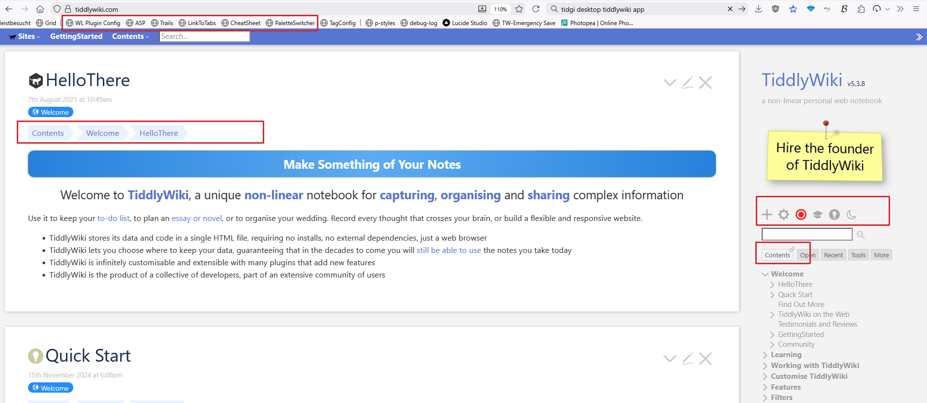
See the screenshot, it might not be easy for TiddlyWiki to modify default UI. But as an “TiddlyWiki App” build on TiddlyWiki framework, I can in charge of simplify UI for TidGi Desktop.
What’s your opinion on smallest set of button and UI element? And all others could be hide for use when new user upgrade to higher level?
I’m not sure about the question. It seems to be a complaint about the difficulty of use. You could be hard or easy to use with small or large buttons. The point is to show only what matters to the user.
I would also say that making everything smaller if you were to switch into a ‘power user’ mode would be a bad idea.
TiddlyWiki doesn’t actually have many options upfront. However, it has a lot of mystery meat in the interface.
If the question is what should be shown rather than its physical size - then I would say that:
Page Toolbar
Show the ▼ (More) button by default on the Page Toolbar, but make it possible to hide some options
Sidebar
I think the Tools tab (really the Page Toolbar control at $:/core/ui/ControlPanel/Toolbars/PageControls) can be cut altogether
MoreSideBar (i.e. everything under the more tab
Remove the Orphans, System, Shadows and Plugins tabs. These are replicated either in Advanced Search or the Control Panel.
Probably Drafts as well as there are enough warning mechanisms elsewhere in TiddlyWiki if you have a tiddler in a draft state. Types still has some use as it offers a semi-hierarchical way to look at just images, for example, and fits with a lot of users’ mental models (think of e.g. the standard folders in Windows and XDG desktops of Documents/Pictures/Music).
Probably cut Tools from here also. Recent is duplicated on the Sidebar, so cut it too. Explorer is of debatable use - I think it shouldn’t default to the tree under $:/ necessarily.
View Toolbar
Remove new journal here altogether from the empty.html distribution as a piece of functionality. The journal is implicitly encouraged to be done once a day per the default configuration, so tagging it with another tiddler shouldn’t be a workflow we actively push towards.
Do not show permalink, permaview, open in new window, close others, fold other tiddlers, fold tiddler.
Again, needs to be possible to hide some options from the ▼ (more) dropdown.
Editor Toolbar
Do not show superscript, subscript, monospace block, options.
If you want to be more aggressive - also cut strikethrough and monospace.
The editor’s ‘choose height’ feature would be better presented somewhere other than the toolbar… though I think people are fine with clicking the bottom-right of the input box and dragging as needed, at leat on desktop. So I honestly question the existence of this feature in the core.
You assume, that everyone knows how TidGi Desktop UI looks like. I have never seen a screenshot here at Talk. I could find one at: TidGi Github page.
If that’s the start UI. I’d say: Yes there are too many buttons and the font is not “my taste”.
There is a reason, why tiddlywiki.com initially only offers 3 buttons (now 4 with the experimental interactive tutorial). Most humans can deal best (only) with 3 elements at the same time.
We do have requests, to simplify the layout even more for default users. … But I personally be the wrong user to decide it.
The first thing I do with a TW site, is add my own plugins, that do not need a restart, from the browser bookmarks bar.
Any other TW page, that I open may get the same treatment, if it allows it.
If UI elements are hidden, but I want to see how it’s done, I download the wiki, open the browser dev-console and switch stuff back on – if possible.
So I am not the right one to decide, what a minimal UI should look like. – I only know, the the “hamburger icon” is the worst thing that happened lately.