Slideshow / presenter based on horizontal storyview

Yeah it i useful to see Slizer, Tx.

FYI I am doing some tests with the codepen you posted a link to. It is looking promising. I had to modify it slightly to get it working in TW (TW does not like “.section__item”; I changed all those to “.section-item” and then it started working).

IF I get anywhere real I’ll let you know.

Best, TT

@TiddlyTweeter Because I am just starting to tinker myself, I would even like to see your work in progress ;-).

1 Like

TW likes it – my guess, you hosted the CSS in the same tiddler; TW wikified the _ as <u> elements. Had you put the CSS in a stylesheet tiddler, 'twoulda been fine.

Right! I tend to do that when testing :roll_eyes:!

@JanJo

Here… put this in a new tiddler at TW .com

<div class="section">
  <div class="section-item bg-1">Item 1</div>
  <div class="section-item bg-2">Item 2</div>
  <div class="section-item bg-3">Item 3</div>
  <div class="section-item bg-4">Item 4</div>
  <div class="section-item bg-5">Item 5</div>
</div>

<style>
.section {
  display: flex;
  gap: 20px;
  max-width: 325px;
  overflow-x: auto;
  scroll-snap-type: x mandatory;
  box-shadow: 0 3px 10px 0 rgba(#000, 0.1);
  -webkit-overflow-scrolling: touch;
  scroll-padding: 1rem;
  padding: 1rem;
  margin: 3rem auto 0;
  border-radius: 5px;
}

.section-item {
  display: flex;
  justify-content: center;
  align-items: center;
  flex: 0 0 300px;
  width: 30px;
  height: 150px;
  scroll-snap-align: start;
  scroll-snap-stop: normal;
  background-color: #ccc;
  font-size: 1.5rem;
}


.bg-1 {
  background-color: #f1c2c6;
}

.bg-2 {
  background-color: #dac2f1;
}

.bg-3 {
  background-color: #ccf1c2;
}

.bg-4 {
  background-color: #c2e9f1;
}

.bg-5 {
  background-color: #f1ebc2;
}

</style>

May be you can use

https://tid.li/tw5/plugins.html#%24%3A%2Fplugins%2Ftelmiger%2FBtx

with krystal. I haven’t tested it .

Good on you @CodaCoder. It is good to have your eye on the biz!

One thing I noticed is the codepen maybe has more CSS than is actually needed for @JanJo’s needs?

I found the “display: flex;” under “.section-item” class not needed for my use cases.

Just to update you, @JanJo, I beginning to get what I need. But it needs testing on mobile for touch actions so not to waste your time.
IF it gets past that test I’ll upload an example wiki.
Maybe in a couple of days time, fingers crossed.

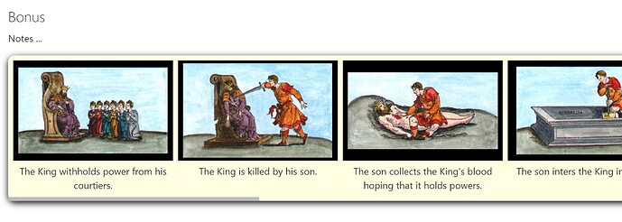
Just FYI here is what it begins to look like in TW …

Best, TT

Hi @TiddlyTweeter that already looks good.
It seems this is within a tiddler, I would like to have a storyview where tiddlers align that way.

As I said I would also draw profit from an untested TW. No TW ever did harm to my PC.

1 Like

Is there a documentation on how storyviews work?

  • What is needed?
  • What happens, when they are changed?
  • What ressources of other storyviews can be while they are not active?

Given the power of that tool my knowledge here is quite incomplete.
In Kristal for example this does not seem to be used correctly. horizontal figures as a storyview…but you cannot switch to normal.

PS: This question was a little too hidden, so I decided to dedicate it a proper thead

1 Like

Right! My step one was to understand the basic CSS. FYI I’d like the approach both in-tiddler and as a storyview. In both cases I need time to grasp what is going on.

Just a comment
TT

Horizontal_storyview_ingredients_borrowed_from_Krystal.json (6.3 KB)

So I had a look at Krystal to see how the horizontal storyview is made there.
This could be a starter.

1 Like

Good stuff! TBH I got a bit out of my depth on how to liberate the right reliably for an horizontal storyview. This looks like it will help!

Just FYI, I’m amazed by what @BurningTreeC and the author of Krystal are doing in code. Way above my competence level.

Also FYI, your OP raises some interesting issues about the basic strategies. I now kinda thinking in terms of buttons for…

(1) Story Saver;
(2) Layout Saver;
(3) Story View Mode

… fully compatible with standard TW. Click and change and click and change back.

A comment
TT

1 Like

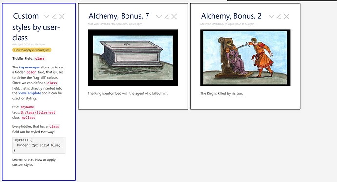
Playing around with the pinched horizontal storyriver CSS of Krystal I found a main flaw in the quick and dirty solution: It does not scroll vertically to the titles when you klick a link.
After all, this is in no way astonishing for this is just a blind experiment - but I do not know how to make it scroll horizontally that the clicked Tiddler is in the middle. How can this be achieved?

1 Like

Hi, especially @TiddlyTweeter I made an early beta of the presentation concept descripd above. Tell me what you think.
http://szen.io/horizont/

1 Like

I use keyboard shortcut to go into and come out of maximized state of tiddler.

https://tiddlytables-budget.tiddlyhost.com/

Check on this site with Alt+M

https://tiddlytables-budget.tiddlyhost.com/#%24%3A%2Fcore%2Fui%2FKeyboardShortcuts%2Fmaximize

This is the tiddler responsible for the shortcut.

1 Like

Thanks for the trick @arunnbabu81,
I need also need shortcuts for navigating throught sections and Tiddlers.

P.S: Your sidebar looks also very neat.

Search by this filter [tag[BTC]]
You can find more shortcuts - these are based on BTC’s demo
Multicolumn by BTC uses a modified version of these shortcuts.

Sidebar is taken from JD’s whitespace theme. I removed the CSS for the story river from the whitespace theme for making it compatible with Krystal. I like to have such a sidebar in multicolumn by BTC. May be I should ask him in multicolumn’s thread

Ciao @JanJo

I looked at it (Krystal — an experiment with a horizontal story) and it seems real neat for what you wanna do on presentations!

[TBH, I do think the demo would get more attention if on entry it was already in full “horizontal mode”. It is not currently so obvious what you are trying to do, I THINK???]

Just a comment, TT

Hello,

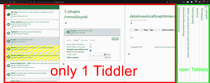
my understanding of a horizontal storyview is like this:

Mouse Scroll in “green area” will bring the latest open tiddler in focus into “red area”.

Wheter the “red area” should be multicolumn → configuration can be an option…

Regards
Stefan

For the daring and impatient, there is a new version to test

1 Like