Sequence-specific animation?

Picking up from the PageTurner thread:

Alas, not quite — my worry was precisely that tiddlywiki’s core wants all story-river tiddler out/in animation to be be centrally controlled by a story view which offers exactly one “in” animation and one “out” animation, which would be disappointing.

What I would love is to be able to designate certain sequences (say, tiddlers tagged as “sessions” within a teaching wiki), with their own “previous session” and “next session” buttons, which would animate within that sequence horizontally (“next” slides in from right, while current tiddler slides out to the left, opposite for the “previous” button).

For handling of all ordinary links — both from within a tiddler and from the sidebar — I’d want to keep the old classic storyview protocol (origin tiddler is still in story river, link causes new tiddler to appear with familiar animation).

Ideally, this all would work within the actual story river. In other words, when you link to a session tiddler, it opens as usual, and its view template includes these special navigation-with-animation buttons, so you can browse forward and back in the sequence, with story river list including only the tiddler that’s actually displaying. (I haven’t yet thought about how the story river would respond to attempts to open multiple sessions independently within the story river; it might be that the story river only allows one of these sessions to be open at a time, so opening one from the sidebar displaces whatever session currently lives in the story river.)

Your swiffy “container” tiddler solution, linked above, has the style of sliding animation effect I’d want… If only it could look like one whole tiddler is giving way to the next (with all of its view template elements, something I’m optimistic I could mostly engineer), and if only the included tiddlers were fully responsive just as they would be in the story river. (This last thing is the problem I’m not optimistic about being able to fix with my own skills. With your swiffy solution, the horizontally-ordered transclusions behave as if they’re behind plexiglass, waiting to be dragged left or right but otherwise missing some of the their content-interaction affordances.)

At your site, just click on “essay or novel” link within the second slider pane…

On all my attempts, it does nothing, though when the HelloThere tiddler itself is in the story river, this works as a link to the Molina tiddler. (And I found this to be true at your site only after installing and configuring the plugin at my own wiki, finding on my site that within-tiddler tab-selection clicks were getting through, while link-clicks were not working… I thought I’d done something wrong until I checked at your demo site.)

EDIT: Maybe it would not be so hard to solve this “plexiglass” problem, assuming I’m willing to just give up the “drag to slide” affordance — which is surely the thing interfering with ordinary mouse interaction… it’s a very cool effect you have there, but not worth losing fine-grained interaction with the sliders’ content, if that’s the tradeoff.
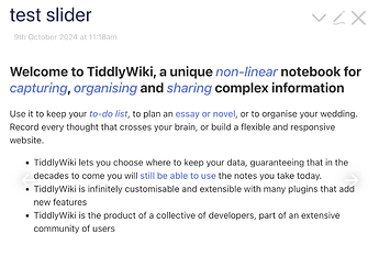
This is a result of the feature that allows the sliders to be draggable with the mouse and not just on touch devices, to reduce the chance of accidental clicks while dragging. Removing the class slider-nav-mousedrag from that demo will disable that feature and allow the contents to be fully interactive, while still allowing navigation within the sequence using previous and next buttons. On mobile, that is already the case even with this feature enabled.

So here is how I would attempt to implement this:

  • a custom view template for all tiddlers that are to be considered sequence tiddlers. The view template should be for the entire tiddler, not just the body. This will allow the title and subtitle to also be animated.
  • a mechanism to animate the navigation within the sequence. Either something like swiffy, or a custom storyview written in JavaScript. The storyview would only handle navigation within the sequence and all other navigation would be handled by the story river as usual.
  • in terms of affordances, if you also want the view toolbar buttons to target the appropriate tiddler in the displayed sequence that could get hairy.

Edit: it would be pretty easy to adapt Swiffy to still allow interaction with links and buttons with a specific class when mouse drag is enabled, such as tc-tiddylink or tc-button.

1 Like

Not that I have any idea how to do it or time to work on it soon, but this sounds like at would be a great addition to my WizardNav demo.

1 Like

This CSS should allow the slide contents to be interactive:

.slider-nav-mousedrag .slider-container::after {
    display: none;
}
1 Like

@springer I made a few updates to the demo that I posted for you earlier.

I am curious what you would want do about the title and subtitle of the sequence tiddler itself. Hide them? That might be confusing since then the displayed title would not match what was shown in the Open sidebar tab.

1 Like

The more I think about it, the more I really do want the tiddler in question to be itself directly in the story river. My desire would be for a special button type (on view template added to tiddlers with sessions tag for example) that triggers a horizontally-animated exit of the one tiddler from the story river, and also triggers a horizontally-animated entrance of the next tiddler (or previous, as needed).

As is always the case, if the tiddler is already open in the story river, we just scroll to it instead. (Or it disappears from its current position in the story river, and appears, animated, in this new position.)

As noted above, I realize this all may not be possible (that is, tiddler transition animation may be “baked-in” as uniform at the story-view level). But I think for my purposes constructing an enclosing (invisible or thin) tiddler “frame” around the specially-animated sequence set is more trouble than it’s worth, since then the story river, and the function of cascades, etc., could easily get confusing.

I don’t know anything about layouts, really anything more than that they exist. So take this with a rather large grain of salt, but it strikes me that this is far from impossible. If we were to clone the current layout, and then have the code branch at animation time between this horizontal animation (either if the old and new tiddlers have the correct properties or if the animation was triggered by a distinct button/action) and the current behavior (otherwise), then it should only be a matter of creating the in- and out-animations.

I wish I knew enough to offer actual implementation ideas.

I had very, very similar thoughts.

One thought (extra) that crossed my mind: akin to the way tiddler body control is handled by fields (e.g. code-body:yes, hide-body:yes) why not animation control, too?

animate-in: left/right/up/down
animate-out: left/right/up/down

Where, animate-*, if blank means, “use theme default”.

Note, this supports (or doesn’t interfere with) cultural norms: in the west (and using @Springer’s purpose) :

animate-in: right
animate-out: left

@Springer: are you picturing an in-place replacement for target tiddler(s). That is, when tiddler-A is sliding out (left), will tiddler-B move in (from the right) to the exact same slot in the river? Is that what you’re aiming for?

Your idea could be interesting as well. But my vision does not involve particular tiddlers animating this way (in general).

Rather, it’s about particular tiddler paths, as illuminated by template-specific buttons (or swipe zones, if we could get fancy). So my idea is, as @Scott_Sauyet noticed previously, really just an animation-enhanced variation of his Navigation Wizard solution.

Yes, it would feel as though, when looking at any tiddler in the story river that happens to be within, say a “sessions” tag sequence, one effectively can “ratchet the carousel” horizontally … but without the larger container/“frame” involved in the solution by @saqimtiaz. (Swiffy is certainly the right carousel tool for other jobs! But it interferes with the actual session tiddler being fully itself in the story river).

Navigating from session #8 to session #9, for example, we see a button at the right side of #8 that causes it to slide out left, while #9 replaces it sliding in from the right. Conversely, there’s a button at the left edge of session #9 that causes it to slide out to right, while #8 slides in from left. (And, for all ordinary links within session #8, none of these should trigger this set of actions. Even if there’s an ordinary link to session #9 within the session #8 tiddler, session #9 opens, in the currently-familiar way, as a new tiddler in the story river.)

If by chance both session #8 and session #9 are both currently in the story river (each with their session-sequence navigation buttons), then activating the “next” button at #8 would either (a) navigate to where #9 already sits in story river (as clicking on links to already-open story-river tiddlers currently does) or (b) session #9 would slide in from right, while also disappearing from its current position in story-river. (The (b) option currently seems more intuitive to me, but either way we should retain the standard that the story-river list abhors duplicates.)

An interesting extension would be one in which you can also navigate over the entire session, and not just back and forth. Of course this may not be relevant to your use-case. But if this interest you, would you prefer to animate just from the current tiddler to the selected one or to quickly animate through the intermediate tiddlers?

That is, this:

You start with this:
🟡 🟡 🟡 🟣 🟡 🟡 🟡 🟡 🟡 🟡 🟡 🟡
           ^-- you are here         ^-- you click here

You animate directly to here:
🟡 🟡 🟡 🟡 🟡 🟡 🟡 🟡 🟡 🟡 🟣 🟡

or this?:

You start with this:
🟡 🟡 🟡 🟣 🟡 🟡 🟡 🟡 🟡 🟡 🟡 🟡
           ^-- you are here         ^-- you click here

Wicked slick animation:
🟡 🟡 🟡 🟣 🟡 🟡 🟡 🟡 🟡 🟡 🟡 🟡
🟡 🟡 🟡 🟡 🟣 🟡 🟡 🟡 🟡 🟡 🟡 🟡  W
🟡 🟡 🟡 🟡 🟡 🟣 🟡 🟡 🟡 🟡 🟡 🟡  H
🟡 🟡 🟡 🟡 🟡 🟡 🟣 🟡 🟡 🟡 🟡 🟡  O
🟡 🟡 🟡 🟡 🟡 🟡 🟡 🟣 🟡 🟡 🟡 🟡  O
🟡 🟡 🟡 🟡 🟡 🟡 🟡 🟡 🟣 🟡 🟡 🟡  S
🟡 🟡 🟡 🟡 🟡 🟡 🟡 🟡 🟡 🟣 🟡 🟡  H
🟡 🟡 🟡 🟡 🟡 🟡 🟡 🟡 🟡 🟡 🟣 🟡

You end here:
🟡 🟡 🟡 🟡 🟡 🟡 🟡 🟡 🟡 🟡 🟣 🟡
2 Likes

I like the intention… not sure the “you click here” is possible with @Springer’s proposal. I mean, it’s not visible…

Either that or I’m still not getting it.

This. The user is staking out the click-point as the focus-point. Suddenly scrolling vertical when the expectation is horizontal breaks the principle of least surprise.

Oh, wait… only if all tiddlers in question are in VIEW mode.

That’s why I called it an extension. Similar to my Wizard Nav business, @Springer is talking about only a previous/next navigation, but for pathways with fewer than, say, 20 nodes, a compact list of links, like my circles above, is a useful navigation widget. As I thought about this animation, I could easily see it extending to handle this, whooshing through intermediate tiddlers and slowing down to land on the new one. It would be more difficult to create, and maybe not quick enough, but it might be a useful way to see that navigation.

Edit: Oh, I think we were talking past one another. I really meant the circles to be a navigation widget. While the tiddlers would move like a sped-up filmstrip, and that was all I was envisioning, I now realize that we could also simultaneously animate the position of the “current” circle in the navigation widget, which is more of what my picture actually demonstrates.

2 Likes

Aah. Okay :+1:

EDIT: Yes, in fact, were that not included, it would soon be a noticeable “missing piece”.

Good stuff, Scott. Me like.

2 Likes

For my initial use-case, there are 26 sessions (for a twice-weekly class meeting over 13 weeks). The “sessions” tag drop-down remains the best way to navigate among sessions, selecting by name, when what one wants is neither previous nor next. (The tag pill is itself organized so that sessions appear in order and color-coded by unit.)

For my purpose, it’s awkward to put a wizard-nav along the bottom of these tiddlers: Not all sessions have the same height, with some being taller than window-height, so user wouldn’t get visual continuity for those dots after the carousel slide (unlike on an iPhone’s home-screen-carousel dots-at-bottom interface). The carousel slide should keep the new tiddler’s titlebar at the same horizontal position as the old one (adjusting “downstream” tiddlers in the story river as needed).

Nor would I want wizard-nav dots along the top (because tiddler-top screen real estate is so valuable for session-specific headers, and because, you know, 26 dots is silly, and previous-next really is the most common need).

So the buttons or hover-responsive click zones running vertically at each edge — along with limitation to single-step forwards/back actions — make the most sense to me.

But if we (I mean, ahem, someone with javascript and core-parsing chops :grin:) can figure out how horizontal animation could work in a wizard-nav-style (but story-river-integrated) plugin, then the horizontal set-of-dots interface (including the natural-accel/deceleration “whoosh” for longer jumps) would be a natural option to include. Especially where the sequence involves tiddlers of roughly same height, as in certain image galleries or database-like tiddler templates.

1 Like