-
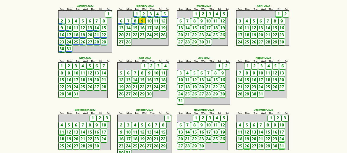
How to make the default view in the
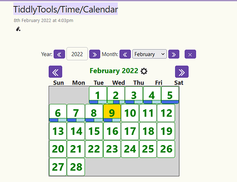
TiddlyTools/Time/Calendarlike this (month view)rather than year view
Monthly view is good for better performance than yearly view in my experience
-
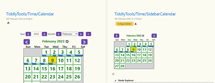
How to increase the size of the calendar in
TiddlyTools/Time/SidebarCalendar(right side of the picture) to the size of monthly calendar inTiddlyTools/Time/Calendar(left side of the picture)
By design, the initial view for TiddlyTools/Time/Calendar as shown in the “Story River” is specifically intended to provide easy access to a “year-at-a-glance” display, while the TiddlyTools/Time/SidebarCalendar view will ALWAYS show a monthly view.
You can quickly toggle the Story River Calendar from the default “year-at-a-glance” view to a monthly view simply by clicking on any month heading. Once a monthly Story River Calendar is displayed, that view is retained – even if you close and re-open the Story River Calendar – as long as you don’t click on the month heading again to toggle back to the year-at-a-glance view.
You can adjust the size of the Sidebar Calendar by opening TiddlyTools/Time/Setup and scrolling down to the “sidebar_calendar_size” range setting. Drag the slider all the way to the right (to “150%”) and the Sidebar Calendar will be displayed using the same size as the monthly view in the Story River Calendar. This setting is remembered and saved with your TiddlyWiki file, so you only need to adjust it once.
As an aside, I notice that things look a little askew in the snapshots you posted:
-
The calendar day headings (“Sun” through “Sat”) appear to be spread out a bit. As a result, the day names are not correctly aligned with the corresponding columns of dates.
-
There also appears to be some excess whitespace in the month calendar layout along the left size of the first row of dates, and along the right side of the remaining rows of dates.
-
The individual day boxes look like they have rounded corners and maybe some extra internal whitespace.
I can’t be certain, but It appears you may have made some changes to the underlying TiddlyTools/Time/Calendar code. I’ve spent considerable effort to get things to line up correctly, and the $(boxsize)$ related calculations and CSS styles used to control the rendering of the showheading_days(), showgrid(), and showday() functions are all highly intertwined.
To achieve the desired calendar appearance, I’d much rather you submit suggestions for how you would like things to look and then allow me to work out the details for customizing the CSS configuration to enable you to implement those changes without breaking things.
-e
I haven’t done any changes to the calendar code. I had to do some CSS tweaking for making the Krystal horizontal layout and captivate theme work together well. May be that is causing the changes you mentioned.
Can you post a copy of your file, so I can see things directly and test them “in situ”?
I found these changes only after you mentioned it here.
That will partially solve the problem. But once i save and re open the wiki, it goes back to “year-at-a-glance” view again . I prefer a default monthly view over “year-at-a-glance” view because “year-at-a-glance” view takes time to load in my laptop.
This will solve the problem for the time being.
Give this a try:
Create a tiddler (e.g., “MyStartup”), tagged with $:/tags/StartupAction/Browser, containing:
<$action-setfield $tiddler="$:/state/popup/calendar/TiddlyTools/Time/Calendar"
   year=<<now "YYYY">> month=<<now "MM">>/>
This will force the initial Story River display of “TiddlyTools/Time/Calendar” to show the current month, rather than the “year-at-a-glance” full calendar view. Note that this does NOT change the handling when clicking on the Sidebar Calendar’s month name, which always opens the “year-at-a-glance” view for easy access to the full calendar.
-e
Speaking performance issues with the yearly view, I’ve noticed a few issues too. @EricShulman , do you know if you plan to further optimize these for performance? Or perhaps have these tiddlers already run up against TiddlyWiki’s limitations?
-
I also noticed that the yearly view is slow to open up, and slow to navigate between years using the double arrow buttons.
-
Also, when you modify the text indicating the year, the calendar tries to load the incomplete year before you’ve finished typing. (This probably unnecessarily burns some CPU cycles too). For example, if the text reads “2022”, and I hit backspace so that it reads “202”, the calendar renders “Jan 0202”.


