Proposal to modify GettingStarted

Current - vs - proposal:

(right click and open in new tab for full size)

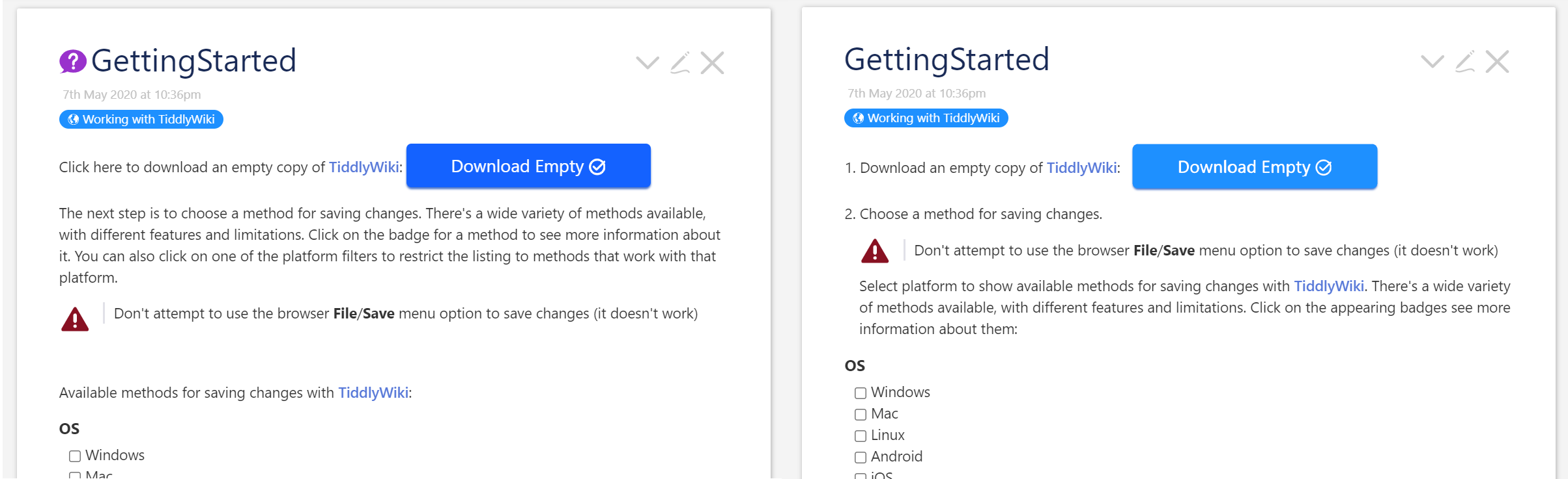
Summary of proposed changes:

  • Change colour of download button to match tag, and increase its left margin from text
  • Remove tiddler icon
  • Vertically center the warning triangle to the text
  • Number the steps in the text for clearer structure (and instead of having to write “The next step is to…”) . I don’t know if the digits should be hard coded or if # is to be used because a problem with the latter is that it indents the digit which would not work well here - but the former, i.e typed characters, do not cause hanging indentation for the succeeding lines of text, which is necessary.
  • Reword text for clarity. (Note: the text below the warning row is a transclusion of the tiddler titled Saving.)
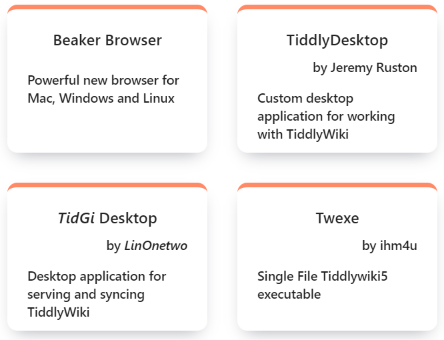
The badges

  • Center align the creator names. They currently look like the image below.
  • Kill CamelCase linking in the badges. (See e.g the “TidGi Desktop” badge where TidGi is a dead link.)

image

2 Likes

I like it! It’s more user- and, especially, newbie-friendly.

Thank you @twMat those all look like worthwhile improvements.

1 Like

Good to hear you like it guys.

Unfortunately I can’t implement most of it so it needs someone else to do it!

The reason I can’t do it is because it is a complex PR that touches several tiddlers, including stylesheets that I don’t know how to PR… because I assume local styleblocks are not OK. And even if they were, to e.g push that warning triangle up a tad can’t be done with a simple vertical-align so I’d need to wrap it in a div which I guess is too hackey. Likewise with the <ol> indentations I mention. And the tiddler icon is there automatically because of the tiddlers tag so how would that be removed? (add an exception to the filter?)

So, I’d be happy if anyone could take over. On the one hand “it’s just some aesthetical changes” so one could say it is not that important… but it is a default tiddler so everyone sees it, so it is important.

I think, those icons have been added with 5.2.0 … I think, we should keep them for a while and see how much “remove it again” feedback we get

The icon would be vertically centered, if there would be at least 2 lines of text with it :slight_smile: So either we add more description text or mess with the CSS settings quite a bit

I know I’m old school, but when I look at that code, I feel like a great deal of effort went into not using a table, even though a table would be perfect.

2 Likes

You are right. We should use a table layout for this type of elements. I think, it would … just work

1 Like

Right. Why not? If its easier. I think it is well semantic too in table format.

Just a side comment
TT

The icon for GettingStarted is actually a cascade demo. We should probably target specially made demo tiddlers instead.

By the way, the biggest problem I have with the current GettingStarted tiddler is that it uses its own fields for state. That means that if you click around in GettingStarted then you’ll make the wiki dirty, and get a warning when you try to navigate away. That is not how TiddlyWiki is intended to operate: we should be using state tiddlers in the $:/state/ namespace.

3 Likes