I originally posted this in the gh discussions but got little traction so reposting here (a tad modified to incorporate an idea expressed there by @pmario )
Many years ago, I proposed a new edit view layout. It was perhaps too radical even if I still think it is valid.
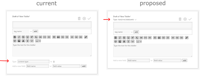
Here is instead a digestible part of that proposal but in an updated form. It concerns relocating the type field, mainly because the current placement causes asymmetry in the whole layout. My feng shui master says the following is much better. He is very wrinkled and eats plankton so he is worth listening to:
Thus, the idea is to relocate and change the type textfield/combobox into a dropdown to select from. I dare say that most people rarely, if ever, use the type field. But if there’s need to add a custom type then there can be a “add new” button inside the dropdown for this. [Edit: However, as @Maurycy points out below, an “add new” button is probably overkill: If someone is savvy enough to create custom types then they can also figure out how to add it to the dropdown.]
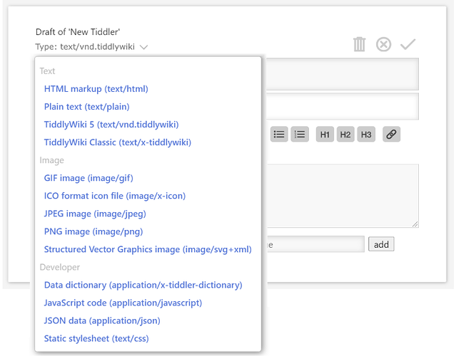
A particularly positive side effect is that we solve the problem with the dropdown always going out of viewport, forcing you to scroll.
Actually, it could be even cleaner: Just like currently, there is no need to at all mention the tiddlers default type. So it could show only the subtle dropdown button, and only if it deviates from default then the selection label is also shown.
The open dropdown list could also be better by using the chooser interface, i.e what you see in the controlpanel to choose palette or theme.
Frankly, the current UI for the edit view is one of those things that give me an uncomfortable feeling when demoing TW for others. I feel users are immediately exposed to too much clutter.

