I originally posted this in the gh discussions but got little traction so reposting here (a tad modified to incorporate an idea expressed there by @pmario )
Many years ago, I proposed a new edit view layout. It was perhaps too radical even if I still think it is valid.
Here is instead a digestible part of that proposal but in an updated form. It concerns relocating the type field, mainly because the current placement causes asymmetry in the whole layout. My feng shui master says the following is much better. He is very wrinkled and eats plankton so he is worth listening to:
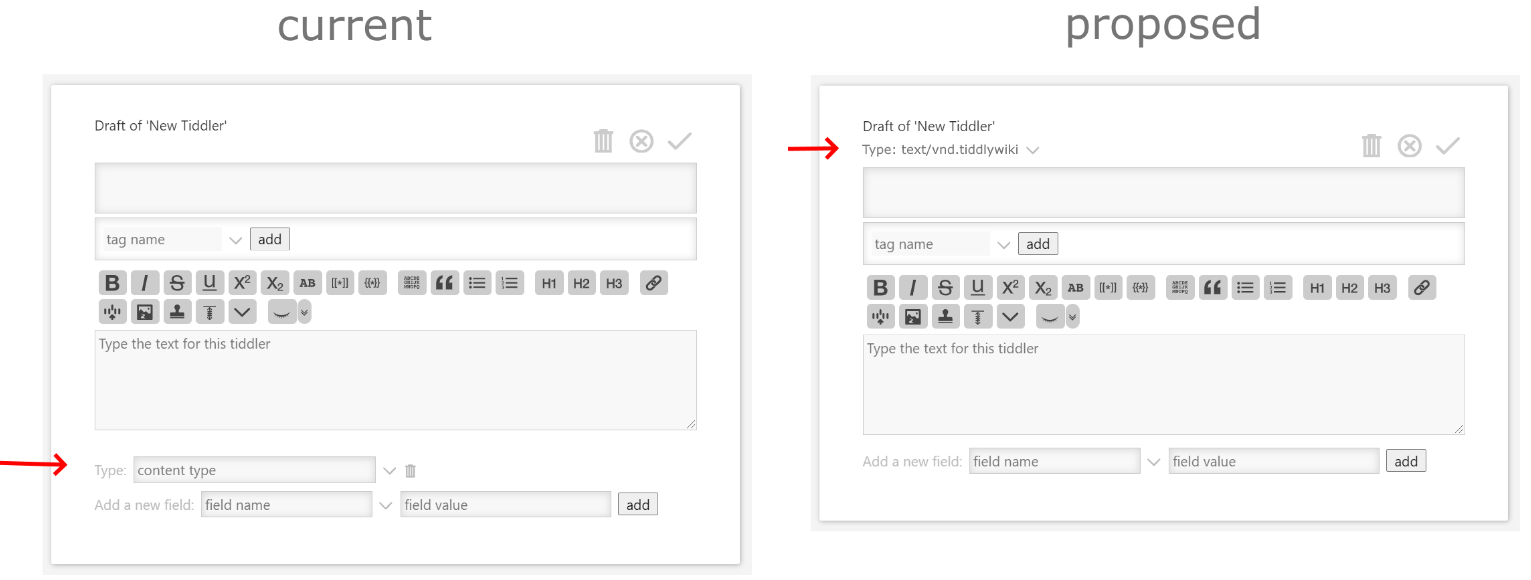
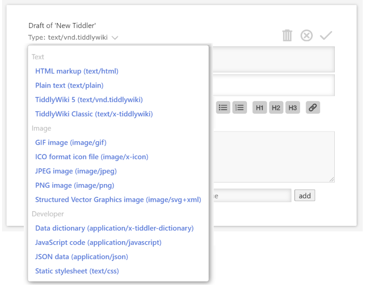
Thus, the idea is to relocate and change the type textfield/combobox into a dropdown to select from. I dare say that most people rarely, if ever, use the type field. But if there’s need to add a custom type then there can be a “add new” button inside the dropdown for this. [Edit: However, as @Maurycy points out below, an “add new” button is probably overkill: If someone is savvy enough to create custom types then they can also figure out how to add it to the dropdown.]
A particularly positive side effect is that we solve the problem with the dropdown always going out of viewport, forcing you to scroll.
Actually, it could be even cleaner: Just like currently, there is no need to at all mention the tiddlers default type. So it could show only the subtle dropdown button, and only if it deviates from default then the selection label is also shown.
The open dropdown list could also be better by using the chooser interface, i.e what you see in the controlpanel to choose palette or theme.
Frankly, the current UI for the edit view is one of those things that give me an uncomfortable feeling when demoing TW for others. I feel users are immediately exposed to too much clutter.
@twMat I support your suggestion, and see no reason for us not to do it.
I would also like to see the ability to reorder the element’s we see in the editor more readily and by tiddler or tiddler setting.
The reason is if this interface is more customisable I think we could design nice forms and make use of the tiddler editor more. Eg open a view designed for a contact form, with the desired field etc…
Also this change makes sense when you look at it from the perspective of just usability. You first define what type of content you want to create and then you create it, not the other way around.
I like the change though I am wondering how useful the option to add custom types is? I’d think that it’s almost exclusively a feature used by plugin developers or people using more advanced functions to display them differently, in which case the burden of creating a new tiddler to hold the definition of a new type shouldn’t be a big deal.
Yeah, there’s much more I’d like to see too but I’m limiting this proposal to keep it well defined, and simple to implement, so that it can become a gh request.
If it helps I tried to make further use of the type field in the past, and with the advice of others gave up on it. In all my solutions I use a different field name, in my case object-type is it a contact object, a task object, project object etc…
I like your suggestion because it minimises something I rarely care about, but when its there I may need to know about it.
Once I set my object-type other view or edit templates click in, and I usually set it on creation with a button, not manually set it. However if set it, I want it clear what it is set to, not unlike type.
OK, I just posted this gh request. Please give it a like if you support it.
Better yet, if you have the chops make a PR - it seems like a pretty small thing to implement but I quickly got lost in the details when attempting to do it.
I like your proposal but for me the combobox is useful, there is a lot of choices and being able to filter the list is a great feature to quickly get the type I want.
Placing this at the top does make sense.
Yes it’s frustrating, maybe the javascript that define where to place the popup could be improved.
I think my proposal should appeal to the absolute majority. But I can see how one could have a little search box inside the dropdown to use as you describe. (It wouldn’t even require any extra click if the focus is set to this search box when the dropdown is opened.) Or some feature to hide those options that you never use under a “more”, inside the dropdown.
I’m curious, how often do you actively engage with the type field at all?
You are right, many users don’t use the type dropdown often.
If we allow disabling options, there will be users, which make the list shorter and then after 1/2 a year they complain, that “Option Type X” is missing, because they forgot about their configuration.
So from my point of view making it configurable would only make sense, if the dropdown would be needed frequently. … Or if it would be much longer
I think this once again points to the need for general solution that provides a drop down field to select values according a given filter. With a method to edit the field and enter a value eg tooltip guide ctrl to edit/add.
We need a few easy to use customisable selector elements.
Exactly. I’ve tried to make my issue post be as minimalistic as possible. Other ideas can come later, if at all. My main objective is a nicer looking viewtemplate.