Thank you everyone for feedback! - I’m working on implementing a lot of it accordingly.
@pmario - that’s certainly flattering compliments!  and thanks for valuable feedback!
ok, ok, ok… I’m buckling under the group pressure.
code-body: yes
sure
license
I don’t think I’ve ever used a license because I figure people are free to do with it as they wish… but I admit it would suck if someone somehow copied it and then he/she put a license on it that somehow blocks my let-go intention. Is that a risk, even when I created it previously?
brittle … core-plugin …
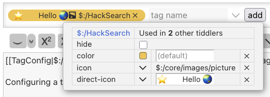
I would love for the functionality of several of my plugins to be in core plugins but, apropos the brittleness, I think seveal of my plugins can merely be seen as proofs of concepts because there’s no chance they live up to the official TW coding standards. In my plugins I try to avoid touching core shadows so I use methods to circumvent this that often rely on a lot of css hacky trickery. For example…
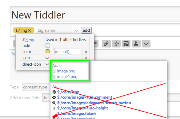
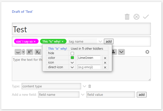
..in this plugin, I try to keep the plugin small and the code simple, so I reuse the color-picker macro via \import $:/TagManager… but to “exchange” the color-picker buttons “palette image” for the “color swatch”, I’m hiding the image and adding a css :before element colored with {{!!color}}.
That’s just one of several examples in this plugin. So, while usable, it’s a PoC.
The adding of hidden in the color field is another hack, but maybe I can improve this with your ideas.
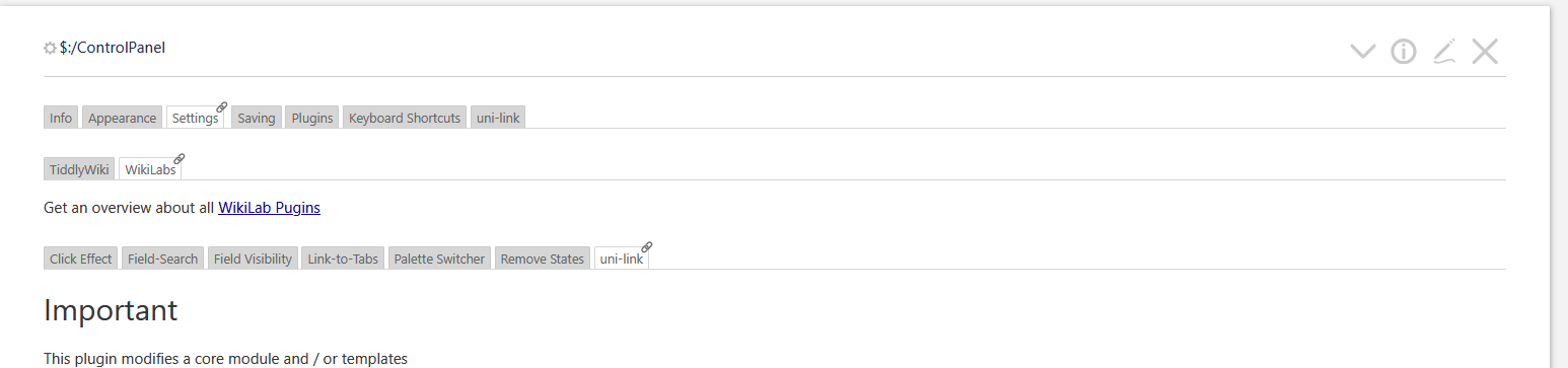
Would you consider to give your “settings” it’s own “higher level” tab in the settings,
Yeah…positioning plugin settings is always a bit of a problem; If I understand you right, you propose a tab Controlpanel > Settings > TWaddle - yeah, I guess I have enough of public plugins for it to be justified. But a consequence is that users need to either know which plugins are TWaddle-plugins or they need to search around. (Side note: There should be a separate and native tag under Settings that lists all settings that the user has modified + the ones he wants immediate access to. That’s one reason for this gh proposal)
Again, thank you, everyone.
 Thanks Scott!


