Presenting: tag-categories ~ show your tags grouped

Long in the wanting, the TWaddler presents…

tag-categories ~ display the tags in categories

You can control the way the tags are presented via the settings.

Note that all tags are still just tags in the regular tags field and no shadow tids have been modified.

For full fledged categorization also in the editmode tag-picker dropdown you need TW version 5.3.5 or higher.

:grinning_face_with_smiling_eyes:


The only previous solution I’ve seen for this is @inmysocks GenTags, also worth checking out.
6 Likes

Thank you Mat! Nice and useful plugin.

Regarding hardcoded sorting of tags, I have raised the same issue before.
I have a problem with the Shiraz dynamic table, where users like to sort the tag column differently!

I use the Autocomplete plugin to set category tags in my own work. For example ?c triggers the autocomplete with a dropdown list tailored to category tags!
Users can then select the right tags from the dropdown!

Love this plugin and am really considering using it in my railroad wiki. One thing that would be nice to have in the settings is to be able to adjust the margin/padding between the category and the tags.

Are you sure it concerns the tagpicker dropdown sorting? Because to sort the tiddlers tags is possible using a trick I use in this plugin: I hide the usual tags area (display:none) and show another viewtempate, which is controllable. In contrast, the editview tags area, where the tagpicker resides, is a significantly more complex viewtemplate.

Sure, I can add that. Just to make sure I undertand you right, do you mean in the vertical display? Because in the horizontal display there is a distande between the category label and it’s tags, but there is also a (tad bigger) distance to the left of the label to distance it from the previous tags.

In my case, I wanted to sort a table based on tags, but the field value (tags field) was different from displayed tags, as what is displayed is sorted!

Oh, fabulous! I have no wikis at home that need this, but I can think of at least three at work that could really use it. I know what I’ll be doing in the morning!

I’ve tried to do something like this just using tag colors, and it does help. But this is so much more intuitive. Thank you!!

1 Like

I’m meaning horizontal distance between the tag label and the tag itself.

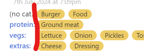
In this vertical display, right?
image

…but not in this horizontal display, right?

Or do you mean in both displays? As you can see, e.g “protein” has a distance both to left and right, and the left distance needs to be bigger than the right one, to indicate what the label belongs to.

1 Like

Ah, I see. I would think both. To me, at least, there needs to be a little more space after the colon.

tag-categories UPDATED to celebrate the release of TW v5.3.5

FIRST uninstall any earlier versions in your wiki (including the, then, separate categorized tagpicker child plugin).

Major update: IF you use TW v5.3.5 then you can also get the editview tagpicker dropdown to show categorized tags for selection. (If you don’t use TW 5.3.5 then uncheck this feature in the settings.)

Also, there is now a setting for horizontal distance ( @HistoryBuff )

1 Like

Thanks very much! Works perfectly. Now the big job of converting everything over to use it fully.