Please, take this 3 second screen test!

Ths is a screen test. Does this look like two rows with basically identical characters to you? (the first is an image)

 image
   🅲 foo⁃foo

Or is anything totally different? What, in that case?

Those who reply shall be rewarded with a very cool plugin where the above question matters.

Thank you.

The second line appears to be indented and does not have a space before the ‘foo-foo’.

Do you need any more insights than that, twMat?

No, I see

Snag_31d0385

For me, the first one is inverted in color, the second one is indented and the letters F are elongated at the bottom

@Hans_Wobbe @Justin_H @TW_Tones

  • appreciated!

I must assume the “inverted color” is because you’re using dark mode or similar on their screens, right?

What I fear is that any of the following appear as totally different characters (e.g an empty rectangle) or not at all:

  • the squared “C”
  • the space between the “C” and foo
  • the hyphen in foo-foo

That is the case for me.

I’m curious about what the goal of this is, seems like text to png or svg :thinking:

The foo-foo part of the lower is darker than the upper. I can’t tell if it is just a matter of slightly thicker characters or if it is a darker gray. The initial white C looks smaller in the lower one and the box around it may actually be darker. Also , If I look at it really hard it seems that the lower box has rounded corners, whereas the upper has angular corners. As a few others have said, the lower looks indented compared to the upper.

The image was just to show what it looks like on my screen i.e what it should look like. I’ll release the plugin very soon and you can probably figure out what it is used for, in there :slight_smile:

DBH - appreciated.  

There’s a slight gap in front of the second hyphen
The second square is slightly rounded, and the “C” is fainter.

image

1 Like

@Hans_Wobbe @Justin_H @Mark_S @DBH @TW_Tones
I promised a plugin as a thank you. Admittedly, I will also release it publicly very soon but this is at least a preview :wink: It is a complete rewrite of the recently released list-rows plugin. Do try it out, I’m pretty sure you’ll like it.

$__plugins_TWaddle_tids-to-table.json (11.9 KB)

1 Like

@twMat … Can you add an example to the JSON. I have no clue hat to configure?

2 Likes

Ain’t no nothing to configure. Things should be self explanatory, given the built-in instructions. I will however release it publicly soon in the context of a Tiddlyhost page where I demo some stuff.

Very nice! For the clueless, like me, it needs a comment to look to the right for the “C” button. Otherwise I’ll be typing “C” into the description box.

And it kind’a needs a revert button, because you don’t always get table descriptions right the first time :wink:

@Mark_S - thanks for your input. I’ll make the official release soon and I hope to get your input there for a more official discussion on what needs to change.

2 Likes

Vector wins !

Why the 1/2 em-space indent ??

I like the rounded corners on the white-on-black ‘c’

My fear in the OP was that the space would not appear as a space (but as some arbitrary character) so it is impressive that you located it. It is actually a dedicated special space character (see e.g this interesting article) and I use it because otherwise that “C” character (which is also just a regular character, see here!) comes too close to the next letter when it is italicized.

BTW, for anyone who downloaded the plugin I attached some posts ago, there is now the official release and the plugin is significantly updated since I posted here.

2 Likes

Great reply !

Your tool will be very useful. Thank you.

Re: locating the detail of the indent.
Nice article link :paperclips:
//// hah!
memory lane: I worked in Graphic Design & Production in New York 1980s. Magazines and Book publishing, including lots of Art books, and the big fancy museum show catalogs.
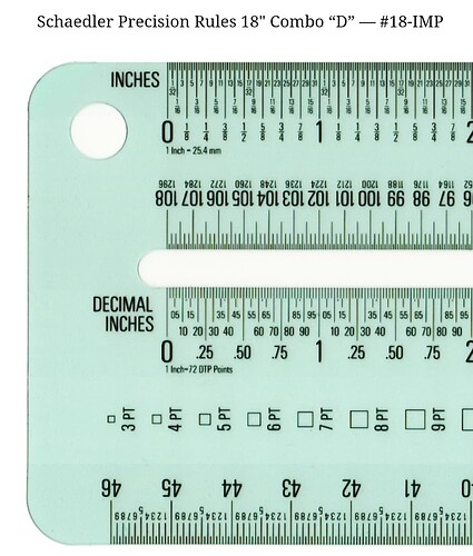
Started out with drafting tables, T-squares, rubber cement and thinners. Exacto knives, then surgical scalpels were our tools. But the best tool of all were Schaedler flexible precision rulers for typography. 1/2 pt = 1/144th an inch. Some of best type and book designers had eagle eyes. Across the room they would ask, can you add or take a point or 1/2 point out between those two letters (kerning kerning kerning)…
Since we used rubber cement one could stretch, squish or reposition type with fingrs. Then burnish it down.
Marvellous training. Hands and eyes
It paid the rent ok too.

Then computers arrived. Desktop Publishing software revolution. Amiga, then Macs => Quark Xpress - which eventually handled fonts and precision kerning, line and word.
Magic
But
Lots of crashes. Waiting. Rebooting.
SCSI connector voodoo and deadline pain.
Frequent Version upgrade torture or plugin funk.

I worked the nightshift for 6 months at one of the first Service Bureaus. They had just bought a Linotype rasterizer and photo printer. So exciting (when it worked ) bugs :bug: in the beginning crazy.
Font wars and incompatibilités.

Really felt like the direct continuation of all human writing & printing culture and processes.
I was very grateful to have started by hand, working at proper drafting tables for architects, in their model shop, and the into graphic design and world of quality photography and printing.

The screen resolution on of the best phones/tablets has now passed that of the best printing. That was a lovely surprise!
~J

https://www.schaedlerprecision.com/

Awesome retrospection. As someone who these days works as a science and tech teacher for ages 10-12, I can tell you that many kids today don’t even know how to draw a line with a ruler. They’ve just never played around and drawn structured things (or even played with magnets for that matter). The hands-on you describe really does something to ones mind that the digital world doesn’t. I can’t tell in exactly what way, but I would think the experiences you describe is of value also in the digital realm - and you did spot that space character :laughing: