We can set up a gofundme account so they can all have desktops!
I’m sure someone will suggest zooming in/out. However, the problem with zoom is that it moves the text off-screen.
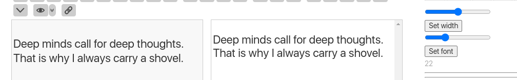
I have a really primitive tool for setting the font for whatever size I need. I use it with dynamic css, so the display, edit, and preview all come very close to the same viewing size. Here’s a sample (on the desktop, because it’s about 6 times easier to get a screenshot than on a phone).
Could we incorporate the screen width into the font size? maybe a custom mobile theme that does something along the lines of, font-size:calc(100vw + 1em); or something a bit more realistic?
There could also be buttons added to TW to adjust the font size on the fly in incremental values?
I personally really enjoy using my TW on my phone for those ‘in the moment’ thoughts that I don’t want to forget, and imagining someone not being able to have that convenience is a little troubling to me.
Have you seen j.d themes + palettes. She solved this before!
For example see: jd’s — (tiddlyspot.com)
Look at the two buttons at the top left:
one increase font size, the other decrease!
LOL yes!