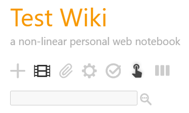
I have the below page control button to create a new tiddler with specific template text and tags (adapted from https://groups.google.com/g/tiddlywiki/c/IqDGCE1d594/m/SRf3dKg6BAAJ)
\whitespace trim
<$button class=<<tv-config-toolbar-class>> tooltip="Add movie review">
   <$list filter="[<tv-config-toolbar-icons>match[yes]]">
    <span class="chunk fas fa-film"/>
   </$list>
   <$list filter="[<tv-config-toolbar-text>match[yes]]">
<span class="tc-btn-text">
<$text text="New Movie Review"/>
</span>
   </$list>
   <$action-sendmessage $message="tm-new-tiddler" title="Movie Name («year»)" tags="movie review" text="""! <$view field=title/>

!! Favourite Scene
«description»

""" tiddly="https://www.imdb.com/title/tt«id»/"/>
</$button>
where
<span class="chunk fas fa-film"/>
Is referencing an icon using Font Awesome — using Font Awesome with TiddlyWiki 5 's FontAwesome plugin. This works okay for me but I have 1 minor issue with the above implementation:
- The film icon is slightly mis-aligned:
On the Page Control Toolbar:

Similarly on the Menu:

I understand from https://tiddlywiki.com/static/Creating%20new%20toolbar%20buttons.html that the icon should be 22px by 22px. How do I implement scaling in the above so that the icon appears aligned with the rest?
<span class="chunk fas fa-film" style="width:22px; height:22px"/>
doesn’t seem to have any effect.


