P tags where I do not want them

Hello. I have a custom View Template that I am adding into the cascade. I’m noticing that it gets added to the flow with a paragraph tag surrounding it.

I do not want that paragraph tag. Is there a way I can suppress it?

Here’s my template code. Is there something I can add to it to change this behavior? The p tag is inserted as the immediate descendant of the div class “tc-tiddler-body”, and thus surrounds all of my code.

<div class='clearfix'>
<div class='scrollerfloat'>
<$list filter="[<currentTiddler>has[illustration]]"><$image class='titlethumb' source={{!!illustration}} /></$list>
<$list filter="[<currentTiddler>has[illustration_caption]has[illustration_source_url]]"><div class='caption'><a target='_blank' href={{!!illustration_source_url}}>{{!!illustration_caption}}</a></div></$list>
<$list filter="[<currentTiddler>has[illustration_caption]!has[illustration_source_url]]"><div class='caption'>{{!!illustration_caption}}</div></$list>
</div>
<div class='end_mark intro'><$transclude field="text" mode=block /></div>
</div>
2 Likes

Hi @JenniferS
I think generating extra p tag is an issue in Tiddlywiki. Of course some developers believe this is not an issue, but when you want to use CSS to implement some custom style, these extra tags make a lot of problem.

See some PR here:

1 Like

It is an issue because it is one for Jennifer and others that opened issues at GH. The problem at the moment is, that there is no generic and backwards compatible fix.

Try the following somewhat counter intuitive code, where all the empty lines are intentional. It does remove the extra P tag for me. … But to be sure I’d need the real configuration with all the cascade filter tiddlers that are involved.

<div class='clearfix'>

<div class='scrollerfloat'>

<$list filter="[<currentTiddler>has[illustration]]">

<$image class='titlethumb' source={{!!illustration}} />

</$list>

<$list filter="[<currentTiddler>has[illustration_caption]has[illustration_source_url]]">

<div class='caption'>

<a target='_blank' href={{!!illustration_source_url}}>{{!!illustration_caption}}</a>

</div>

</$list>

<$list filter="[<currentTiddler>has[illustration_caption]!has[illustration_source_url]]">

<div class='caption'>{{!!illustration_caption}}</div>

</$list>

</div>

<div class='end_mark intro'>

<$transclude field="text" mode=block />

</div>

</div>

Since I don’t have all the elements involved, it may be possible that with your “real” configuration there are even more unwanted P tags.

2 Likes

Very interesting reply.

I did for a long time not understand TW auto-<P> behaviour. For me it has only really been an issue when I need exact visual control of layout.

I often wonder if we could have a wikitext method to suppress <P> generation for a scope (a defined section)??

Just a comment, TT

1 Like

The simplest way to avoid the paragraph tag is to use double line breaks in between each element:

<div class='clearfix'>

<div class='scrollerfloat'>

<$list filter="[<currentTiddler>has[illustration]]">

<$image class='titlethumb' source={{!!illustration}} />

</$list>

<$list filter="[<currentTiddler>has[illustration_caption]has[illustration_source_url]]">

<div class='caption'><a target='_blank' href={{!!illustration_source_url}}>

{{!!illustration_caption}}

</a>

</div>

</$list>

<$list filter="[<currentTiddler>has[illustration_caption]!has[illustration_source_url]]">

<div class='caption'>

{{!!illustration_caption}}

</div>

</$list>

</div>

<div class='end_mark intro'>

<$transclude field="text" mode=block />

</div>

</div>

What’s going on is that an opening tag followed by a double line break is recognised as a block mode tag, and thus doesn’t generate a wrapping paragraph tag. It’s awkward but it’s one of the main techniques that the core uses to address the underlying problem.

The technical detail is documented here:

https://tiddlywiki.com/#WikiText%20parser%20mode%20transitions

1 Like

That’s exactly the problem we have at the moment. There are some P-tags in the core UI, where the margin-top and the margin-bottom are “convenient” even if they are considered bugs by some users.

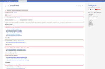
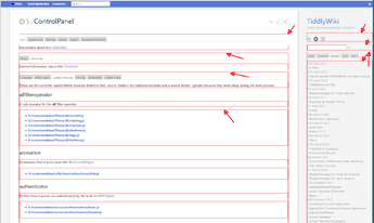
See the first screenshot at: [BUG] Slotted transclusion - no way to remove P tag · Issue #6687 · Jermolene/TiddlyWiki5 · GitHub, which shows the right sidebar and the ControlPanel highlighting the “erroneous” P-tags.

The second screenshot shows a “partially fixed” version which only contains P-tags where they should be. … BUT it kind of messes up the right sidebar as it is at the moment, because the p-tags did provide some vertical spacing. …

The vertical spacing is easy to fix, but not really 100% backwards compatible, because there may be and probably is 3rd party stuff out there that relies on the broken behaviour.

So the question is: “Should it be allowed for a fix to break backwards compatibility”.

Very interesting, useful reply!

IMO, conceptually presenting the issue is actually quite difficult!
It becomes a bit of a labyrinth to get your head around.

Your response here does improve my understanding!

TT

Any solution that is dependant on special use of empty lines needs to be well documented or an alternative presented. Otherwise it causes problems because behaviour changes because of the absence of something, or the inclusion of something that is “invisible”.

It may even be better if we had a symbol that is interchangeable with double line breaks.

  • This would allow the reading of such code to make this more obvious.

A few times I have cloned tiddlywiki internal code to build something new and removed these blank lines because it does not suite my coding sensibilities, arising in subsequent problems.

  • If there were a way to wrap a block of code to remain in block mode without “double spaced lines” or “insert a symbol like " ␍or ⏎” at the end of a line that is treated as “double line feed” it would be more obvious to naïve users.
<div class='clearfix'>⏎
<div class='scrollerfloat'>⏎

<$list filter="[<currentTiddler>has[illustration]]">⏎
   <$image class='titlethumb' source={{!!illustration}} />⏎
</$list>⏎

Note in this case the ⏎ in the second line is redundant but could be simply “ingested”.

It has to be fixed on the code level. Introducing new complexity only makes the problem worse.

1 Like

With my lack of knowledge, I can’t be able to see where it breaks backwards compatibility of any functionality, I only see that it breaks the UI.

Ciao @pmario.

I wanted to add that I think that kind of illustration is useful. Not just for debugging but also to illustrate class use in TW.

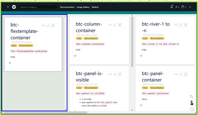
For instance, I thought it useful that @BurningTreeC in his docs provides visual illustration of the special classes he added for a multi-column layout. MultiColumn Layout — a non-linear personal web notebook (Click “Documentation” to load it). Example …

Just saying
TT