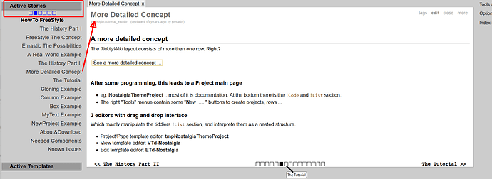
If we’re in the context of a tutorial, adding more “dimensions” to the otherwise linear flow of the tutorial can be very confusing. You not only need to take a note of where you were in the main thread but then also keep track of the current digression (and hope it doesn’t digress into more branches). I remember years ago when I first stumbled upon Reveal JS (tool for making presentations) I was very confused by how you could not only navigate left-right but also up/down in the demo presentation. Is the stuff below important or not?
I think this line of thinking could be extrapolated into the context of a tutorial. Let’s say we have a tutorial that is made of some tiddlers and one of them is part of another tutorial. Looking at this from the point of view of the user, how should they know how to proceed? Continue the same branch? Go down the other one first? And what if the other branch branches out more later or it’s actually the middle of a branch?
My personal experience is that on average people have hard time following linear tutorials, and I am talking mostly about programmers who could reasonably be held to a higher standard than an average computer user¹. If the functionality of Prev/Next would be used in the context of a tutorial I think the best approach would be to:
- Make it linear – significantly reduces mental load of keeping more information in head at once and knowing how to proceed.
- Make it on point and avoid digressions – for the same reasons as above.
If used outside the context of tutorial and just, say, documentation then I’d ask “what purpose does the navigation serve?” @TW_Tones mentions two examples: Features and addsuffix Operator. For the former I think it makes a lot of sense to be able to go through them one-by-one as you’re likely learning about the system’s capabilities and building an index of knowledge in your head.
But filters? If you’re reading about addsuffix you are probably trying to understand how exactly it works, all of the nitty-gritty details. I find it unlikely you’ll want to read about after filter next. If anything you’ll want to go back to the list of all filters where you can get a better overview of the existing filters, in which case breadcrumbs seem like a better navigation tool.
I think I very indirectly am addressing the challenge posed in the first post – that is, good navigation requires understanding how your users will use the product.
But from a more personal level, here are some thoughts and experiences about navigation:
- I like the idea of Prev / Next provided it’s used in a context where it’s desirable to navigate that way
-
Breadcrumbs are underrated and they are great if you want to quickly see the bigger picture / orient yourself in space. But it works best in tree/multi-tree structures
- I am very quickly overwhelmed and confused when using Tiddlywiki.com for documentation and having more than 1-2 tiddlers open:
- I use browser’s Ctrl+F extensively and unnecessary tiddlers make it less effective
- Some tiddlers are large and it’s a lot of scrolling to get where I want
- Also on Tiddlywiki.com, I sometimes look for a specific filter. I open it, quickly scan its contents, close it and then am annoyed it doesn’t take me back to where I was when I originally opened it.
- I think I am not very good with non-linear navigation.
- I also never use the “Open” tab in the sidebar.
- In both of my personal TWs I use Zoom In with tabs at the top.
¹ - I say programmers could be held to a higher standard is because their job is understanding complex systems so it should make sense they’ll digest complex information easily. Turns out they’re still just human.
 .
.


