
My proposal to relocate the type field in edit view, mostly to “declutter” the UI, triggered a comment by fellow @saqimtiaz where he said:
From a UX perspective I would be much more inclined to support the affordance to hide less commonly used UI elements until needed, with what is less commonly used being configurable by the user.
While this point doesn’t necessarily exclude my proposal, I have to agree that also hiding it all together would be even better! But it would only be good if such configuration is…
- locally located - i.e accessed directly where the user’s at, i.e from within the edit view (not via e.g the Controlpanel or inside a tabs in the tiddler info)
- locally applied - it only applies to the current tiddler
- self explanatory - it is obvious how to use it (or gives direct feedback)
In fact, there are several things I would like to hide from default edit view:
- the type field
- the custom fields area
- some of the editor tool buttons
- …sometimes the whole editor button toolbar
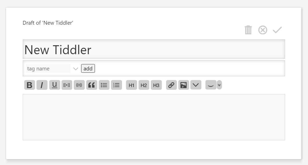
Imagine if users by default were faced by something like this:
…presuming that it was obvious there’s more stuff and that this is easily brought forth. So my question here is:
How can hidden information fulfil the criteria #1-3 here above?
I’m hoping for some generic mechanism and UI. A standard solution that we can use ubiquitously.
The “more button” seems like a pretty obvious go to and that we already use. I guess they always use revealwidgets (right?) In view mode it is used in the tiddler toolbar and optionally as the “fold tiddler” button. In edit view it is seen in several places; the tags, type, and custom fields dropdown and the editor tools more button.
But how should additional more buttons for hidden stuff be presented? The above illustration would not be very pretty if it had more buttons seen everywhere. Maybe “show on hover”?
And how should things be moved between the visible interface and the hiding area?
Thoughts?
