Request 1:
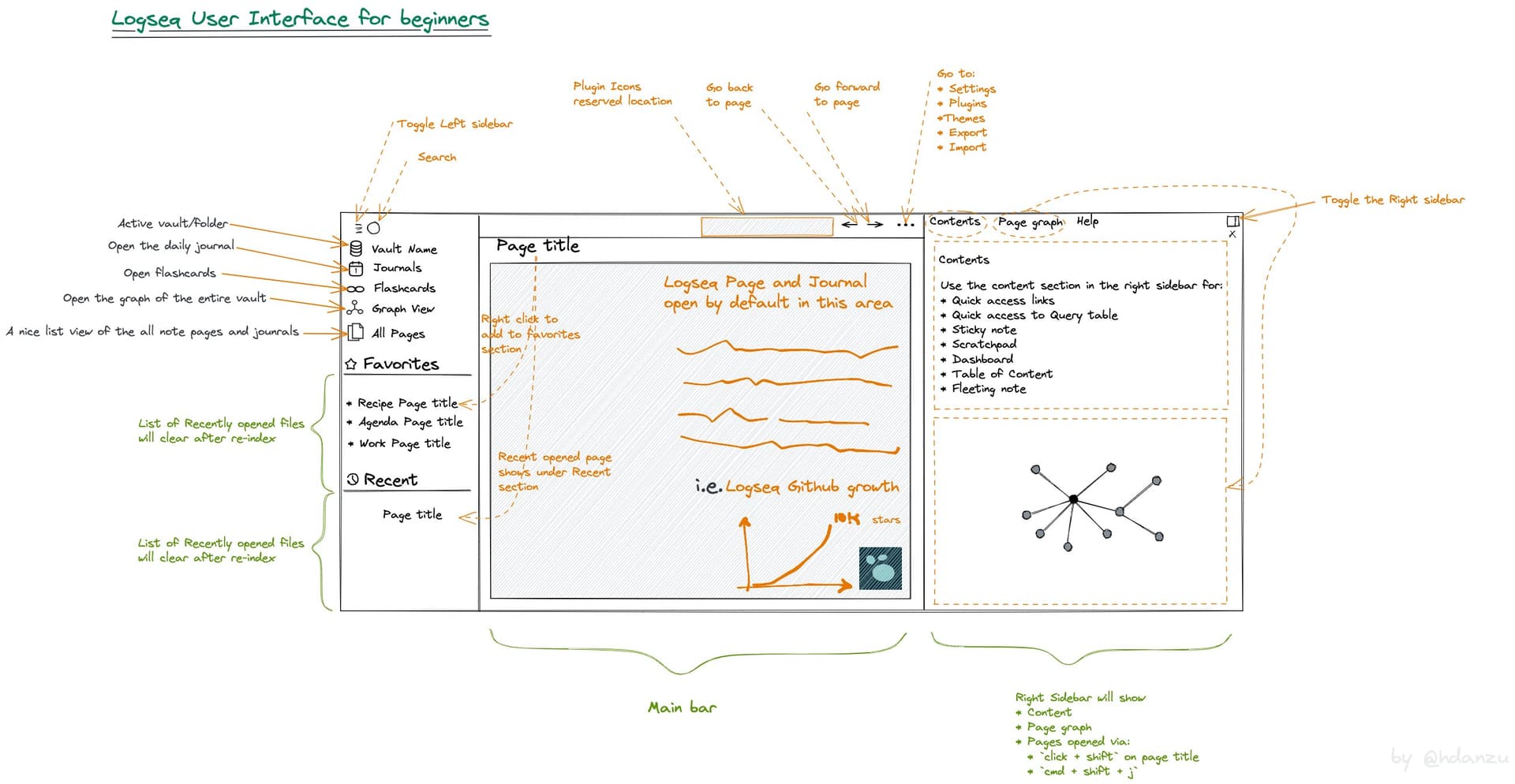
We should learn from other note taking tools. Above image is the user interface of logseq what we can learn from it and what feature you see missing in Tiddlywiki to add it?
Request 2
The above image is generated using https://excalidraw.com/ are there volunteers to create one for Tiddlywiki and share here so others can contribute and customize it for Tiddlywiki tutorials?
I’m currently working on a custom edition for tiddlywiki aimed at providing tools to help develop UI elements, when I’m done I’ll share it here, maybe that will help.
Other great inspiration for UI aimed for learning :
EDIT: I forgot to give feedback for the screenshot, my bad ! I like the graph view a lot, and two side panels could be better than one sidebar with a lot of tabs. I’d prefer to have a search bar at the top center instead of a tiny icon at the top left of the screen though…
Request 1 - agree that designing user interfaces is a skillset all on its own Mohammad. It is fascinating to see how good ui’s reduce down and minimise for efficient interaction. We all use them every day but it’s like another language trying to make one. Mobile in particular. Here’s an interesting link with some basic principles, if you’re interested. I’m sure there are many more around;
(Vectornator is a free svg app for ios - no affiliation, it is good though)
Request 2 - here is a proof of concept of something that I think might be useful for tutorials but I’m not so sure of its fundamentals. It is very primitive. I’ve tried to use it to explain itself in the Help tiddler. Tap the red buttons; https://wattaged.github.io/popmap/
Primitive I know but maybe the concept has potential as a tool for explaining tw interfaces and plugins, amongst other things? Maybe the concept could be developed further by someone with ability so that we have an ‘in-house’ tool? What do you think?
Yes, we need to improve UI in TW for better User Xperience, and so TW looks more friendly to newcomers.
In my case, I like the centered themes, there are great centered theme but it is annoying for me when the storyriver shifts if you hide/show the sidebar. I tried create a theme but I saw that the problem (IMO) is in the layout. Then I started a new layout but it is WIP.
We can enum the pointo of UI, not features, that we like from other notetaking tools and we give the reason. The we can evaluate the most important issues in the UI.
I would ask if anyone goes ahead to build a wiki with new UI elements that they do so in a modular manner so they can be selectively added for example - provide a generic Left bar UI page element with tags to populate it, I could then reuse my focus tiddler/history list and place it in that.
Not only does it ensure reusable, customisable code it also promotes community contributions.
For example: I have solutions that use a second toolbar, page and tiddler indicators (Icons that display a state), search indicator (responds to search text) that I can divide into page elements and solutions that use such page elements.
TBH, over years I have seen implementations (TWs) by folk that are phenomenal.
I do not think we lack capacity to make most anything.
What I would say is that “modularisation” is an issue. What I mean is there is currently NO meta-level way to relate easily actual coding folk done in buckets (= a lot of) already. That, maybe, makes harder what might otherwise be plug-n-play into laborious recreation of the wheel? Dunno. I, dunno.