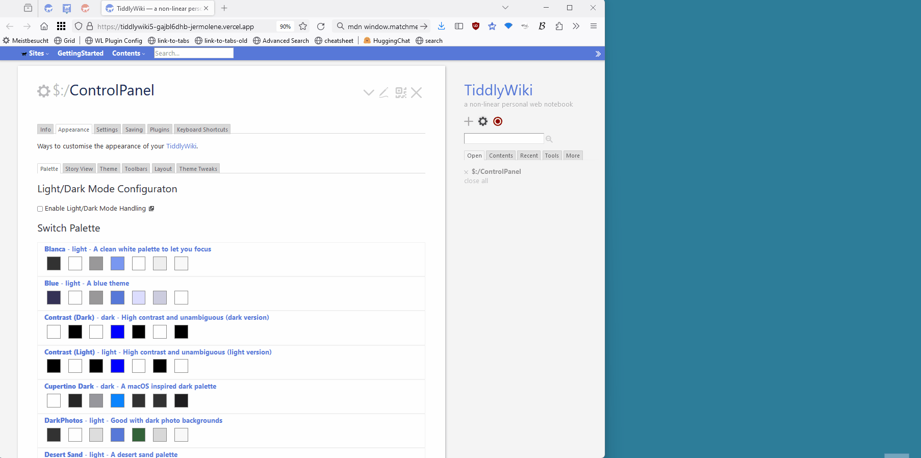
The configuration is in ControlPanel → Appearence → Palette, where it belongs.
By default the new configuration can “Enable Light/Dark Mode Handling” to change the setting manually
There is a definition for a “Light Palette” and a “Dark Palette”
If the configuration should be switched automatically, according to the browser “appearence” setting we need an action-tiddler tagged: $:/tags/DarkLightChangeActions
So several plugins can add new actions if needed
If the action-tiddler is removed, auto-switching is gone and the menue is for manual switching.
These changes are compatible with my PaletteManager preview function and the TiddlyTools PaletteManager (not shown in the screencast below)
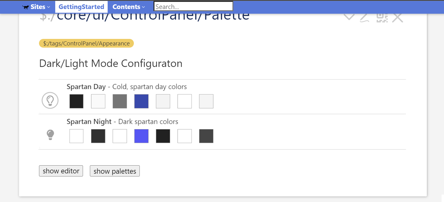
I very much like the idea to simplify for the user to have two main palettes (dark/light).
I do not like the checkbox because it is an extra layer/step that the user needs to face. I’d rather see the two settings only, by default, and beneath them, next to the “show editor” button, have a “show more palettes” button (to open a revealwidget and the usual palette switcher list display).
I understand the idea behind those rightmost “choose palette”-buttons, but they are a tad cluttery and would think they would be better inside the “show more palettes” display I mentioned above. That display could segment all palettes into dark palettes vs light palettes.
I have several further comments on UI details but I’m guessing the demo is a proof-of-concept rather than the envisioned final look (right?) so I’ll refrain from posting them unless asked about it.
First, to show both your Dark/Light thing and the Switch Palette is conflicting UX. IMO, only your thing (as presented when checked) should be shown by default - i.e only the two settings, no checkbox, no explanatory text.
IF the user wants fine tuning, then he can click enter a separate area where they are properly presented, in my image the “show palettes” would show two tabs, one for the dark palettes and one for the light. (…although I am a bit hesitant what to do with palettes that don’t fit this binary division). I.e this would be instead of your rightmost “choose palette buttons”.
To signify “selected”
When there are only two options, the gray background coloration of the standard switcher lists doesn’t make any sense.
And instead of the very subtle chevron to signify the selection, in our case here I think it is clearer with icons as shown or sun/moon, etc.
Here I use a circled icon to signify “selected” but maybe this breaks TW standards. (E.g an open Controlpanel gives the Controlpanel button icon a shadow …which I always thought looks like smudge, but…)
Another idea could be to simply outline:1or2px solid somecolor around the selection.
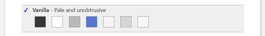
Yet another idea would be a clear checkmark; I use this in the Booster booster stylesheets, here (the selected option, Vanilla happens to be at the very bottom which is not optimal for the demo, but should show what I mean.)
…while at it - and this is something I’ve said before but you disagreed - as you also see both in the image here and in the Boosters demo, I’ve cleaned up the text color to be black. IMO blue text means “link” (not “click here”) and the font-weight is toned down. (it is very confusing when it is not a link!)
Now, your demo has a link to the actual settings-value-tiddler. I agree this is desirable. I’m not quite sure where to put it but possibly a float:right; and maybe we need an generic “link icon” for tiddlers whose name are not really of interest.
Another thing is to peel away unnecessary “lines”. If your demo tiddler appears inside the actual Controlpanel, one can zoom in and see this maze:
In my big image above, I tested to remove also the three lines but it became too bare IMO.
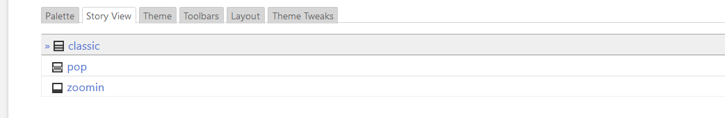
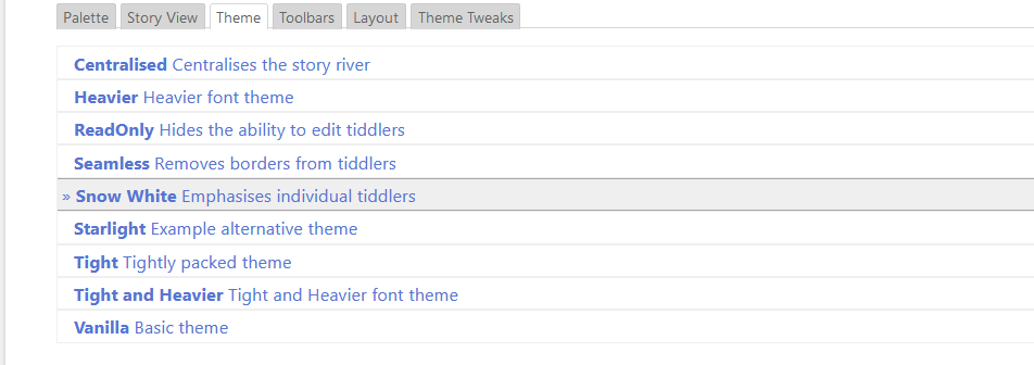
That’s nice. But for consistency reasons the Story View and Theme switcher need to be chanted too, because they use the same UI element. Adding unrelated elements to the PR will make it even more unlikely to get it merged
I only want to make the !%&$/&§ Palette handling simpler because: Currently it sucks!
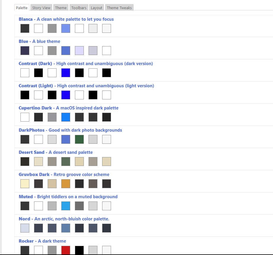
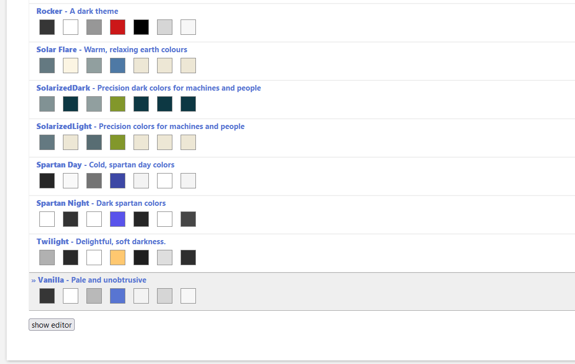
I need 2 screenshots to even show it. So everything that makes it simpler IMO is a big win. I develop new palettes or if you want to fix problems with the existing ones as I do at: Palette Manager — Preview