As I previously noted, the above phrase has a double meaning:
“Make a greater quantity of your notes by using TiddlyWiki”
or
“Using TiddlyWiki increases the value/utility of your notes”
I think that one of the more important goals of the “tag line” should be that it is able to appear as a stand-alone phrase that serves to promote TiddlyWiki, separate from its use on the TW webpage itself.
While keeping “with TiddlyWiki” in the slogan might seem somewhat redundant when it appears on the TW webpage, it would be essential if it is ever used in other contexts such as advertisments and related marketing materials.
Agreed. I specifically called it out as redundant in the context of the webpage, where between the slogan, the heading, the paragraph and four dot points, “TiddlyWiki” appeared in 6 out of 7. It felt like it was leaning on the word like the old smurf joke (https://tvtropes.org/pmwiki/pmwiki.php/Main/Smurfing ). Perhaps also in danger of semantic satiation, though I don’t know if that’s more or less likely given it’s an uncommon word to most people.
Perhaps a short version sans ‘TiddlyWiki’ for where the context is already unambiguously TiddlyWiki, and a “with TiddlyWiki” only when it makes sense to have it?
As for the double meaning? I’m in the “the something” version is a more pleasant double meaning to me, but the distinction is trivial. The two meanings you list and the two Jeremy listed have little between them IMHO. But “Make something…” is riffing on the “make something of your life”, and that tips the balance for me.
tl;dr: I think Jeremy’s intitial draft idea of “Make Something Of Your Notes” is the best short version, and a slightly longer “With TiddlyWiki” suffix when appropriate (and perhaps a reasonable default outside the TW page itself)
Of course, further work on style might be needed. But I’m not good at CSS, so I had to give up.
Edited.
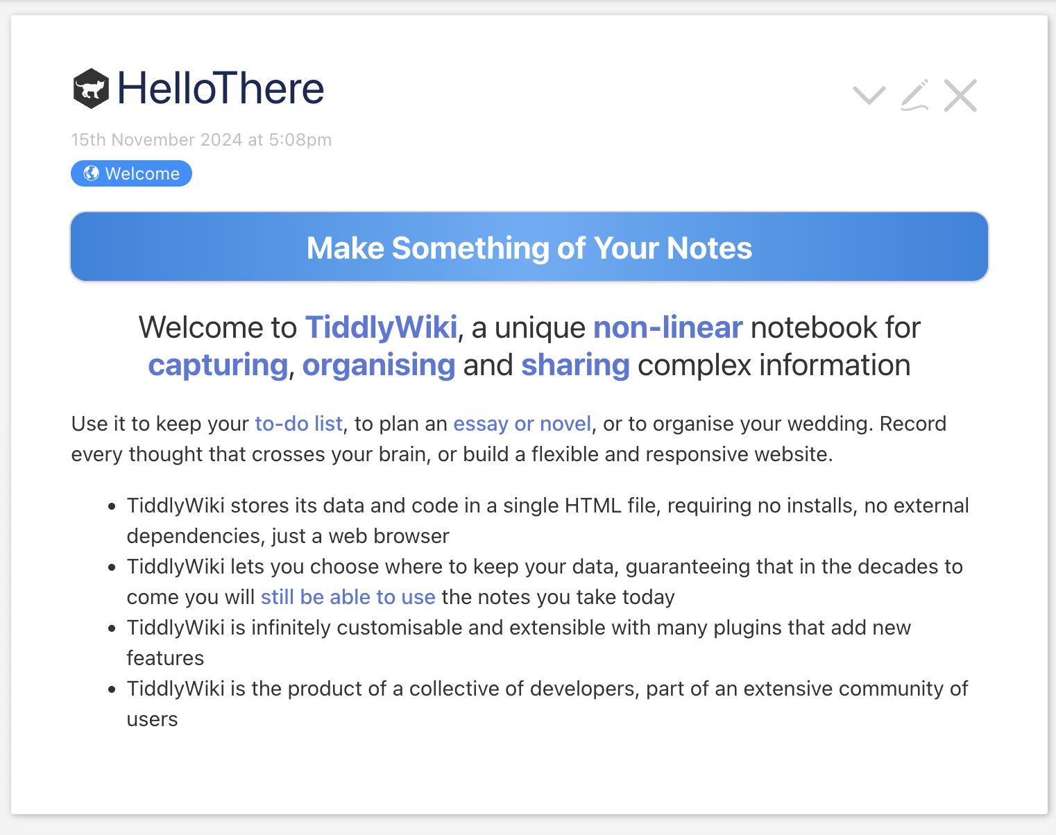
The first line indicates a salutation and welcome, the second line indicates the uniqueness of TiddlyWiki, the third line indicates what the user can use it for, and the fourth line indicates that it can be shared via TiddlyWiki. A separate description might better characterise TiddlyWiki.
I’m not a software developer, and I haven’t done similar market research, but I have observed that many products are advertised line by line, and rarely through a full sentence, especially a complex one.
Hi, I’ve been using Tiddlywiki for a few years now but only recently joined this forum, so definitely a new kid on the block. Nevertheless and for what it’s worth:
(a) I like the new line and especially the play on words but then I am a native English speaker;
but (b) I also think of my own use of TiddlyWiki as a means of bringing order out of chaos;
and (c) one further thought, I’d be very sad to see replaced any of those terms that are so characteristic of and nearly synonymous with TiddlyWiki. For example and especially, “Tiddler”.
I like the idea of quirky and unique/invented naming. There is something a little bit cold and fulldull about a rename that’s based off “Note” or “Item” (though there are arguably logical ‘gets the idea across easier’ when introducing the idea to others)
And yet my revulsion to that word is the biggest reason I sit at the “it can’t be renamed quickly enough” end of the scale. But it sits alongside my (relevant context: Australian) “the country absolutely should have a new flag” opinion, and probably a few others that dont spring to mind at midnight - as things I feel strongly about, but accept that if it’s going to change, it probably wont be till an alternative catches enough of the collective consciousness get the ball properly rolling. In the meantime, every now and then I design a flag. Oh yeah, and ponder alternative names for TW too.
…should TW have a flag? Am I opening a can of worms?
Hi Nemo, an interesting perspective with a lot of value. So at least one of us is going to have to let go of a few attachments. (I’m sure there’s a Van Morrison song to cover that. There usually is.)
As for “…should TW have a flag? Am I opening a can of worms? ” I don’t think a flag will necessarily be a problem but if anyone starts talking about a monarch, well, maybe that’s the time to start sharpening the guillotine and singing the Marseillaise! And I’m English.
For what it’s worth, I’ve leaned extensively into distinguishing tiddlers (titled entries in the JSON of tiddlers) from nodes, which are potential places in the name-space — whether occupied by tiddlers or not. Templates can display content for nodes even when there’s no tiddler there. A “node” suggests something more like a logical coordinate intersection, while a tiddler is more like an actual data-point of content at that node.
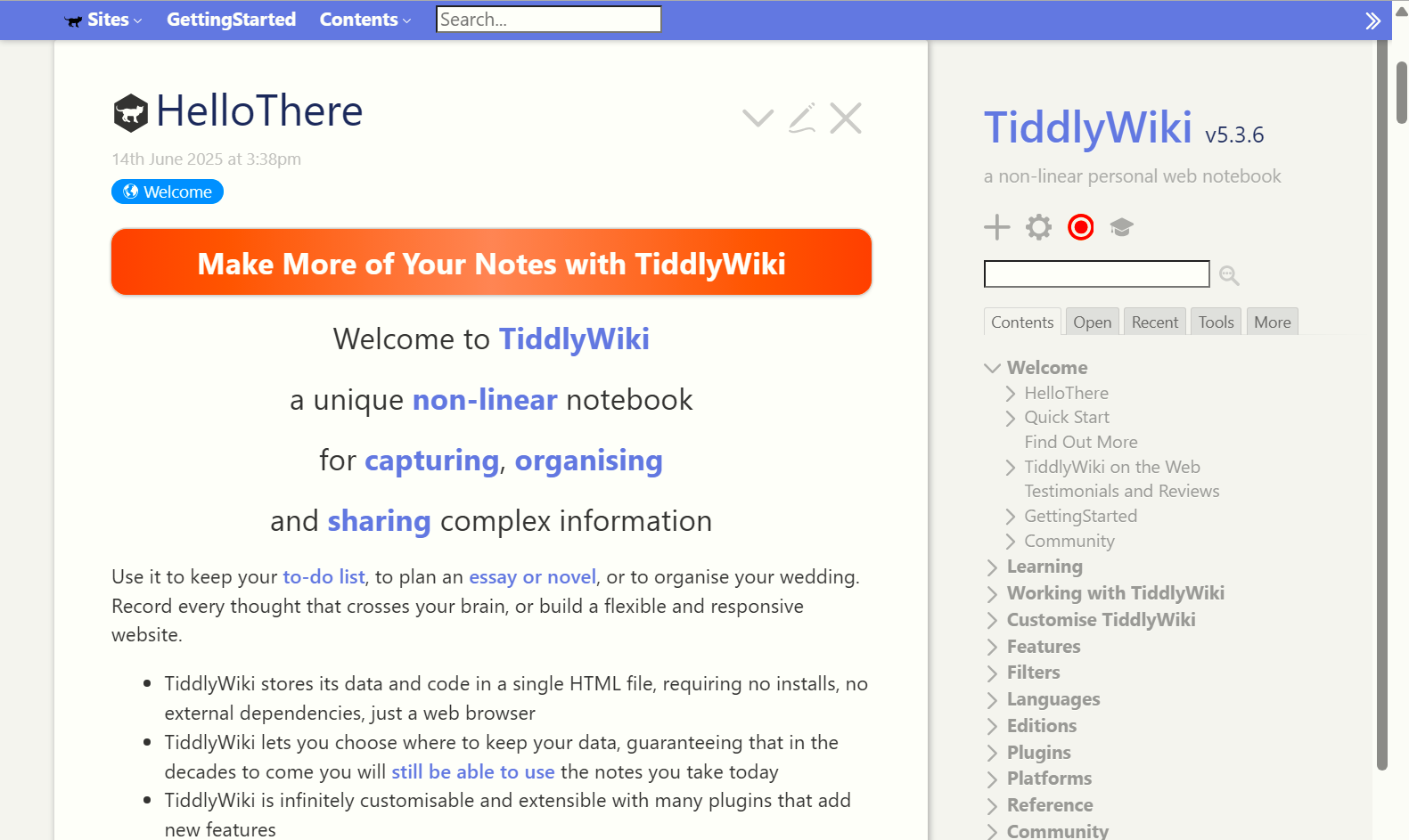
Thanks everyone for the very helpful feedback. I’ve changed the tagline back to “something”, removed the words “with TiddlyWiki” and changed the background colour.
I think the “something” form has the strongest double meaning, and emphasises our most important distinction from conventional products like Roam, Obsidian, Notion: TiddlyWiki lets you build and share useful custom tools to work with your data.
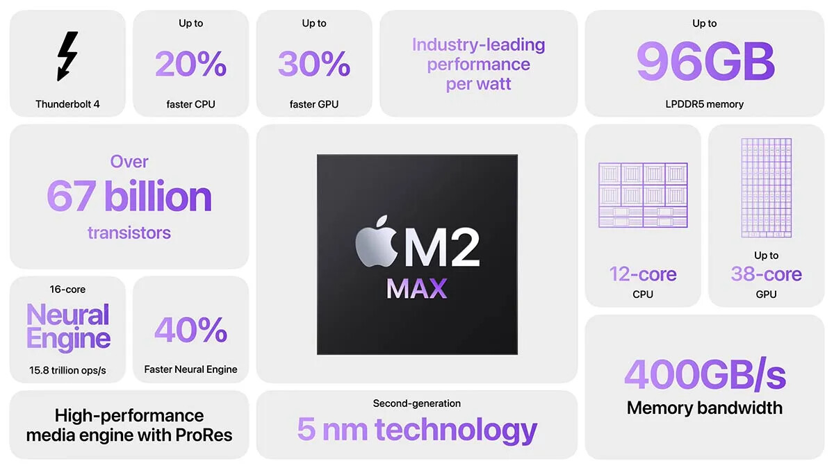
While I think the banner itself looks better, I think there is an awkward transition from the banner to ordinary text, and particularly the bullet points. I have been experimenting with a bento box layout. Here’s an example from Apple:
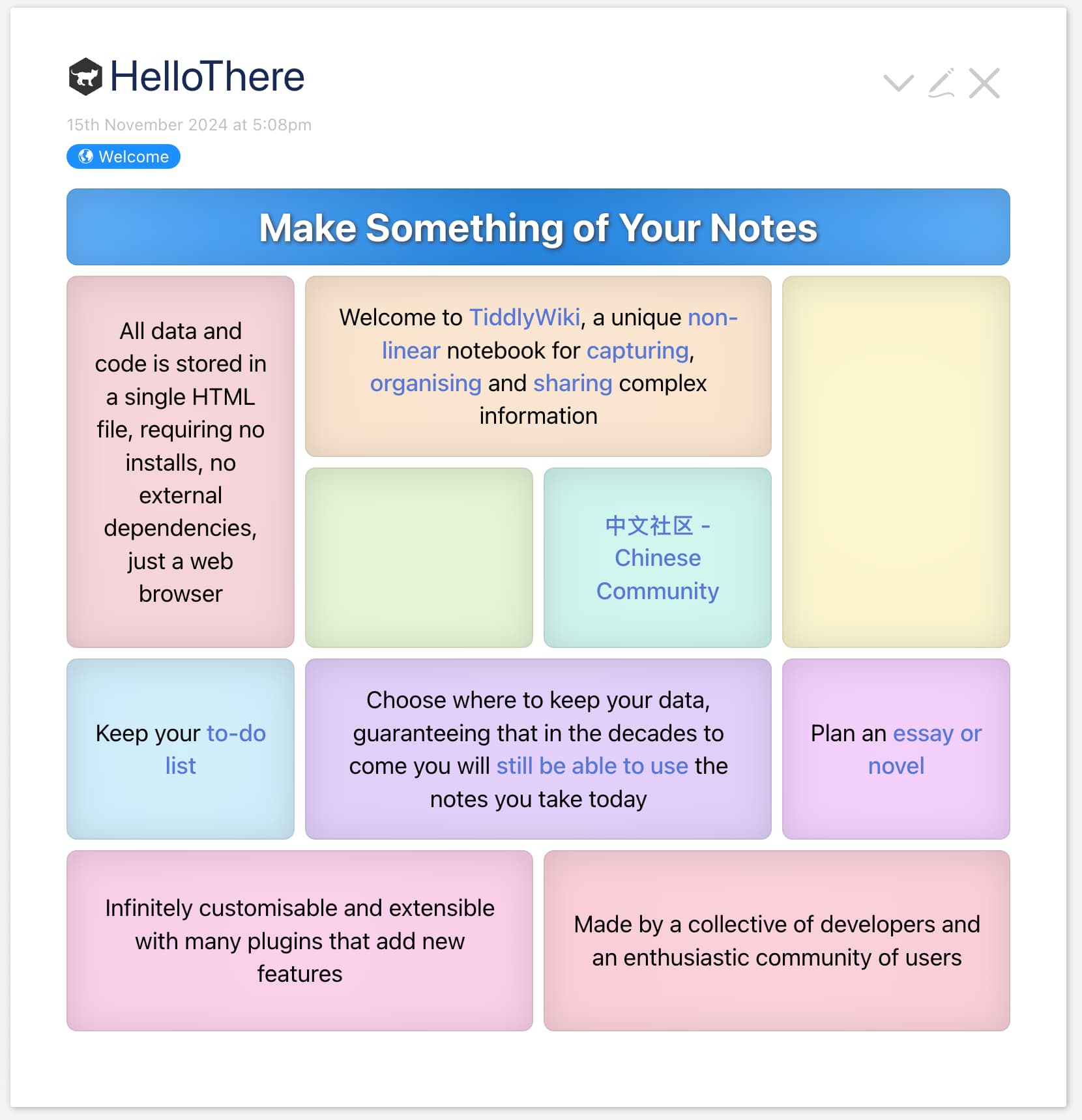
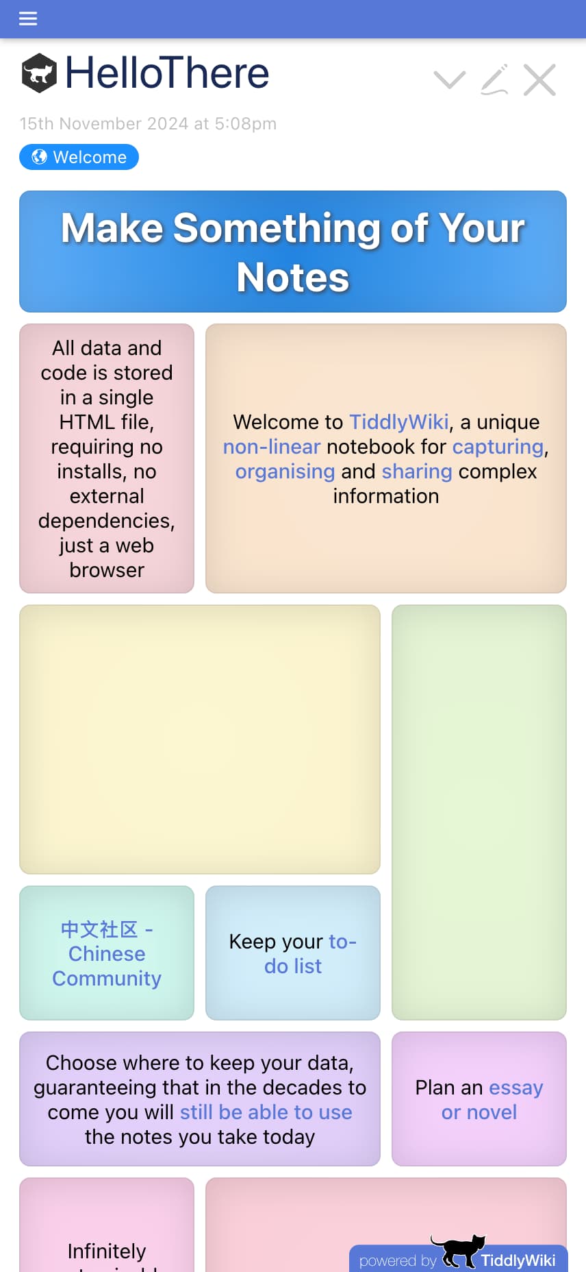
My idea was to turn the bullet points and paragraphs of HelloThere into boxes within a bento layout. I’ve got as far as a very basic grid layout with some basic styling. First is the desktop layout, and then the mobile layout.
There is obviously a couple of gaps, and I also want to add some varied, appropriate images to go into some or all of the boxes to add visual interest.
While I was working on this I noticed that a few of the links in HelloThere should be updated. For example, “essay or novel” links to a very old TiddlyWiki edition that was wonderful at the time, but is now surely too old to be relevant to users coming to TiddlyWiki for the first time.
This is the sort of work where I would welcome assistance: anyone who can write good copy, or can design layouts, or compose pleasing colour schemes, or any of the other skills needed to make our front page as good as it can be.
(“Cards” maybe feels a little dull to me, but the historical link is very neat, and reminds me I have a long dormant retro computing plan of playing with HyperCard)
 ” I don’t think a flag will necessarily be a problem but if anyone starts talking about a monarch, well, maybe that’s the time to start sharpening the guillotine and singing the Marseillaise! And I’m English.