Any previous diagramming tool/ mermaid plugin or thing which does CPA/ PERT diagrams?
See below for an example:
I only recall Gantt charts. But search for tiddlywiki project management as a possibility. I also think you could find graphing or chart utilities that may go a long way to presenting this. I assume that you need it to find the critical path as well?. I think this would be trivial in tiddlywiki but has it being done yet as you ask?
Hi Tones,
I was just thinking purely from a diagram point of view, but it’s a good thought! I know there are some clever solutions for other types of graphs and diagrams but couldn’t recall CPA… Was hoping I might have just missed/forgotten the brilliant resource that did.
A form of this could be written with the railroad plugin used for some of the tiddlywiki.com documentation.
Hi @TW_Tones , is there a tool for Gantt-charts in TW? I’d love to have it!
The time lines plugin does Gantt chart like. I’ll dig out the link when I’m back on a pc.
Mermaid plugin can do Gantt charts, with some limits (no clickable wikitext in graphs).
mermaid-tw5 plugin
Fred
Great!
It seems that it can do timelines as well! @Ste_W You should have a look at this, seems to be close to what you want.
The syntax for is understandable but it would be great to
- be able to generate charts based on tiddler-fields.
- scale the chart in a frame.
Are there any implementations of that out there?
The flaw of mermaid is that the diagrams cannot create wikilinks :-(. Square brackets ruin the graph immediately. I would like to click objects on the charts to retrieve information.
vis.js Timeline — emkay plugin, reloaded is the one I was thinking of for a bit of Gantt.
If you are into that kind of thing, you could create a gantt chart with CSS: How to Create a Simple Gantt Chart Using CSS Grid
@Charlie_Veniot link How to Create a Simple Gantt Chart Using CSS Grid is very promising.
One thing it makes obvious is a Gantt chart is only aligned multiple timeline rows.
In this CSS example the data ie months and tasks across the “multiple timelines” is coded in CSS.
- In tiddlywiki we can replace row columns with list widgets and dates from tiddlers
- Ironic really CSS supposed to ONLY format the Data in this case it is the formatting AND the data.
- All you need to do is to edit the CSS version to pull data from tiddlers.
But there are so many features including zoom in and out with this that I would use that first.
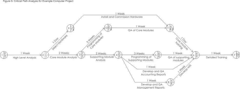
Just stumbled across a graphviz plugin (GitHub - chanilino/tw5viz: Graphviz plugin for tw5 (Tiddlywiki) · GitHub) which kinda lets me create something closeish.
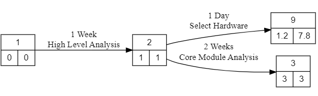
<$viz text='  digraph g {

    node [fontname="Arial"];
    node [shape=record];
    rankdir="LR"
  1 [label="1\n|{0|0}"];
  2 [label="2\n|{1|1}"];
  9 [label="9\n|{1.2|7.8}"]
  3 [label="3\n|{3|3}"]
  1 -> 2 [label="1 Week\n High Level Analysis"];
  2 -> 9 [label="1 Day\n Select Hardware"];
  2 -> 3 [label="2 Weeks\n Core Module Analysis"];
}' class="myexample"/>```@Ste_W note that recent discussions on Nearby Neighbours are closely related to this thread.
- Related to this is some work I am doing to allow a network of tiddlers to be entered
- Networks, as opposed to hierarchies or lists which we are more familiar with in tiddlywiki actually look a lot like your OT Pert diagram.
- I am doing this to support real world data and relationships, to be capture/entered as easily in instinctively as “new here” does for hierarchies.
- Shortest paths, critical paths and weighing connections has arisen in the Nearby Neighbours discussions.
- To really test Nearby Neighbours, we need test date of the network style, in part why I started the above.
For your reference Gantt charts include much of the same information as does a Critical Path analysis. There are some tiddlywiki implementations, on which you could build.
Yeah. In the real world you would just plan using Microsoft Project or similar which creates a Gannt style layout then press a button to be shown the critical path, but I still need to deliver Critical Path as part of several course syllabi (syalabuses?)