…I know this is quite a hard task for css. But there are some tricks and libraries achieving this and perhaps someone knows a solution for TW
.
Yes, container queries do this well:
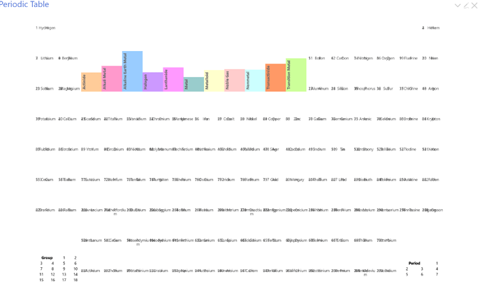
It’s not a TW trick, just standard CSS. I use them in my periodic table demo; the relevant CSS is in $:/_/my/styles/periodic-table.
oops, at the moment your table (at least in my FF) seems to be broken.
Where do I find the code?
I have come up with this solution using a svg which scales to the container. (Now it works)
\define alias() <$list filter="[all[current]get[alias]]" emptyMessage={{!!title}}><<currentTiddler>></$list>
\define fontlink() https://fonts.googleapis.com/css2?family={{{[<fonto>search-replace[ ],[+]]}}}&display=swap
\define typography(font, viewbox, y, text:<<alias>>)
<$vars fonto="$font$">
<$wikify name="flink" text=<<fontlink>> >
<link href=<<flink>>  rel="stylesheet">
</$wikify>
<svg viewBox="0 0 $viewbox$" >
<text y="$y$" style="font-family: '$font$';">$text$</text>
</svg>
<$vars>
\end

<<typography "Finger Paint" "116 27" "20">>
The only flaw is that you have to add the two viewbox-values (here 116 27) by experimenting
I think I might have misunderstood in any case. In this demo, the font-size scales with the container, but it looks like perhaps you want the text string as a whole to scale that way:
Container Query Demo.json (271 Bytes)
Can you give me details (FF version, OS, what’s not right)? The annotated version is waiting for a bug fix now in active development at Mozilla, but everything seems to be working for me in latest FF on Windows and Ubuntu. The source is at https://github.com/CrossEye/TW5-Chemistry.
If you’re looking to scale so that the text fully fills the container, and if you don’t mind part of it being written in JS, then we might be able to convert a 10-year old technique I wrote that used jQuery: javascript - Calculate font-size required for text to fill desired space - Stack Overflow. Converting the code would be easy; figuring out how to integrate that back to TW might take a bit more, and I never even thought about how to handle resizing.
Hmm, I saw that once in an ancient version of Brave, I think, but it went away after an update. I’ll put it on the growing list of things to look at when I finally get back to that codebase. Thanks for the report!
Should this json already be styled to fit if it was dragged eg to tiddlywiki.com or does it need an extra ingredient?
The text should be styled to scale with the container, but not to fill it. That’s why I said I thought I must have misunderstood your requirement. The StackOverflow link shows a technique for fitting in the container, but it’s pure JS/jQuery.
I am very interested in this. Tamasha (a presentation edition/plugin) in TW uses a brittle method to scale the font and content.
I recived feedback from users when they use Tamasha on very big screen it fails (like a big screens used in conferences).
I tried to learn from reveal.js by Hakim El Hattab, but it seems it is based on some calculation performed in JS modules. So, I like to give a try to see how this works using pure Modern CSS.
Tamasha uses two modes, author mode (simple tiddler), presentation mode (enlarged single tiddler covers whole screen)
I’m not entirely up-to-date on the changes in CSS in the last few years, but last I knew this was simply not possible. CSS has lots of links to the DOM model, but the primitive items in that model are opaque to CSS. This includes text nodes. That means one text node in a certain spot in the DOM would be styled like any other text node in the same spot, regardless of the length of the string in that text node. The only exceptions I know to this are the pseudo-selectors :first-letter and :first-line.
As I said, I may be wrong – in fact I’d love to be proven wrong – but I believe this cannot be done with CSS alone.
SVG techniques, though, might do it.
