For the docs on widgets, couldn’t there be a little interactive “template” to test them, with checkboxes to set which attributes to apply and small editors (perhaps selectwidgets) to set values for the attributes.
AND, not only is the widget output shown but also the resulting widget code that the user can simply copy!
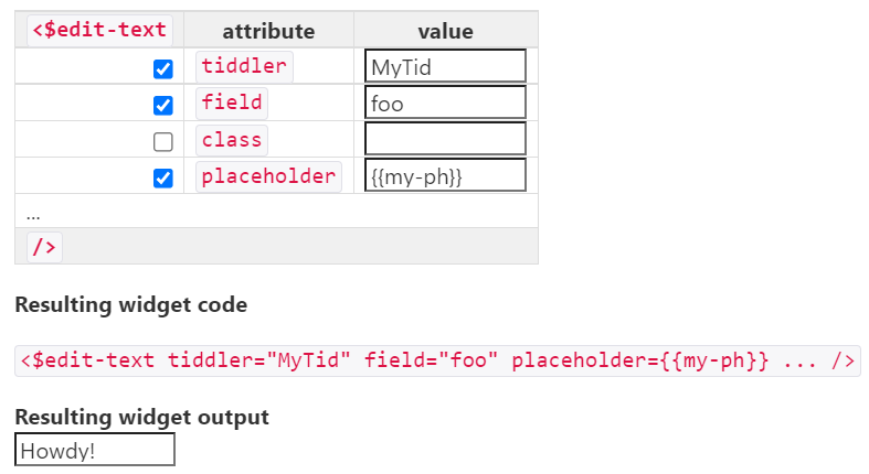
So, for example, in the EditTextWidget doc tiddler it could look something like this:
I thing this would be appropriate for most widgets, even if some don’t have any showable output result (only the code). ActionWidgets could perhaps have a option to embed them in a button or whatever other contexts there are.
…and I wonder if some script could be made to autogenerate this, i.e to list all a of the widgets attributes or if it would all need to be done by hand on a per-widget basis?
I believe this would make some widgets substantially faster to use.
That’s a bummer. But I just got an idea: maybe the existing attribute table in the doc could feature the checkboxes! So the resulting “fill in” is limited to what the user actually wants. That’s actually a good idea because some widgets have a zillion attributes.
I support your suggestion @twMat and have considered such things myself.
The complexity of widgets can make this also more complex, but one thing to keep in mind is most widget’s can be used in fundamentally different ways.
I suggest as you look into this as you consider building such a solution for each of the different forms of the same widget (where they exist) rather than trying to build one for the whole of the widgets functionality. This keeps it simpler but also helps the reader see the various ways such a widget can be used.
Such a project should be a continuous development process and may be best in its own wiki at a different domain address, with matching tiddler names to the tiddlywiki.com so we can provide a button on tiddlywiki.com to visit the “widget constructor”, by separating the wikis you do not need to comply with tiddlywiki.com stricter controls.
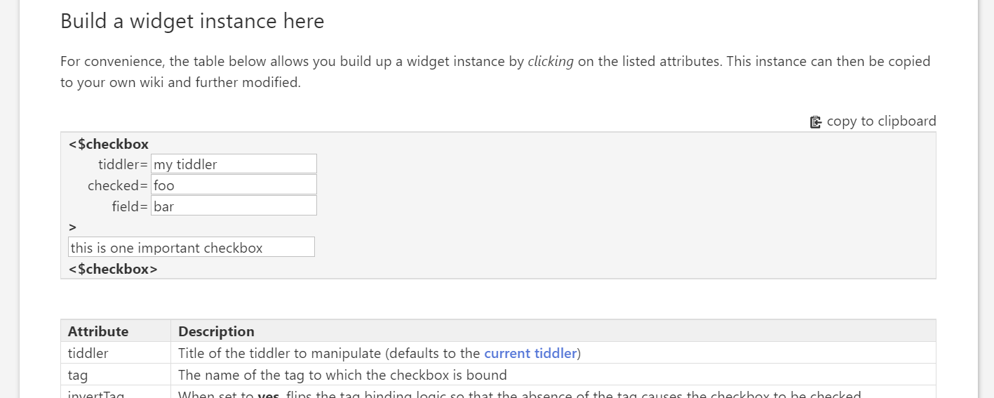
OK, the attached file is a modified doc tiddler (the CheckboxWidget tiddler) with an interactive mockup. The “building up” of a widget instance works so you can try it out, but “copy to clipboard” is just a dummy. You can drag the file to tiddlywiki.com to overwrite the tiddler there.
Basically, it is a section titled “Build a widget instance here” in the middle of the doc that appears like this in use:
Hi @twMat this is a good idea, and well worth exploring.
A concern at the moment is that it is not obvious that the attribute names in the table are clickable. I think it might be clearer to have a “+” button that brings up a popup that lists the unused attributes.
I notice also that using these controls marks the wiki as dirty, which seems unexpected. I think the problem is that you are using the “CheckboxWidget” itself as state storage. That’s super confusing because the tiddler ends up with a misleading modified date. Instead we should use a state tiddler in the usual way.
But then the user can’t as easily see the attribute description, including what optional values and defaults etc it has. So the user must either go back and forth or memorize stuff. This is especially problematic in a big table (like in the mockup). Alternatively, the whole table could be repeated in the popup which doesn’t make sense.
How about, still in the attributes table, simply adding a prefixing icon before the attributes? I.e like in the mockup but made clear that it is a button there. I played with using visible checkboxes but it was too dominating so I think it should be more subtle icons for what is checked vs unchecked.
I think it’s difficult to combine the table with this new user interface without compromising either the usability of the table or of this new demo gadget. Better to keep them entirely separate.
The trouble is that that makes the table more complex for people who are just looking things up and don’t want to use the new demo gadget.