Improving TiddlyWiki formatting/layout flexibility for non-developers

Prompted by discussions in 5.4.0 and other places, I’m curious about others’ thoughts on what the future could look like with TiddlyWiki in this area. Look and Feel are important factors in people choosing a software / platform. On the ongoing discussion here about “Is TiddlyWiki a note management tool, or a platform on which to build a note management tool?” My use of Tiddlywiki is most definitely the latter, and I think that many especially here in the forums agree.

TiddlyWiki is built on web technologies and have added toolboxes to simplify them:

  • HTML: Macros and Widgets are the toolbox to make this easy
  • Javascript: Filters and Action Widgets are the toolbox to make this easy (also Procedures, Functions…)
  • CSS: Much more limited tooling to make it easier. There are mechanisms for theme, toolbars, and layouts if you already know CSS, but no tooling to help build those. No real “primitives” on which to build with if feels like.

To me there are many ways we could take a next step in this area.

Small Step: Slight evolution of the base layout to a superset of current allowing people to very easily add/remove things like topbars, statusbars, and more than one side panel / story river. My recent post was meant to spark discussion to this end.

Medium Step: I’m not a web developer but I’ve heard of things and have seen posts about using things like grid and flexbox to make these types of things easier. Could we get to the point where if you want a panel docked to the side of the screen that there are some system recognized fields for “dock top/bottom/left/right”, maybe “scrollable-x: true / scrollable-y:true”, “height / width” etc. This type of philosophy aligns with how the rest of TiddlyWiki seems to work and would be very exciting.

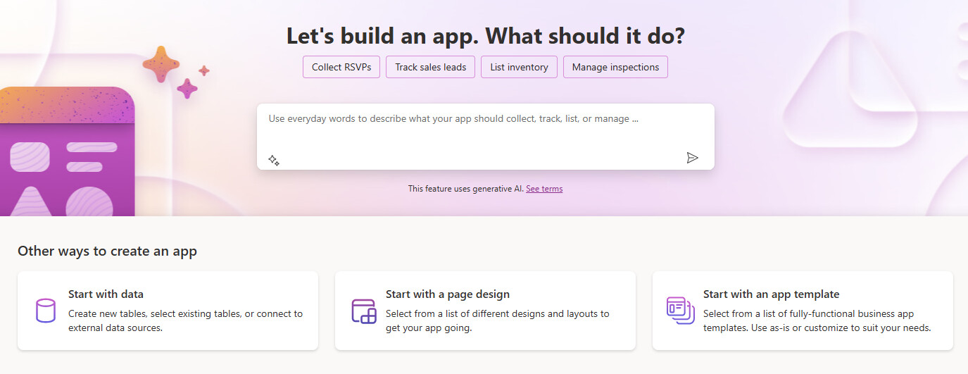
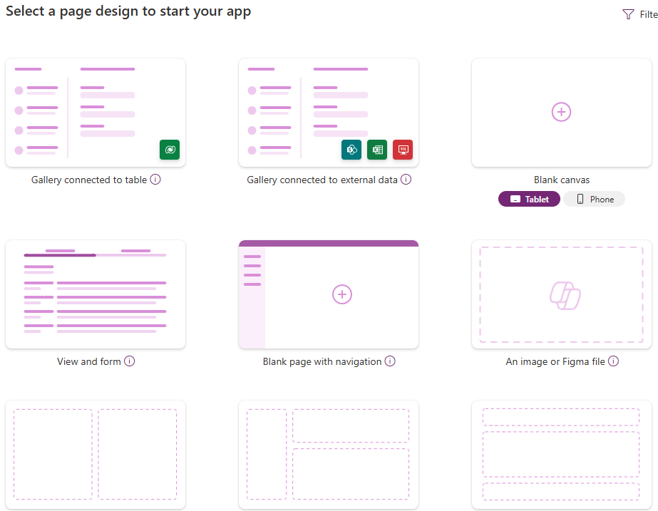
Large Step: Maybe somebody’s built this already, but what about a UI builder? Recently someone compared TiddlyWiki to MS Access (which I agree with), I’ve often thought of TW as a spiritual successor to VB6, and I’ve also used quite a bit of programs like AutoHotKey / AutoIT. These other “RAD Tools” have GUIs for building UIs for the tooling. Is something like that a good idea?

Is it possible that turning off the sidebar, turning off all tiddlers, and then just displaying the customized PageTemplate will do what you want?

Use the widget to make the query interaction interface and the output display part.

Hmm, sorry @tomzheng - I’m not understanding your question.

Let me phrase things a slightly different way to see if that helps answer it. One of TiddlyWiki’s differentiators is flexibility. People end up here because their other tool isn’t flexible enough and they find that in TiddlyWiki.

Pick a software - Notion, Roam, Obsidian, etc. People want to recreate what they like about these other tools but in platform what allows for the flexibility of TW.

  • Can they recreate the functionality of any of these other tools: Usually quite easily with “off the shelf” macros, widgets, etc. There are many “clones” here on the forums.
  • Can they recreate the look & feel of these tools: Usually depends on how much CSS you know. Not only are there widgets for the functionality side, there’s also documentation, examples, etc. to help you do it. If you want a left sidebar or to move the existing sidebar to the left, learn CSS or hope there’s a user-supplied tutorial (thankfully there are some here) and hope that’s close enough to what you need.

I have nothing against learning CSS, just like I have nothing against learning HTML or Javascript, but I’m pointing out that it’s a much different scale and support level of endeavor. If the core developers do want to position TW as a platform more than a tool, it seems to be an area with opportunity.

I work at a corporation with Office 365 and the closest thing to TiddlyWiki (in my opinion) is PowerApps.

The start of the process of building a PowerApp:

If you select “Start with a page design”

Within PowerApps I could build something that looks like TiddlyWiki quite easily, but not something that acts like it. From the TiddlyWiki version it’s the opposite. I can build a TiddlyWiki to function like a PowerApp, but to make it look like anything other than what it starts out with is much more challenging compared to PowerApps’s drag and drop experience.

5 Likes

The part of your statement that I quoted mentions access. l mistakenly thought you wanted a database query interface and data presentation display. But looking at your statement, it looks like you want a whole new look for your notes system and want to be able to drag and drop actions to customize the interface.

First issue. About the new look note system. This idea has already been raised in the previous “Obsidian beats TiddlyWiki” discussion. I think this can only be achieved by having a headless system that provides no interface but only an API.

Second issue. About drag and drop operations to customize the interface. This feature is usually found in commercial software on desktops. web applications have drag-and-drop customization, but it’s not common. If you just want to have the ability to choose the layout of the interface, see the previous issue.

I think this is achieveable and a good direction - at least with the approach much of the customisation for TW is done ( through widgets and reusable procedures) … I think of this approach as what I would call “low-code” … the Large step and how PowerApp works is what i would call a “no-code” - which i think is not where TW is at… )

BTW - I think we need a concept/word for “non-developers” that are stilll looking to cusomise TW … using widgets like <$list> and the filters - which still requires some code like thinking … I think they are not end-users who just want a Note taking app… but not full developers wantiing to understand the internals… The documentation could be better split to support this group if they were identified as such.

5 Likes

I think doing something like this would be quite possible. However, we have few example layouts. Creating them would be a fair bit of work. Then we’d have to figure out a major question: Would we want a builder edition, which has the sole job of creating your base wiki? Or would we want this to be part of your regular use of the wiki: add some content, tweak the color scheme for links, add some more content, visit the layout manager and add back that footer?

The first option sounds much simpler to achieve. You go into the builder, choose your template, create the filters or whatever to configure it, and get a layout bundle that you can just drag to your wiki. If you need to alter it, you drag it back to the builder, tweak it and drag the result again to your wiki. But it has a significant drawback: you would not be able to preview it in the builder with your live data. It’ll be quite annoying when you create a layout and drag it to your wiki, and find that the main page has none of the avatars that you were expecting because you told it to use the tag People, when the wiki actually uses Person.

This concern would make me want the second option: a new Control Panel tab, let’s say, that shows in real-time what your new layout might look like. But this is more intrusive, much more difficult to build (I imagine) and a little scary: let’s say you choose some builder option that hides the editing interface. Once you close that control panel, your wiki is stuck, and there’s no obvious way to go back. (Yes, I know, backups, first rule of Tiddlywiki, grumble, grumble.)

So it’s an interesting idea, and one that might spur us to get more serious about reusable layouts. But it’s a lot of work, and will take a great deal of up-front thinking.

From what I’m familiar with, you typically have your standard users, your power-users, then you have your programmers.

I think in this instance it would be for standard user customization, whereas using filters or tags to control the UI, might be power user level control, etc.

But that’s just my way of conceptualizing it 🤷