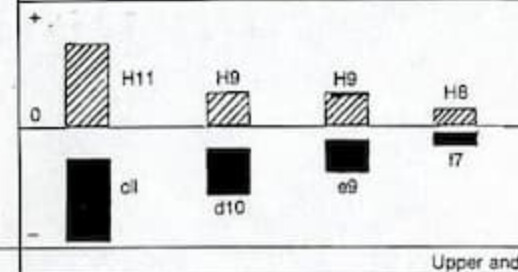
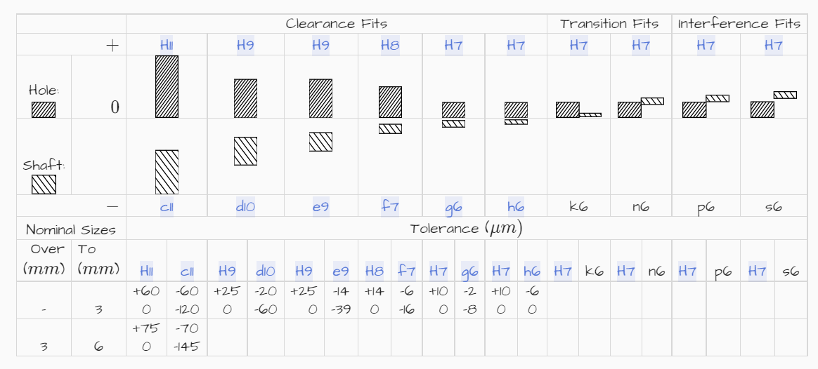
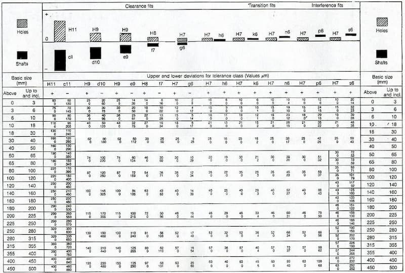
I am trying to recreate the Holes and Fits information traditionally much scanned and copied from the BS poster 4500a as I’m tired of having eyestrain from printed sources (I need glasses) or the blurfest that is most online copies. See here for the one of the better examples.
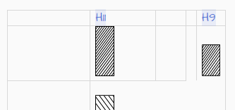
I thought I could be a little clever and have each of the boxes at the top as its own tiddler and then use the table lines as the divider. Then the diagram will always line up with the data regardless of screen size.
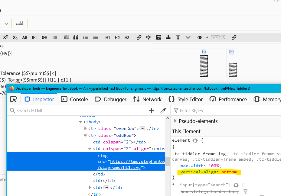
What browser Mat? Chrome and FF work with just the img for me. I did double check, because it was the TD I targeted first and figured I’d left that behind and forgot about it. Turns out, it works on just the img here in both browsers.
I am not sure but is your answer CSS with 0 padding or 0 margins in the top and bottom?. If so you can introduce all the css styles you can imagine using html tags to build tables with lists driving the number of rows and columns. Sometimes even negative margins make sense.
I’ve only just had a chance to sit down and look at your help, and ummm…
To wrap the table in a class then target I do something in a $:\tags\Stylesheet tiddler???
I am not too well versed in CSS selectors yet, rather I would with create a class and assign it to a row or column or use the style="" on the HTML element.


