Why? Testing if a wiki will be okay on phone.
We have …
IF I changed, for instance, height & width (virtual), would that help to test whether a wiki would look okay on a phone?
Thoughts?
TT
Why? Testing if a wiki will be okay on phone.
We have …
IF I changed, for instance, height & width (virtual), would that help to test whether a wiki would look okay on a phone?
Thoughts?
TT
No. All the values are read only. But browsers have a preview mode.
Very useful to know.
also available in Chrome:
And on a mac: Command-Shift-I etc.
(But oddly, Chrome is apparently listening directly to the hardware key-press location, not necessarily where I is according to the active keyboard layout. So those with alternate keyboard layouts may experience a glitch here.)
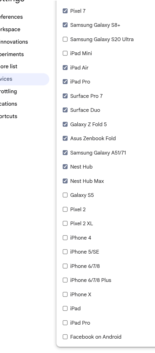
Mama Mia! I never realised there was so much variation in phone screens!
For testing purposes is the exact pixels of Width & H. needed?
Or would ratios of W:H be enough?
UPDATE …
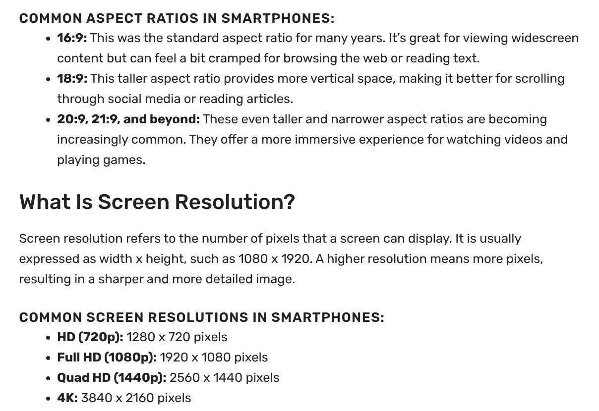
At Phone Aspect Ratio: Guide - 9meters I read …
Q: Would testing in boxes of the 3 current common aspect ratios listed be enough?
TT
I think the browser preview element is dynamic. So you can take the corner and move it, to see, what happens.