Idea - Turn TiddlyWiki into modern HyperCard?

I’m a super new user with zero HTML, CSS, or Javascript skills so I wouldn’t be able to implement this idea, but…

After learning about TiddlyWiki and how immensely customizable it is, I’m reminded of HyperCard, a very old program for the Apple Macintosh that’s a GUI-based visual programming environment with scripting and database functionality behind the scenes. It’s really hard to describe HyperCard, just as it’s kind of hard to describe “the power of a fully armed and operational” TiddlyWiki. Search for videos about HyperCard can also help understand it.

To get a feel for it, there is a modern implementation of the HyperCard concept in Decker: a “multimedia platform for creating and sharing interactive documents, with sound, images, hypertext, and scripted behavior”. It is intentionally a black-and-white system, and there is a gallery of things people created with Decker: GitHub - 1jss/awesome-decker: Links to Awesome Decker Decks and Resources

My random idea is: What if a plugin can be made to implement the HyperCard UI/UX in TiddlyWiki? This “new HyperCard” would be open source - just like TiddlyWiki - and can harness modern multimedia capabilities (including color!).

Again, I have none of the skills to do this, but fondly remember tinkering with HyperCard decades ago, and think lots of it is in TiddlyWiki…

5 Likes

To anyone of the proper generation and geek-level, I always describe TiddlyWiki by inviting them to remember Hypercard, and then imagine what a two-generations-matured multi-dimensional version of it would be like.

Zoomin mode gets us 90% of the way toward looking like hypercard. Honestly, it’s been a while since I’ve interacted with hypercard’s interface, but I think it’s really just a matter of hiding some of TiddlyWiki’s advanced features.

3 Likes

I don’t know much about HyperCard or HyperTalk but a quick read of the Wikipedia entries suggests two fundamental differences.

The first as Springer points out is that TiddlyWiki is probably more powerful - I say this simply based on the age of HyperCard - it’s rare to find public facing software 30 years old that compares with modern.

The second observation is the scripting language HyperTalk intended for novice programmers to write apps and interfaces and there I can see differences - Hypertalk looks as if it designed to be simpler than Javascript.

Tiddlywiki is browser based and so inevitably users wanting to create their own custom interfaces and plugin applications will end up encountering HTML CSS and Javascript.

There are some tradeoffs in Tiddlywiki due to it’s browser dependency - what you get in return is a wiki that can travel on almost any operating system that has a browser - you can run TW on your phone, tablet and laptop.

1 Like

Thank you @zapiar, I have fond memories of HyperCard. In fact, the first really TiddlyWiki-like software that I wrote was a simple HyperCard clone back in 1989/90. A client had asked for a multimedia front end; my HyperCard clone was a stack of cards, each containing arbitrary rectangular widgets like images and live video, all arranged by drag and drop.

Nowadays HyperCard is held in great regard, and there is an active community of retro computing enthusiasts around it. I particularly like this modern reworking of HyperCard as a web app:

6 Likes

This is not necessarily true unless you look under the covers. You can remain wholly within tiddlywikis platform and not need to take much account of “HTML CSS and Javascript”. On one hand Tiddlywiki is implemented in “HTML CSS and Javascript” you do not need to know it, on the other hand because it is implemented with this technology “HTML CSS and Javascript” can be integrated into it, or you can learn about these technologies inside your tiddlywiki.

2 Likes

I stand corrected :slightly_smiling_face: I was thinking exclusively “under the covers” because of the but of course you are right that customisations can be made without delving into HTML CSS and Javascript.
1 Like

I think tw is already a app dev platfrom (so it’s important to setup standards).

See how many apps I’m already using: What mobile launcher are you using, how will you design the TW layout launcher? - #4 by linonetwo , some of then are lowcoded with wikitext.

1 Like

Wow thanks for all the interesting responses!! Upon reflection, I agree TiddlyWiki is technically far more powerful than HyperCard.

That said, it might still be an interesting project to create a version of TiddlyWiki - perhaps via a combination of plugins and layouts - so that its user interface (UX), user experience (UX), and exposed functionality closely matches that of the original HyperCard.

I agree.

One use would be to serve as a gradual introduction to TiddlyWiki for people who know HyperCard (though we’re an aging cohort!). So the user starts out with an interface that looks and feels very much like Hypercard, and gradually the “training wheels” can come off, revealing the powerful stuff under the hood. But only at the speed that the user is ready for. :slight_smile:

1 Like

And, for reference, another implementation of the HyperCard concept but with Python as the scripting language is CardStock:

https://cardstock.run

I chortled when you said TiddlyWiki was more complex than HyperCard… like do you realise what you can do with it, and what it actually does?

Then I realised, I only have a passing knowledge of TiddlyWiki - long time fan, but I never became a serious user of TiddlyWiki, and that was in part, for me, because the interface and features just didn’t suit me.

So. First, thanks for the link to CardStock. CardStock looks bloody brilliant, it’s a great fascimile of ole HyperCard (I’m not a fan of Decker, it being too reverential to the old skool aspects ).

And Second, please do do a theme for TiddlyWiki that makes it behave more like HyperCard - for example it might only show one card / tiddle at a time perhaps, I’d love to see that!!!

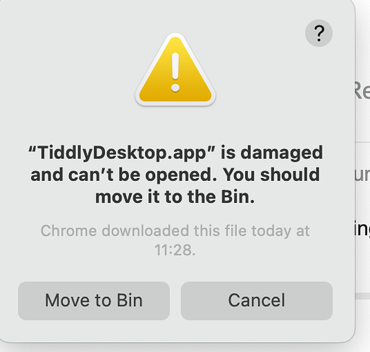
p.s I just downloaded Apple-silicon version of Desktop TiddlyWiki and it won’t launch. No clues in the Privacy & Secuity Prefs window either. It just says it may be broken. Mac M2 Sonoma 14.5 (23F79)

The 64bit version worked, once I’d gone through the “Allow anyway” in System Prefs.

1 Like

See $:/ControlPanel > Appearance > Story View ($:/core/ui/ControlPanel/StoryView) and select the “zoomin” view.

-e

2 Likes