Idea: Enhance radio widget to use listField like checkbox widget?

The checkbox widget can include or remove a title from a list field using a fairly new parameter listField. The checkbox shows if the title is present in the list, and it can be removed with a click.

A radio widget typically only adds the selected item, and when changing removes the other. But always has one value (if any are assigned) This is helpful when you only want one of a set of values.

  • The check box widget can be made to do this with its actions however using the checkbox icon does not imply it is an either or as the radio icons do.

I wonder If we could have a way to get the checkbox widget to use radio icons, and or the radio widget to allow a listField to be named?

1 Like

I agree I also wanted to use the look of a radiowidget to perform what only a checkbox-widget can do.
I principle I would have liked it to be a style of the checkbox. This brings me to the question: What’s the advantage of this as a separate widget?

1 Like

Maybe this article is helpful:

I would not agree. One single Checkbox is an either or: either activated or not.

Cheers,
Thomas

Of course that is a single checkbox, two or more it is a different thing.

  • For more than one item, checkboxes are either/OR, radio buttons only OR.
  • A range slider is also an OR only for a range of numbers.

Let us assume for a moment I fully understand the difference between radio and checkbox’s;

  • First, a key here is what the icons use for checkboxes and radio selectors mean visually to the user. I have no desire to undermine this, in fact I wish to make use of it.
  • The radio nature of the tiddlywiki radio widget in part comes about because we use a fieldname and only set that field to one value at a time.
  • The checkbox widget now allows use of the listField, this allows multiple logical states to be stored in a single “list field”.
  • One way to see where I am coming from is to consider using a combination of these checkboxes and radio elements against the tags or an alternate tags like list.
  • My idea was to
    • allow the radio widget to also use a listField - adding actions or a parameter to eliminate values from that list field not selected by the radio button. But leaving other values in the list field in place.
    • This logic can be achieved with the checkbox listField already, so if we can change the checkbox icons to radio icons we can emulate this behaviour.

Although I think an out of the box radio widget that could behave this way is a good idea, I think I may go ahead and build my own custom widget for this driven by buttons. In part because I can possibly add other smarts and logic.

But I remain interested in other views and possible prior art.

I have written a solution for this. I am struggling to find a good procedure name, for now lets call it working-title

It works like this;
<<working-title fieldname values [condition]>>

  • fieldename is a fieldname in which the values is or will be set
  • values is a space delimited title list but may include filters.
  • condition is a filter that determins if it will be displayed or not. defaults to display with [all[current]].

Here are some examples I will discuss;

# <<working-title status "A B C">>
# <<working-title status "new wip done" condition:"[all[current]tag[todo]]">>

eg;
Snag_a60884
with the status field set to new B X

Important points;

  • the fieldname is treated as a list field
  • the working-title procedure will only set and unset the values it is given
    • other values and more than one set of values can use the same fieldname
  • There are additional parameters to determine how the list is displayed join, end and spacers.

What if any additional features should I add before publishing?

Possible futures;

  • Optionally include next and/or previous value buttons since a radio list is often followed one after the other. Or perhaps next and reset (first) and let previous be done manually.
  • other ideas?

[Edited]

Here is an example of my progress so far

\procedure radio-list-field(fieldname values condition:"[all[current]]" join:", " end:"." spacer:"&nbsp;" eol-tag:"" nav-buttons:"no")
   \procedure reset-value-actions()
      <$action-listops $tiddler=<<currentTiddler>> $field=<<fieldname>> $subfilter="-[enlist<value-list>] [<value>]"/>
   \end reset-value-actions
   \function break() [<item>match<items>then<end>else<join>]
   \function next.value() [enlist<value-list>after<current-value>]
   \procedure not-set()
       <span title=`click to set to $(value)$`>
       <$button class="tc-btn-invisible" actions=<<reset-value-actions>> >
          <$transclude tiddler=<<thisTiddler>> field=unchecked-image/>
       </$button><<spacer>><<value>><<break>></span>
   \end not-set
   \procedure is-set()
       <span title=`It set to $(value)$`>
       <$button class="tc-btn-invisible" tooltip="current Value">
          <$transclude tiddler=<<thisTiddler>> field=checked-image/>
       </$button><<spacer>><<value>><<break>>
   \end is-set
   \procedure set-next()
       <span title=`click to set to $(value)$`>
       <$button actions=<<reset-value-actions>> class="tc-btn-invisible" >
          {{$:/core/images/right-arrow}}
       </$button>
       </span>
   \end set-next
   \procedure set-reset-button()
       <$let value={{{ [subfilter<value-list>first[]] }}}>
       <span title=`click to set/reset to $(value)$`>
       <$button actions=<<reset-value-actions>> class="tc-btn-invisible" >
          {{$:/core/images/refresh-button}}
       </$button>
       </span>
       </$let>
   \end set-reset-button
   \procedure show-nav-buttons()
      <$list filter=<<next.value>> variable=value emptyMessage=<<set-reset-button>> >
         <<set-next>>
       </$list>
   \end  show-nav-buttons
<$list filter="[subfilter<condition>]" variable=~>
<$let items={{{ [all[current]enlist<values>count[]] }}} 
         value-list={{{ [all[current]subfilter<values>join[ ]] }}}
         field-list={{{ [all[current]get<fieldname>enlist-input[]join[ ]] }}}
         current-value={{{ [enlist<field-list>] :intersection[enlist<value-list>] }}}
>
<$list filter="[<nav-buttons>match[yes]]" variable=~><<show-nav-buttons>></$list>
<$list filter="[enlist<value-list>]" counter=item variable=value>
<!-- is <<value>> in <<field-list>> -->
<$list filter="[<value>match<current-value>]" variable=~>
       <<is-set>>
</$list>
<$list filter="[<value>!match<current-value>]" variable=~>
       <<not-set>>
</$list></$list><!-- end values --></$let></$list><!-- end condition -->
\end radio-list-field

# <<radio-list-field status "A B C">>
# <<radio-list-field status "new wip done" condition:"[all[current]tag[todo]]">> if todo
# <<radio-list-field status "new wip done" join:"">>

To use get the tiddler radio-list-field.json (3.8 KB)

1 Like

Hi Tones,

I like the idea very much, thanks for sharing!
May I suggest the following enhancements:

  • Add a (CSS-) class parameter to be added to each item, or even better, two parameters selected-class and unselected-class
  • Add a display (inline or block) parameter, for items to be displayed on the same line or each on its own line. Or maybe this is the purpose of the spacer parameter?

Fred

I have added a html tag to the buttons span or html to select inline or block in my latest version an will add class. Have you any suggestions for css defaults?

Not especially, but I remember needing classes when I tried to design a wiki usable on PC as well as on phone, for UI elements like radio buttons or checkboxes.

Here’s an example:

and the code, which might not be really useful out of context:

\define viewIcon() {{$(iconName)$}}
\define isDisabled() {{$(disabled)$}}

<$tiddler tiddler="$:/temp/newroutetry">

<div class="formulaire" style="display: flex; flex-flow: column;">
<div style="flex: 1;">

!! {{{[<grimpeur>]||template-inline-climber}}} sur la voie {{{[<voie>]||template-inline-route}}} :
</div>
<div style="display:flex;flex-flow: row;"><div class="formulaire" style="flex:1;">

;RĂ©sultat :
:<$list filter="[tag[RĂ©sultat]]" variable="resultat"><$let iconName={{{[<resultat>get[icon]]}}}><$radio field="resultat" value=<<resultat>> class="route-try">&nbsp;<<viewIcon>> <<resultat>></$radio><br></$let></$list>
</div>
<div style="flex:1;">

;Circonstances :
:<$list filter="[tag[Circonstance]]" variable="circonstance"><$let iconName={{{[<circonstance>get[icon]]}}}><$wikify name=disabled text={{{[<circonstance>get[disabled]]}}}><$checkbox listField="circonstances" checked=<<circonstance>> class="route-try" disabled=<<disabled>> >&nbsp;<<viewIcon>> <<circonstance>></$checkbox></$wikify><br/></$let></$list>
</div></div>

Associated CSS:

div.formulaire input {
    min-width: 60%;
}

div.formulaire input[type="checkbox"] {
    min-width: 0%;
    vertical-align: baseline;
}

label.route-try input[type="checkbox"] {
    appearance: none;
}

label.route-try input[type="checkbox"]:disabled~span {
    color: lightgray;
}

label.route-try.tc-checkbox-checked span {
    border-radius: 10px;
    padding-right: 0.5em;
    border: 3px solid lightgray;
    background-color: lightgray;
}

div.formulaire input[type="radio"] {
    min-width: 0%;
    vertical-align: baseline;
}

label.route-try input[type="radio"] {
    appearance: none;
}

label.route-try.tc-radio-selected span {
    border-radius: 10px;
    padding-right: 0.5em;
    border: 3px solid lightgray;
    background-color: lightgray;
}

label.route-try {
    font-size: 25px;
    line-height: 30px;
}

div.formulaire input[type="checkbox"] span {
    vertical-align: baseline;
}

div.formulaire textarea {
    min-width: 60%;
}

div.formulaire select {
    min-width: 60%;
}

Fred

1 Like

Whilst working on an unrelated issue, I realised that I have tended to use a list of radio buttons to select one only of a list.

However I realised is is equaly valid as a standalone radio button, on multiple tiddlers, for example for all tiddlers of the same type eg project, we can have a radio button that if selected makes the project we are looking at the selected project. If not set it is not the current project.

  • If you use object-types you could have a selected item for each object-type

Simple but useful.

And the lord did speak with a voice as of thunder, saying,

Cast aside all standalone radio buttons for they are an abomination in my sight! Seek you not to confuse the users and their children and their grandparents and their uncles and aunts and brothers and sisters and their hamsters in their little cages, nor seek you to annoy the great programmers on high, for it is they that sought to give to you these gifts calling them HTML and CSS and JavaScript and TiddlyWiki


And the cheese makers – blessed be the cheese makers for they are holy in my sight.

Clearly this comes from the ancients?.

I stand to be corrected, and perhaps changing the icons will appease the gods, but the idea that every tiddler has a single radio button in the subtitle that indicates it is selected (or not) as the current member of a list of similar tiddlers eg a project tiddler (is this the current project?), a task tiddler (in this the current task?), page tiddler is this the current page? 


  • Remember the story is in effect a list of tiddlers, so perhaps when one is displayed on a tiddler in the story it is not a standalone radio button, but a radio button on all listed in the story?

or something :wink:  

Let’s see if I understood this. If I had to rephrase this as a use case, it would say:

As a user of Tones’ project management app, when I look at a tiddler that belongs to a project, I want to be able to make this project the active project with immediate effect and no option to undo.

Is this correct?

Not exactly. Lets say I am working on my tiddlywiki project and that is my focus for the next hour. I open the project and indicate its my focus.

Now I get to work including reviewing to do lists in subprojects. I open tasks, read reference research things and record the details. Open and close other tiddlers and projects.

  • In the sidebar there is views of the current project. Stats on tasks completed today in the project, quick links to reopen the project in the story.
  • It is easy to always return to my focus and links to facilitate it.

I get a phone call and go to my communications tools, work on a client. When finished ask where was I, oh the current project is tiddlywiki.

  • back to work in a jiffy.

The currentProject has no consequence other than focusing on it. No need to undo, just reselect.

  • A multitude of side bar tabs could list, not all things, but only things about the current project.

I intended to only place the current project radio button, on the project tiddlers, but riffing of what you said I could have an indicator on any tiddler telling me if it belongs to the current project or not.

  • The same can be done for subjects or categories and more.
  • You could even configure a separate story for a project.

This confirms that my user story (it is only relevant for the interface element you suggest) is correct. All the rest is nice to know context – actually what I assumed to some extent – but not necessary knowledge for the programming (choice) of the interface element that sets the focus project.

Technically, the task of the interface element is to save the focus project. This could be done e.g. by setting the project name as the value of the text field of the tiddler $:/config/FocusProject (correct me if I am wrong).

Now we would have to check the available interface elements and choose the best option from a user perspective.

  • Checkbox
  • Radio buttons
  • Button

Why would you choose a single (!) radio button which would present a completely unusual element to most users? Why not a button? Why not a single Checkbox?

Last but not least: What if a user activates the interface element by accident? Why not have an undo option? (I only wanted to compare with another project, but then the cat jumped on my mouse – how can I return to the task or project I had been working on before?)

Sorry if this is not relevant for you, but it would be for me.

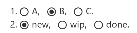
I suppose the way I was looking at it the radio box may appear on one or more projects in the story, one will be selected, setting it apart, and I am just making that selectable. But the radio icon implies “this is it”, and none of the others will be anymore.

  • I implemented it in the subtitle so its small and you must be deliberate to use it. I doubt I will hit it accidently.

It may have to do with the bigger picture in my personal organiser wiki. For example I have half a dozen smaller projects containing repeatable tasks. Which was I last using is nice to know, or an easyway to indicate I am now focused on another, replacing the last.

I do think there are a range of “currency settings” and selection tools that can help people working within a large wiki, that we could develop.

In your example it is somewhat trivial for us to also maintain a history permitting you to undo, but also review where you have being. I did not include it in this idea because I already have a history tab that does this for last navigated tiddlers, and even the focus tiddler solution, https://focus-tiddler.tiddlyhost.com/

  • If I were introducing undo etc
 I would be more likely to use a button and use ctrl-click to undo as an example. Radio buttons are not usually undone.

Back to the Original Topic I have shared a preliminary version of a radio button that can use a list field and contain multiple sets of radio buttons in the one field, you could even add special logic on top of this.

  • Perhaps if you state what you would like we can build it?

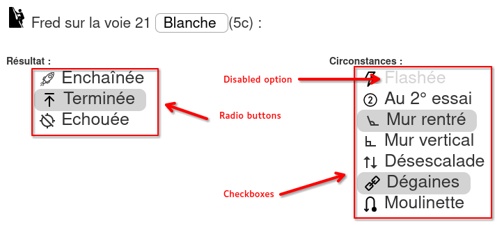
[Edited] Let me illustrate;

In the side bar I have a table of installed packages, I can select the Current Package I may be working on.

Snag_11e79edc

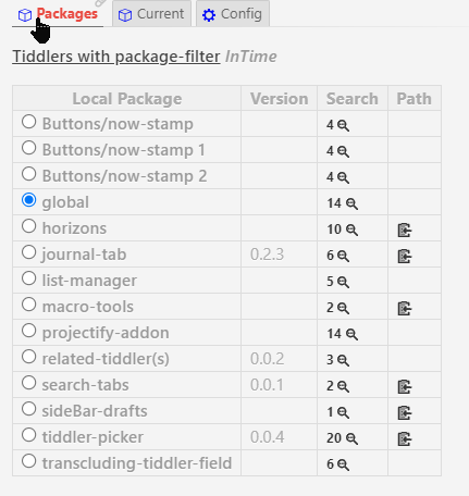
When I open the Global package I see this;

Snag_11e8aa02

If I open a package that is not the current package I see this;

Snag_11e9ecb4

  • Thus I know its not the current package, but can make it so.
1 Like