@jeremyruston What do you think?
Happy to tweak any design things. This is just a default theme.
I quickly made that graphic, I’m also not sure what font is in the core logo.
@pmario can you make a new version?
Does it allow SVG images, so we can scale them in a lossless way?
Yes.
There are a couple of notes that non-SVG formats are needed for the ones that go in email.
The alternate logo image used at the top of your site’s email summary. Use a wide rectangle image. Don’t use an SVG image. If left blank, the image from the
logosetting will be used.
Do we have a GitHub repo, where I could send a PR for some SVG suggestions about the banner logos.
I do have 2 versions for the wide-banner and 1 version for the 40x40 which is shown when you scroll down. …
They are all SVGs since Discourse also uses an SVG banner. See: Discourse Category Banners - theme - Discourse Meta
The problem with the existing smaller icon is, that it’s a 1024 x 1024 JPG which needs to be downscaled by the browser to 40x40px … So the TiddlyWiki text isn’t very readable anymore.
I think an SVG could improve this. … We will see.
The favicon also seems to use this image, which is even worse readable. … I’m not sure, if the favicon should contain any text at all.
Is it possible to define the file for the favicon? … If yes we need to create a new one. … The existing one is very similar to the favicon at tiddlywiki.com …
The forum icon should be “branded” but imo it should be different to the icon of the main page. … Will think about that too.
-m
Don’t have a Github yet, if you / someone wants to make a custom Discourse theme it would be welcome! I believe they are CSS/HTML/JS only.
You should be able to attach / upload SVGs directly to this thread for now.
Also, I’m happy to grant you admin access so you can edit the Branding site settings directly. The settings for all the logos are just a simple backend upload. I’ll send you a PM about this.
@jeremyruston … It would be interesting how the e-mail logo looks like. When you get the new logo please let me know.
For the favicon we should use a new “background colour” …
We use
-
“blue” for tiddlywiki.com
-
“black” for tiddlywiki.com/prerelease
-
“red” local node-js server
-
“yellow” for tiddlywiki.com/dev
-
“blue/black” head only for links.tiddlywiki.com … imo this one isn’t very “iconic” and hard to identivy
So I need an idea for talks.tiddlwiki.org
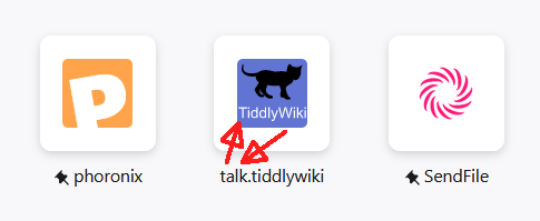
On my FF browser start page the “talk-icon” has been updated. It looks nice and is readable. It seems to use the favicon, which is one of the SVGs. That’s a nice side effect  … BUT
… BUT

It has the wrong text … I think it should be “Talk” instead of TiddlyWiki.
because tiddlywiki.com looks like this:

@jeremyruston … It is a 64x64 px PNG image. IMO it should be an SVG too. Would probably look nicer.
