I believe the TiddlyWiki editing experience is its most significant area for improvement

I believe the TiddlyWiki editing experience is its most significant area for improvement.

When you open a standard document or a modern note-taking app, you can usually start editing immediately. You create a new document, begin writing, add a link, click it, and can quickly edit the new page. Some advanced editors even allow for a completely keyboard-driven workflow, eliminating the need for a mouse.

In contrast, TiddlyWiki requires you to click an edit button before you can start typing. For long tiddlers or when you have many open in the story river, this often involves extra scrolling. After editing, you must click a save button to finalize your changes. Most modern note-taking apps save changes in real-time. This extra cycle—edit button, edit content, save button—adds up. Even if it only takes 0.1 seconds, over thousands of edits, it becomes a significant time sink.

I know this is a complex problem due to TiddlyWiki’s unique refresh and wiki-text parsing mechanisms, which rely on the save button to re-render all wiki-text code. But is there truly no other way to improve this?

Perhaps we could have a separate button for this refresh action, giving users control over when a full refresh occurs. This way, simple edits on a regular tiddler wouldn’t require a full reload. Another potential solution might involve relying on a WYSIWYG (What You See Is What You Get) plugin, but even these often require you to click a button to enter and exit the editing state. I feel this needs a core-level solution.

This is a point worth considering and could be a key feature for a future version of TiddlyWiki, perhaps TWX, or even in version 5.4.x or by the year 2036. I’ve been using TiddlyWiki for over three years now and am very satisfied with it, but I believe the current editing mode wastes a lot of time. While I don’t have a perfect solution, I am convinced this is the most critical area for improvement.

1 Like

IMO, the accumulated problem is on attention. You need to mouse over there, you need to hit the exact spot, then back to the tiddler area, etc.

I’ve said it before; TW is actually not good for note-taking but it is amazing for note-managing (so to call it a “note-book” probably gives the wrong expectations). If anyone doubts that, then try to use default TW for taking live notes in some intensive lecture. There you really experience the problems. Forget using multiple tiddlers, you’ll need to dump it all into one tiddler and, as a safety measure, save every now and then. While I guess all note taking needs some post-editing, for TW there is typically a lot of splitting, formatting, etc.

2 Likes

Well Not only. alt-N will create a new tiddler and you can type.

  • This will create a default tiddler
  • A lot of tiddlywiki solutions are more sopisticated and provide interfaces to deside what kind of tiddler/document/object/item you want to create so there is no single new method. for example new contact, new project task …

It is importiant to know there are a lot of big keyboard users of TiddlyWiki and there has being continuose improvement on this front.

  • In tiddlywiki the tiddler is in effect the document. One of its special features is that the document is also a record. I call this putting the record at eye level, and if is a different philosphy to other solutions and I belive why so many people love it.
    • You have recently being talking about tiddlywiki as the document, which can be valid but less so for many users of tiddlywiki, as each wiki is a site/app/solution.

I note on firefox if I just start typing on a tiddlywiki without an edit field selected (eg search or tiddler text field) the browser opens the “search on page”, Chrome does nothing and Edge opens what appears to be an internet search.

@dongrentianyu perhaps you can spell out a behaviour you would like to see and we will see if someone has already developed ity, or could develop it.

If I need “real-time” note taking, I use the streams plugin. It works incredibly well, once I did set up the keyboard shortcut for my personal likings.

It needs a bit of settings preparation, but then it – Just works.

3 Likes

Whilst I 100% agree with this, I actually consider TWC to be better than TW5 for note taking. This is due to a couple of things:

  • doubleclick to edit
  • the edit view having smaller headers, meaning a greater chance the text in the edit view will align with the text as previously seen in the reading view.

Neither solve the main problems raised, they just minimise some of them, making it much more transparent to flip between read and edit modes.

FWIW, I used the 2click2edit plugin on the first TW5 I setup - and still have it there. But not on any others. I find it equally parts great (when I want to edit) and frustrating (when I want to highlight text but not edit) and after 18 months still haven’t decided which way I want to lean. (sekrit third option: learn enough JS to implement my idea (idea: select-text only when mouse is on text/selectable content · Issue #4 · danielo515/TW5-2click2edit · GitHub ) that doubleclick only activates edit mode when no text has been selected from the doubleclick).

Anyway, all that’s tangent.

For TW5…

Changing the editor is something discussed for 5.4.0. To quote @jeremyruston from [TW2036] Planning for v5.4.0

All if these can be configured back in to TW5

I made my own for this and use ctrl-click to edit and leave the click and drag to select.

I’ve toyed with the CSS myself to reduce the edit mode header size, but ran into usability issues (now forgotten) and have mostly disabled my testing. I’ve not seen this brought up elsewhere, happy for pointers.

That sounds neat. I hope to see it in your forthcoming Plugins collection!

1 Like

I only used this on show-code=yes tiddlers?

What was your need?

I’m wondering if we’ve talking at cross purposes here? I dont even know what “show-code=yes” means.

I want the header when editing:

…to be smaller.

There are four bits of content there across three lines, and about 75% of the total space is wasted.

I attempted to shrink the title edit to half width (success) and the “Draft of” and controls to be on the right of that, thus reducing a line of space. But while I got it somewhat working, I reverted it because of a forgotten usability bug, and haven’t gotten back to it.

(I think my ideal would be [title edit field] [tag edit field] [controls] all on one line. I don’t think I need the “draft of” displayed, and the rest I’d prefer to be compact)

IMO that’s not true. Your tiddler does not have any tags. Tags are very common, so most tiddlers do have several of them. So the tag space has to be there.

The "Draft of … " text and the toolbar buttons on the other hand really waste vertical space. I did create a GitHub issue for that one.

The default UI also has mobile devices in the view. For mobile devices IMO the tag-input area is way to small. Removing a tag is a nightmare on my phone.

1 Like

That example didn’t have tags only because I chose one that didn’t have any so as to minimise personal data leakage. The field to add tags is there in the screenshot, and I didn’t suggest removing it, only relocating it with the others on a line (though that may be the one that doesn’t scale well to lots of content. The other two essentials - title edit and controls, either handle overflow data nicely or are a static size). My failed attempt to resolve with CSS only tried to put the title and controls on one line, and I left the tag line alone.

In response to the original post: It’s an interesting idea. I’d love to see a POC/demo where:

  • Editing is Wysiwyg
  • Tiddlers are always in edit mode, imagine each tiddler is like a little Google Doc.

Would such a thing be possible? Difficult? I suppose there is a lot of core TiddlyWiki functionality related to the transition between viewing and editing. Perhaps there could be some kind of mouse focus driven transition, so when you click on a Tiddler all other visible tiddlers switch to view mode and the tiddler you clicked on switches to edit mode, but in such a way that there’s no (or at least only minimal) visible change in appearance. :thinking:

There is a very primitive demo here that supports only basic text formatting, links etc:
https://saqimtiaz.github.io/sq-tw/typewriter.html#View%20demo

I developed this further since for some editions that I manage but it isn’t a properly implemented WYSIWYG solution, rather a bit of a hack based on converting HTML back into wikitext.

4 Likes

A post was split to a new topic: Problem with Typewriter Edition

I only wish the stuff I thought was finished worked half as well as the stuff you say is primitive.

This looks serviceable for quickly jotting notes. Then when you’re done, you can just go back to standard wiki mode. Maybe just a button to flip the two modes quickly would be useful.

Well, if you don’t mind modifying core tiddlers, a small change to eventcatcher.js would make this work.
First we need a new parameter to activate this behavior, since it might not be wanted for all double clicks:

stopPropagation = self.getAttribute("stopPropagation","onaction"),
cancelOnSelection = self.getAttribute("cancelOnSelection","no"),
selectedNode = event.target,

Insert the middle line between the other two. This gives a new parameter cancelOnSelection which you set to yes if actions should not execute when text was actually selected by the double click.
Then,

if(event.type.toString() !== "dblclick" || cancelOnSelection === "no" || window.getSelection().toString().trim().length === 0) {
	self.invokeActionString(actions,self,event,variables);
}

Wrap the already existing middle line into the conditional statement.
Now, if the event was a double click, the actions are only invoked if the parameter cancelOnSelection is either not set or there is no selection.

<$eventcatcher $dblclick=<<actions>> cancelOnSelection="yes" >

Your actions would be to send the tm-edit-tiddler message. The eventcatcher itself would have to be added to the ViewTemplate.

1 Like

A couple of questions for anyone with more experience with modern note-taking apps, especially of the WYSIWYG variety:

  1. How do they handle drafts? (Or do they?) I don’t use the standard TW edit mode very much myself, but I do think one of its major strengths is that you don’t have to commit to any changes before you’re ready — and you can even save a wiki, including all your current drafts, without ever leaving edit mode.

    I think this can be especially helpful when editing multiple tiddlers at once: if I’m cutting content out of one tiddler and pasting it into another, I don’t necessarily want those changes to affect the “live” tiddlers until both are in a finished state. And I wouldn’t want all my changes to be permanently committed the moment I click into another tiddler.

  2. How do they handle more complex code like widgets? I can see the utility of WYSIWYG if you’re not doing anything beyond basic text formatting… but I’m struggling to see how it would work with a $list widget, for instance, or even a transclusion. Surely you’d want to preserve a visual distinction between transcluded content and content actually present in the tiddler you’re editing. How does this work if you’re always seeing rendered results — especially if there’s no distinction between edit and view mode?

1 Like

I know there are some keyboard shortcuts that can help, but I generally don’t use them because remembering all of them can be a hassle. Another key issue is that they often conflict with other software on my computer. Furthermore, shortcuts don’t change the fundamental “edit and save” process; they just remove the need to use the mouse to click the buttons.

That’s a good question, but it’s primarily a rendering issue. Imagine you have some Mermaid code. If you change the code, the rendered diagram has to change too. Similarly, when we want to edit a widget like a list, we’re editing the underlying <$list> code, not the rendered output directly.

Of course, the code can be short while the rendered content is long, so keeping the two in sync needs more research. Maybe we could add a delay or a special button for a manual refresh.

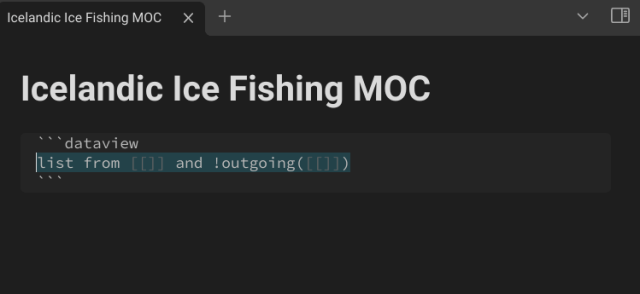
In Obsidian, there’s a popular plugin called Dataview, which offers functionality similar to <$list>, and even has a more complex UI. Yet, the rendering issue hasn’t been a problem for users. From what I understand, many people love Obsidian precisely because this plugin allows them to organize their notes more extensively.

I’m not familiar with Obsidian or Dataview, so I looked around and found some screenshots that seem to demonstrate the way it works, courtesy of this blog:

What you’d type:
icefishing1

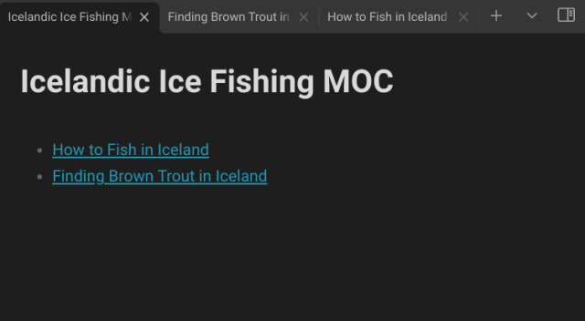
This is apparently the Dataview syntax for “all files that link to the current file but do not already have a link in the file”. It seems equivalent to {{{ [<currentTiddler>backlinks[]] -[<currentTiddler>links[]] }}} (or perhaps a $list widget version thereof — I’m unclear on whether Dataview allows you to assign display templates to your results.)

What that would give you:
icefishing5

So… this looks more like edit mode than WYSIWYG to me — perhaps with double-click-to-edit? It’s not clear in the screenshots I found, but perhaps Obsidian also supports editing a single section at a time1, rather than editing the entire note (or “file”) at once?

If so, it looks like you’re still clicking to enter/exit editing mode. And you alluded to the division between code and rendered output, too:

I guess my question is, how do you see an improved system differing from the editing methods we already have? Is the “section editing” the most important aspect?


1 For anyone looking for section editing in TW, @Mohammad’s Section plugin is a good starting place. In theory, it might be possible to modify his plugin so that it splits editing “sections” at the paragraph level rather than at headers… but linebreaks can convey parsing information in TW, so I’m not sure whether this would really be a good idea.

1 Like