How to reduce the gap between tiddlers in collapsed state

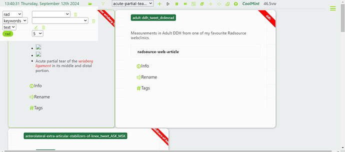
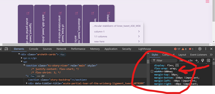
Here I am using a custom layout with collapsed tiddlers / cards.
When the storyriver has many tiddler, these collapsed tiddlers are closely packed.

But when the tiddler number in the storyriver is less, the gap between tiddlers are more.

How can I fix this gap ? This occurs only when the storyriver is horizontally oriented instead of the default vertical orientation.
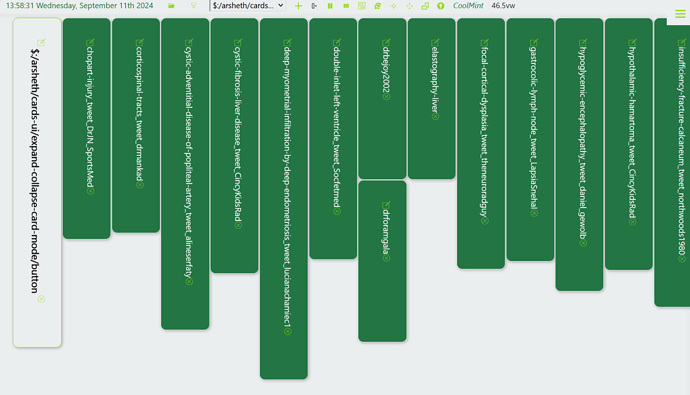
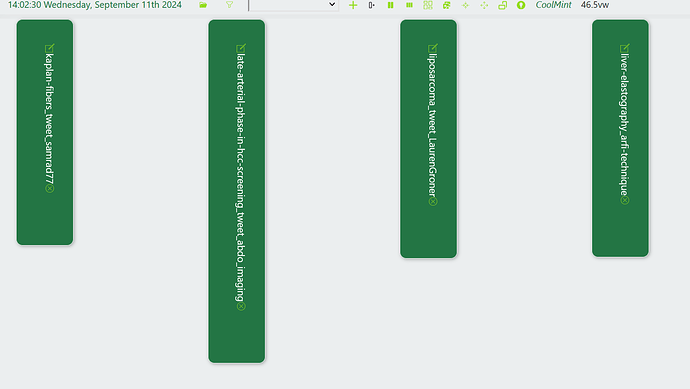
I’m not sure why, but the vertical writing mode css line seems to control both the tight padding around the text (which you do want) and the distributed spacing across the screen (which you don’t want). In my inspector, deselecting that writing-mode line solved the one problem at the expense of the other.

.arsheth-cards .tc-story-river {
    writing-mode: vertical-lr !important;
}
1 Like

I am trying to fix it for last few days, no luck yet.

I don’t understand how to reproduce what you show in the image, in the actual wiki you link to. It would be better if you linked to a wiki that directly shows the problem.

There is filter button in the topbar to the left of the select widget. Click that button to change the tiddler count to a small number like 5…That would be sufficient to reproduce the problem…

Can you press alt+shift+Z and see

I am away from desktop… that’s why

1 Like

Shift+L also is needed to change from vertical to horizontal orientation of storyriver

OK, that did fold the tiddlers but even setting the number to 2 does nothing.
But better take this when you’ at you desktop.

I have uploaded a new version with the issue described in OP in the home page. Can you take a look now. https://cards-ui-demo.tiddlyhost.com/

I have very limited experience with flexbox, but maybe this?

If I were to dabble with flexbox I’d first use the CSS-tricks writeup as a reference:

2 Likes

This article helped. Thank you @twMat for sharing this.

.arsheth-cards .tc-story-river {
    writing-mode: vertical-lr!important;
    align-content: flex-start;
}

align-content: flex-start; solved the issue.

This vertical list story would be nice inside a single tiddler, in otherwise a way to list or equivalent to tabs.