Hello,
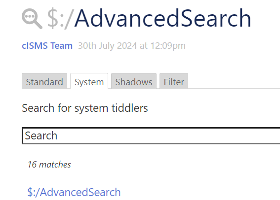
I would like to hide the system shadow and filter tabs so as not to confuse my users unnecessarily.
Is this easily possible?

Thx
Stefan
Hello,
I would like to hide the system shadow and filter tabs so as not to confuse my users unnecessarily.
Is this easily possible?

Thx
Stefan
Doesn’t this mean it’s not advanced search at all? So then you’re just putting the same thing as the sidebar (or menubar) search into the story river?
No. I only want to hide the tabs in des $:/AdvncedSearch result.
I’m afraid I don’t understand.
The tabs are not in the results; they’re different scopes / methods of searching. If you remove the tabs for system, shadow, and filter, then you only have the standard tab… and you don’t need a “tab” at all if there’s only one of them… and then you have something that looks almost identical to the $:/core/ui/SideBarSegments/search
(although there’s still a difference, which is that advanced search shows results within the tiddler body, rather than as a dropdown).
You may be interested in a readOnly plugin, if you have the general need to reduce clutter for visitors who are focused on a theme that has nothing to do with TiddlyWiki.
One such discussion is here: Simple solution for an online read-only TW
There may be others, more recent. At any rate, there are tons of interface elements that I suppress when the wiki is loaded over the web, but which show when I’m editing locally, or when I have an active connection to tiddlyhost.
At any rate, you could certainly edit the advanced-search button (in the sidebar, which is the $:/core/ui/Buttons/advanced-search tiddler) to open up the standard search directly (the part that displays under the tab “standard”), rather than the set of tabs in the advanced search:
$:/core/ui/AdvancedSearch/Standard
Perhaps you’d still want to keep the keyboard shortcut to open up the full Advanced Search, for wiki editing purposes…
It’s only to hide the information about system and shadow and so on.
I have two different type of users.
These ones understand the philosophie of tiddlywiki and there are more than enough people writing content. It is difficult enough to have them under control as long I have not the possibility to use the node.js version
the Users. They only consume the content. And believe me, they don’t understand search results with $./ at the beginning and I don’t have time to explain it. 
The $:/AdvancedSearch tiddler, clone it. Rename it if you like. Create a link to it wherever convenient so you can access this whenever you need it.
Now, alter the $:/AdvancedSearch, making the “text” field equal to the following:
\whitespace trim
<div class="tc-advanced-search">
{{$:/core/ui/AdvancedSearch/Filter}}
</div>
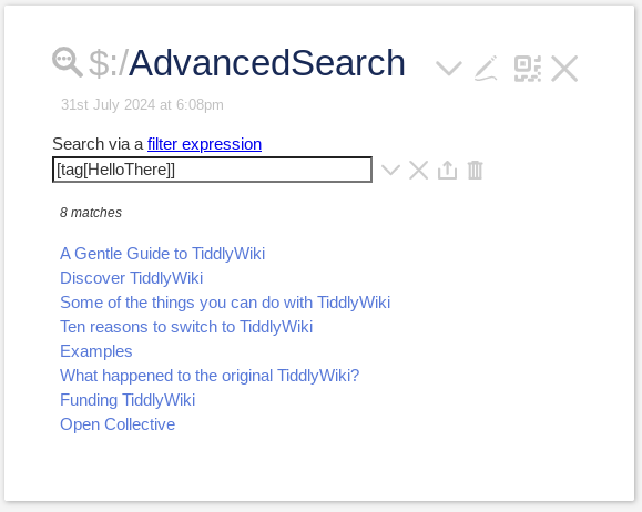
The result:
If and whenever you want to revert the Advanced Search to whatever it used to be, simply delete the $:/AdvancedSearch (I.e. your version) tiddler, which will cause the original to be resurrected.
Try all of this out at TiddlyWiki.com so you can see how it all works.
Oops, I had “Filter” tab stuck in my head.
For just the Standard search, you want:
\whitespace trim
<div class="tc-advanced-search">
{{$:/core/ui/AdvancedSearch/Standard}}
</div>
And, if you don’t mind getting a little fancy to accommodate all users, put the following in the text field of $:/AdvancedSearch
\whitespace trim
<$checkbox tiddler="$:/temp/PowerUserSearch" field="text" checked="yes" unchecked="no"><$text text=" Power User Search"/></$checkbox>
<hr>
<div class="tc-advanced-search">
  <$list variable="show" filter="[[$:/temp/PowerUserSearch]get[text]else[no]match[yes]]">
    <$macrocall $name="tabs" tabsList="[all[shadows+tiddlers]tag[$:/tags/AdvancedSearch]!has[draft.of]]" default="$:/core/ui/AdvancedSearch/System" actions="""
 <$action-setfield $tiddler="$:/state/advancedsearch/currentTab" text=<<currentTab>>/>""" explicitState="$:/state/tab--1498284803"/>
  </$list>
  <$list variable="show" filter="[[$:/temp/PowerUserSearch]get[text]else[no]match[no]]">
      {{$:/core/ui/AdvancedSearch/Standard}}
  </$list>
</div>
This is a good idea. Most of the user will not recognise the checkbox except the experts 
May be a good idea for integration in the core? 
A simple solution is just to style away the tabs.
tag: $:/tags/Stylesheet
type: text/css
[data-tiddler-title="$:/AdvancedSearch"] .tc-tab-buttons {display:none;}
Doesn’t overwrite any code. I didn’t read the previous replies carefully but I saw something about a checkbox; You could have one and toggle the Stylesheet tag to revert the look back to normal.
That’s pretty cool, but like any solution, there is a price to pay.
In this case, the pieces of the solution are spread out instead of being in close proximity.
Somebody else looking at the advanced Search and does not see the usual tabs might have a hard time figuring out what’s going on. Where does one look to get the out of the box advanced Search working again? If you don’t know about the CSS style, how do you find out about it? And if you don’t know what tiddler the CSS is hiding in, how do you find it?
And the check box. Where do we put it? Another tiddler involved. One that needs to be visible for users. Easy enough to find the widget code if we see the check box somewhere. If we don’t see it, easy to know about it if we know about the CSS. Assuming we know about the CSS.
I’m no fan of overriding core tiddlers, but for me proximity is king. You can find out everything about the advanced search tiddler by just editing it: there it is, all of it.
I don’t think any solution is better (or even simpler) than any other because it all depends on the eye of the beholder.
Well, all of that is just a thought. Largely because I’m procrastinating in regards to the family-doc mandated walk. Ugh.
Personally, if this were nessasary, I would just hide the advanced search button because what’s left is the standard search from the side bar.
This whole exercise may help inexpert users but it is closer to “security by obscurity”, do you really need this? Or is it somewhat paternalistic?
To follow up, a good read to put things in perspective:
Golden Rules of User Interface Design
So I think, @stefan_from_germany , what you are doing is A-1. You are making it very easy for non-TW-users to see that it is possible to do more powerful searching when they are ready for it, via the one access path.