Hej,
I googled a lot and tried a lot of the found css-solutions (overflow-options, wrap-options,…) … Maybe I only did not find the right ones or I tried them in the wrong combination or maybe I missed something or … I don’t know… Also looked & tried long time in the explore inspector- also with no success.
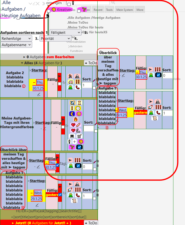
So, when I use my mobile layout (on my tablet) (My mobile Stylesheet), which I switch by the “<m”-button on the top right side, then the whole table overflows to the right. But also the titles of the tasks inside the title-cells overflow to the top. Like the things in the red circles in the picture:
The link for trying:
https://meinetodos.tiddlyhost.com/#.Alle Aufgaben /Heutige Aufgaben
What I would like to achieve is: The height of the rows depends on the title-cell, which has a defined width. So, when the title of the task is long, then the height of the row should grow as much as the title needs.
I do not want, that anything is hidden or clipped or to scroll.
How to achieve that? Please help…
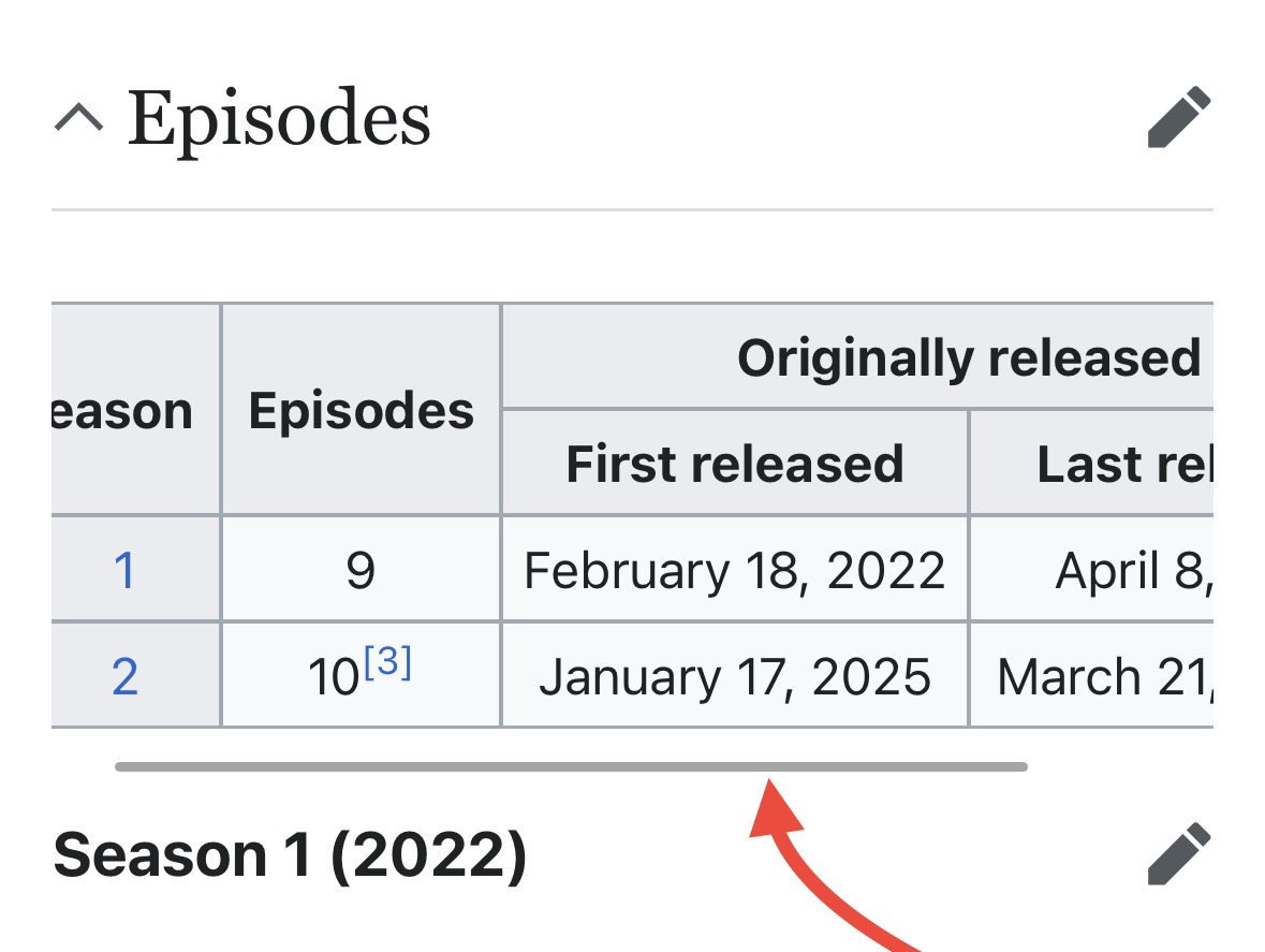
I’ve been having issues with wide cells and/or tables in TiddlyWiki as well. One idea that came to mind is adopting Wikipedia’s horizontal scrolling of wide tables:
Any WP page with wide enough table will do, this one is from the Severance article as viewed on a mobile screen.
I guess some CSS could be applied to <table>s in the tiddlers’ body, something like this.
Thanks for your answer, but sorry, I do not want scrollbars. Instead I wish, that the height of the row increases to fit the cell-content inside the cells.
Maybe my main problem is, that I do not know, where to put best the styling of the table, because the table in https://meinetodos.tiddlyhost.com/#.Alle Aufgaben /Heutige Aufgaben transcludes 2 other tables (here without any styling):
<table><tr><td>{{.Meine ToDos}}</td><td>{{.Meine ToDos für heuteXS}}</td></tr></table>
So, these both transcluded “.Meine ToDos” & “.Meine ToDos für heuteXS” are also tables, with filtered content shown by a list-template.
-
Where to put the styling, that the task-titles stay inside the title-cell: In the list-templates or in the “.Meine ToDos” & “.Meine ToDos für heuteXS” or in the “Alle Aufgaben /Heutige Aufgaben”? And in the <table>-part or the <tr>-part or the <td>-part?
-
The same question for the problem that the whole table is overflowing to the right in “Alle Aufgaben /Heutige Aufgaben”.
And also I do not know, how to combine the styling options like “display:”, “table-layout:”, “width:”, “overflow:” and so on for achieving my wish.
If I would try all of these possible combinations I would have to try about… 1 million options? That’s a bit to much for my little brain, sorry. So please point me to the right direction…
I do not know where to begin…