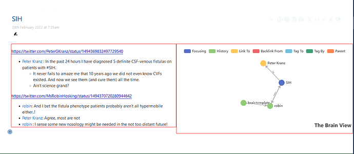
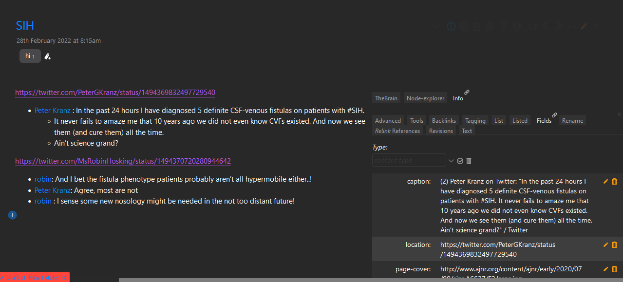
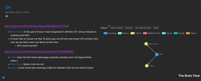
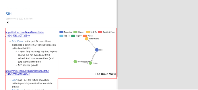
How to create a viewtemplate to float the TheBrain (echarts) to the right of tiddler text field using Shiraz/flexgrid/autolayout-with-image

Ah, yes I did. I thought I realized a somewhat better solution even though the first also worked. I think the initial styling was like this:

<style>
[data-tiddler-title='{{!!title}}'] .tc-tiddler-body {
  border:1px solid red;
  width:50%;
}
[data-tiddler-title='{{!!title}}'] .rightside {
  border:1px solid red;
  width:50%;
  position:absolute;
  right:0;
}
</style>

But, in my edited code, you can see if just removing clear:left; will position them correctly. You can also see what happens if the widths are set to 49% instead.

1 Like

This the code I am using now

<$list filter="[all[current]!is[system]!is[shadow]!tag[$:/tags/SideBar]!tag[Journal]!tag[$:/tags/ViewTemplate]!tag[$:/tags/Stylesheet]!tag[tweaks]!TheBrain[no]]">
<div class="rightside">

{{TheBrain}}
</div>

<style>
[data-tiddler-title='{{!!title}}'] .tc-tiddler-body {
  border:1px solid red;
  width:50%;
}
[data-tiddler-title='{{!!title}}'] .rightside {
  border:1px solid red;
  width:50%;
  position: absolute;
  right:0;
  margin-top: 146px;
}
</style>
</$list>

I don’t know whether it’s the right to use margin-top:146px; , it somehow works.
float:right; never used to work in krystal horizontal layout plug in.

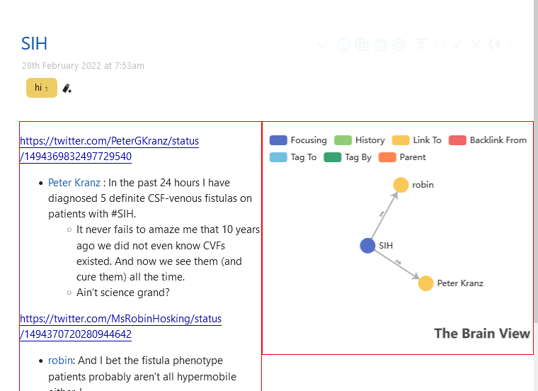
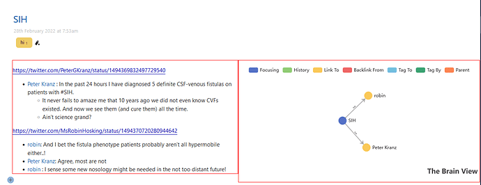
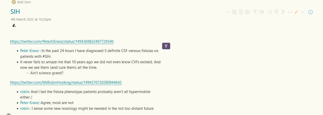
Non maximized state of tiddler

Maximized state of tiddler

Another thing that i noticed is when the filter used was smaller, i had to use margin-top:164px;. Any idea why is it so?

<$list filter="[all[current]tag[hi]]">
<div class="rightside">

{{TheBrain}}
</div>

<style>
[data-tiddler-title='{{!!title}}'] .tc-tiddler-body {
  border:1px solid red;
  width:50%;
}
[data-tiddler-title='{{!!title}}'] .rightside {
  border:1px solid red;
  width:50%;
  position: absolute;
  right:0;
  margin-top: 164px;
}
</style>
</$list>

Edit: When i reverted back to the first code, I had to use margin-top: 164px; there also.

Anyways it works as I intended. Thank you so much for your help @twMat

@twMat

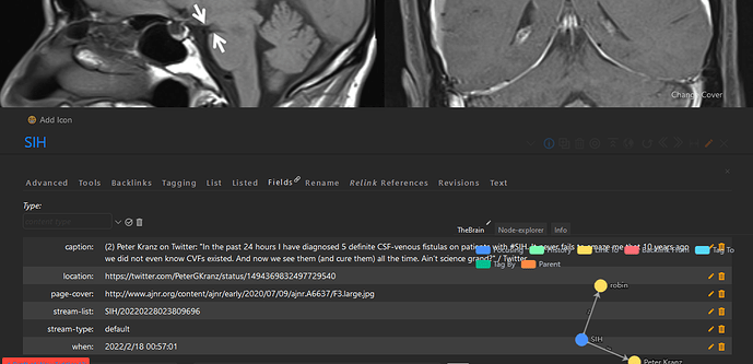
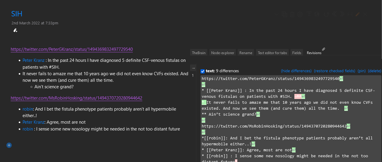
I had a small problem with the above code. When the tiddlerinfo viewtoolbar button is clicked, the thebrain on the right side will overlap the opened tiddlerinfo section like shown in the below image.

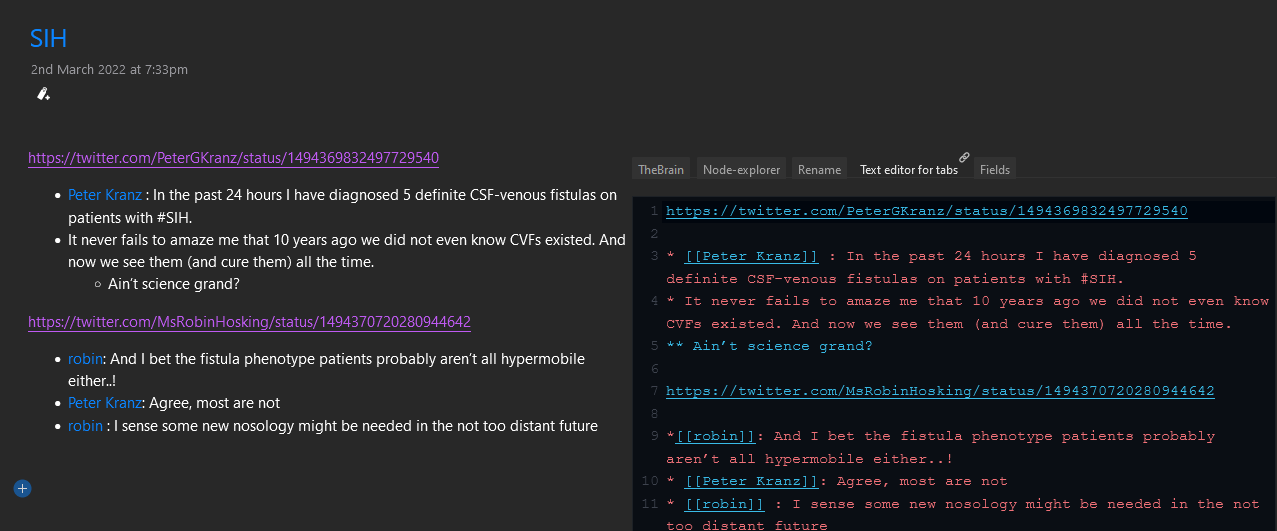
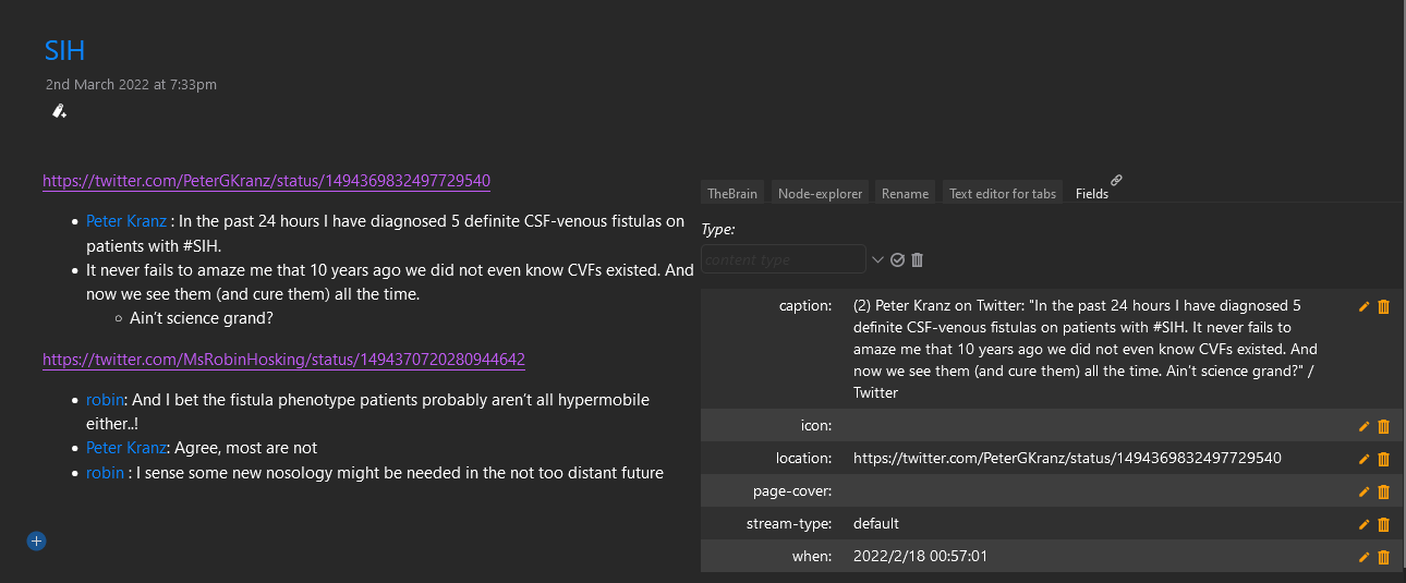
As a work around, I added the tiddlerinfo into the braintemplate using a tab macro like this.

Is there any other workaround for this?

Also can I incorporate your side-editor into this tabs for easy editing of tiddlers (If yes, can you suggest how to do it) Side-editor wont work easily with krystal horizontal story view. That why I am thinking in that direction.

You can try to set the z-index for the popup and the Brain side, i.e in the style parts defined previously, you can see if this works

[data-tiddler-title='{{!!title}}'] .rightside { z-index:10; }
[data-tiddler-title='{{!!title}}'] .tc-titlebar .tc-popup { z-index:20; }

(that first z-index:10can be directly inserted in the previous definitions, it does not have to be a new definition).

What do you mean with “into this tabs”? Where?

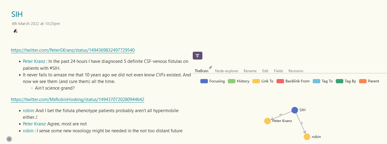
Check the second image in my today’s post. On the right side, you can see a tab instead theBrain graph view

This is my current setup.

This the braintemplate used currently

<$list filter="[all[current]!is[system]!is[shadow]!tag[$:/tags/SideBar]!tag[Journal]!tag[$:/tags/ViewTemplate]!tag[$:/tags/Stylesheet]!tag[tweaks]!TheBrain[no]!has[page-cover]]">
<div class="rightside">

{{||Bottom Tabs for viewtemplate - without folding}}
</div>

<style>
[data-tiddler-title='{{!!title}}'] .tc-tiddler-body {
  border:1px solid transparent;
  width:50%;
}
[data-tiddler-title='{{!!title}}'] .rightside {
  border:1px solid transparent;
  width:50%;
  position: absolute;
  right:0;
  margin-top: 146px;
}
</style>
</$list>

Bottom Tabs for viewtemplate - without folding is the tab macro used.

<<tabs "[[TheBrain]] [[Node-explorer]] [[$:/sq/ui/ViewTemplate/rename-tiddler]][[Text editor for tabs]] [[$:/core/ui/TiddlerInfo/Fields]] [[$:/plugins/jd/plainrevs/TiddlerInfo/Revisions]]" "default:[[TheBrain]] ">>

Contents of the tab macro include a text editor tab, field tab and revisions tab also.

I cloned the core text editor tiddler and removed the editor toolbar buttons to create Text editor for tabs. Is it ok to do so?

Field tab was taken from Saq’s UI experiments wiki.

Revisions tab is taken from JD’s revisions plug in.

These are just some experiments I am doing. Not my main wiki.

I have some questions

  1. Is it possible to hide the .rightside using some button so that it seen only when the button is pressed. The .tc-tiddler-body shall occupy the entire width of the screen when the .rightside is hidden. Is it possible ? Not an urgent thing. Was just exploring some UI ideas which came to my mind.

  2. Is it possible to hide the .rightside when the wiki is opened in mobile phone. Or is it possible to bring the .rightside to the bottom of the tiddler by using another viewtemplate when the wiki is opened in mobile phone.

  3. z-index thing didn’t worked. I will check later once more.
1 Like

To get the SideEditor into a tab would take some redesigning depending on which aspects of the SideEditor would you want. It is designed to float and be resizable, so I’m guessing you don’t want that, but there is also the “hover features”. And maybe you’re not interested in all the button controls? The more of those things you cut out the easier it should be because it is basically just an EditTextWidget and some buttons. I’m afraid you’d be the one who experiment with it all but I’d be happy to assist with specific questions.

One method could be to enclose all of the listwidget content in a revealwidget. You can use a field in the current tiddler to store the state.

Everything is possible but different degrees of fiddling. There is the InfoMechanism to find out what size of screen is used, which you can use as a condition to show one template or the other or no template etc.

If this works, I may not need to incorporate SideEditor into the setup.

For these two, I will get back to you after reading and experimenting a little with it.

Sure, I don’t see why it would be a problem. (Doesn’t that pretty much leave just a EditTextWidget?)

I guess so. It works fine in my short testing

This is what i could find in my search

Can you suggest how to use it in my case to select which viewtemplate to show in mobile

Here’s the general idea:

<$list filter='[{$:/info/browser/screen/width}compare:integer:lt[1000]]'>
use the small screen template or styling
</$list>
<$list filter='[{$:/info/browser/screen/width}compare:integer:gt[1000]]'>
use the big screen template or styling
</$list>

i.e the info gives the screen width and the compare operator looks if it is less or greater than 1000px (…a number I just pulled out of the air)

There are many variants. For example, the ListWidget has an emptyMessage parameter that could be used instead of a second listwidget, i.e to call some macro that does pretty much the same thing as the second listwidget in the example. And if the “either or” only concerns pure styling then you could use a CSS media query instead of listwidgets. But the above idea is pretty standard TW handling and easy to construct. The real task is of course to design the actual two templates etc

If it isn’t obvious: As much as possible of the templates or styling should be placed outside of the conditional tests, i.e no need to repeat identical content inside both of those listwidget conditionals.

@twMat I used a reveal widget example shown in tiddlywiki.com in my braintemplate

<$list filter="[all[current]!is[system]!is[shadow]!tag[$:/tags/SideBar]!tag[Journal]!tag[$:/tags/ViewTemplate]!tag[$:/tags/Stylesheet]!tag[tweaks]!TheBrain[no]has[page-cover]]">
<div class="rightside">

<$reveal type="nomatch" state="$:/state/SampleReveal2" text="show">

<$button set="$:/state/SampleReveal2" setTo="show">{{$:/core/images/fold-button}}</$button>

</$reveal>
<$reveal type="match" state="$:/state/SampleReveal2" text="show">

<$button set="$:/state/SampleReveal2" setTo="hide">{{$:/core/images/unfold-button}}</$button>

{{||Bottom Tabs for viewtemplate - without folding}}

</$reveal>

</div>

<style>
[data-tiddler-title='{{!!title}}'] .tc-tiddler-body {
  border:1px solid transparent;
  width:50%;
}
[data-tiddler-title='{{!!title}}'] .rightside {
  border:1px solid transparent;
  position: absolute;
  right:0;
  margin-top: 426px;
  width:50%;
}

</style>
</$list>

And now it looks like this

  1. Is there any way I can bring that reveal button to the right most corner.
  2. Can the .tc-tiddler-body occupy the full screen when the .rightside
    is hidden by the reveal button and return back to 50% width once the .rightside is revealed by the reveal button

If you put all the previous code inside the revealwidget, is what you request not what is happening? I.e inside the revealwidget, pubt the listwidget with the div+brain + the styleblock.

I believe the content of a revealwidget is only active if the reveal is open.

The button to set the revealstate can have a class (defined outside of the aforementioned styleblock, e.g in a stylseheet or possibly in a separate local styleblock) to float it to the right, just like you did earlier. You can put this button in the code after the revealwidget, to make it be to the right of the revealwidget regardless of if the reveal is open or not.

<$list filter="[all[current]!is[system]!is[shadow]!tag[$:/tags/SideBar]!tag[Journal]!tag[$:/tags/ViewTemplate]!tag[$:/tags/Stylesheet]!tag[tweaks]!TheBrain[no]!has[page-cover]]">
<div class="rightside">

{{||Bottom Tabs for viewtemplate - without folding}}
</div>

<style>
[data-tiddler-title='{{!!title}}'] .tc-tiddler-body {
  border:1px solid transparent;
  width:50%;
}
[data-tiddler-title='{{!!title}}'] .rightside {
  border:1px solid transparent;
  width:50%;
  position: absolute;
  right:0;
  margin-top: 146px;
}
</style>
</$list>

Are you telling that i should put the whole code given above inside reveal widget given below

<$reveal type="nomatch" state="$:/state/SampleReveal2" text="show">

<$button set="$:/state/SampleReveal2" setTo="show">{{$:/core/images/fold-button}}</$button>

</$reveal>
<$reveal type="match" state="$:/state/SampleReveal2" text="show">

<$button set="$:/state/SampleReveal2" setTo="hide">{{$:/core/images/unfold-button}}</$button>

</$reveal>

But when I tried like that it was not working.

Yeah, because you want it to reveal/activate when you click the button, right?

What you’re showing doesn’t show that you put anything in there - ?
The idea is that you put it in the lower reveal. (I’m not sure if it is best put above or below the button, it depends on how you style the button to position it.)

This is what actually I want it to look like. The only problem for me now is the position of the button - which I want to be in the right corner. Also the tiddler body should automatically fill the rest of the screen when the button hides the .rightside

I am not understanding what you are trying to say. Can you please show how you want the code to be

<$reveal type="nomatch" state="$:/state/SampleReveal2" text="show">
<$button set="$:/state/SampleReveal2" setTo="show" class="mybutton">
{{$:/core/images/fold-button}}</$button>
</$reveal>

<$reveal type="match" state="$:/state/SampleReveal2" text="show">
<$button set="$:/state/SampleReveal2" setTo="hide" class="mybutton">
{{$:/core/images/unfold-button}}
</$button>
<$list filter=.............>
ETC
</$list>
</$reveal>

<style>
.mybutton {float:right}
</style>

Test the above structure. Note that I put in a class param for the buttons and added a second styleblock. I’m not sure it will appear correct but it is a start.

1 Like

Hey,
can someone put in the files for echarts as JSON, cause i’m fiddeling without success…
Best

Hey @2right4 - do you actually think you question has anything to do with what is being discussed? Start your own new thread.