I think there is no real solution. Even if you only have 1 icon, if the title text in long enough it will need to be broken up. Especially on a mobile device.
The more dropdown works very well for me. I don’t have that problem since my titles are short and I use max 4-5 icons at the same time.
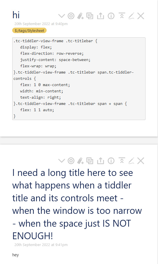
The following CSS will prevent the title text from word wrapping.
.tc-title { white-space:nowrap; }
However… if the text is longer than the width of the tiddler (which is based on the current story width), then the excess title text will be clipped and hidden from view which can make it difficult to differentiate titles that only vary in the last part.
Alternatively, you could limit the width of the tiddler toolbar so that heavily populated toolbars will wrap onto multiple lines, leaving more room for the tiddler title text (which will still wordwrap if needed):
.tc-tiddler-controls { width:30%; }
One drawback to this approach is that the tiddler controls will wrap even when the tiddler title is short enough for the entire tiddler toolbar to fit on one line.
This is better than nothing, although ultimately it would be nice if it could be responsive to the number of buttons, title length and current zoom level.
Even a tiddler by tiddler customisation option we have to manually apply would go a long way.
Customisation can include
Title fonts can be reduced in size
Buttons behind a horizontal slider or hamburger
Buttons overflowing to the next line
Buttons moved up into the tiddler border like stroll but “trimmer”
It seems to me finding a good solution for this needs to be on our roadmap.
I notice that titles with plain english and average length words is not bad even with the default. Where it still “fails” is with system tiddlers with no word breaks or perhaps hyphenated titles and large words.
As a result I wonder if we count words and length in the titles and use this info to determin how we present the title?
It would be great if css could calc the space available or used by title/buttons.
Another thought that arrises with system tiddlers is to divide them into words delimited by / which I did previously for long urls then let them wrap like your plain language example.
I wonder if in this arrangement, where the full title appears on the next line, it would be appropriate to display in the original location the caption if available or a description like “System Tiddler”, “Shadow Tiddler” etc…
As I suggested titles delimited with “/” could be split to look like this;
where the intermediate name links to the tiddler eg extended-search to $:/PSaT/extended-search allowing extra navigation options.
Of course these suggestions can be driven by a set of config options to suite the wiki owner.
I apologize for reopening this old topic but I need some advice on something discussed here
I’ve used and enjoyed this stylesheet for a long time.
But recently I ran into a problem when I decided to use the setting that turns tiddler titles into links. ($:/ControlPanel > Settings > Tiddler Titles / Optionally display tiddler titles as links)
I’ve been going crazy for a couple of days looking for a solution, but I can’t figure out how to make it behave as before.
Do you have any idea how to do it?
If you want to test this happen in a empty copy of TiddlyWiki
(Screen size shouldn’t matter much because this also happens when shrinking the window)
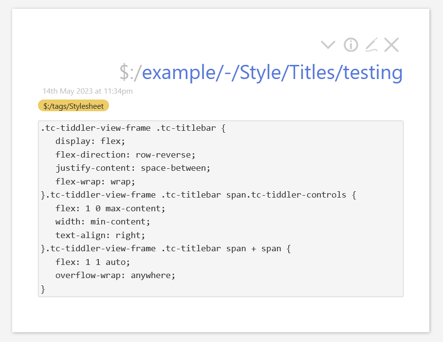
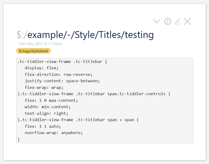
Look in $:/core/ui/ViewTemplate/title which contains the title code by default, this should be where the styles are applied and not correctly when links are activated by changing $:/config/Tiddlers/TitleLinks to yes.
I can’t remember the exact behavior I was trying to get with those styles, but getting rid of them will still have the Tiddler Controls go above the Title Bar if the either one is too long.
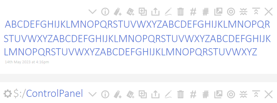
Here is the title bar without any additional styling applied:
I’m not having much luck. I’ve also tried removing all references to $:/config/Tiddlers/TitleLinks, but that doesn’t change anything.
I’ll make other attempts. wish me luck
But I like your work, I don’t want to get rid of it
One question is how a multi-line title should behave. Should it “reflow” if the toolbar shows? And if a title splits into more lines when the toolbar shows, should the submenu and text fields be pushed down, or covered?